
 McArthur Universal Corrective Map of the World
On Sunday September 14, i had the great pleasure to host a panel on Cartography of Protest and Social Changes with 3 artists and activists i admire a lot: Brooke Singer, John Emerson and Lize Mogel. I usually avoid writing about the events i’m so closely involved in, either because i don’t have the opportunity to take notes or because there’s some video of it about to broadcast the ridiculousness of my accent on the world wide web.
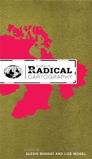 It all started a few months ago when i found about, read and fell in love with a book: An Atlas of Radical Cartography. An Atlas is in fact a collection of 10 maps and 10 essays about social issues from globalization to garbage; surveillance to extraordinary rendition; statelessness to visibility; deportation to migration.
When Christina Ray, the director of Conflux, asked me if i’d like to host a panel i said i’d like to moderate one inspired by An Atlas. Lize Mogel is one of the editors of the book (together with Alexis Bhagat ), Brooke Singer and John Emerson contributed to the volume with maps. Just like the book, the panel was an attempt to demonstrate that maps have the potential to bring about social changes. I am not going to write down everything that was say, i’ll just share with you tiny bits from the presentations:
Lize’s presentation focused on the maps of An Atlas, you can find information about them online but her intro contained some fascinating facts. Here’s just one of them:
One of the world’s most famous maps can be seen on the flag of the United Nations.
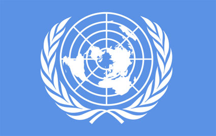
The first version was drawn in 1946 by someone from the US department and had North America at the center of the emblem. The design was changed after some complains from other countries. But one question remained: how do you design a map of the world that has to be fair and display equality between the nations? There is always something on the top, something in the middle (and thus the center of the attention), even being on the left side is not innocent as our eyes are used to read from left to right, the right is also meaningful as advertisers have discovered that the eyes always seem to fall on that side of an image. The solution adopted represents an azimuthal equidistant projection centered on the North Pole. But that area which one would believe is blank and neutral is in fact a space for debate: the area is owned by Denmark, Canada, Russia, Norway and the US and it’s unclear how it should be divided up exactly.
 Pedro Lasch, Guías de Ruta / Route Guides, 2003/2006,
An Atlas of Radical Cartography exhibition opens on September 23 at the Global Education Center, UNC campus. Upcoming venues for the exhibition include New Jersey (October), New York City, Utrecht (2009), etc.
John Emerson has a very impressive portfolio and a blog i’d recommend anyone to subscribe to. He often collaborates with grass-root, independent, non-profit associations dealing with human rights, from California Coalition for Women Prisoners, to the Office of The Tibetan Government in Exile, or Injection Drug Use, Syringe Exchange Programs and AIDS in California. His belief is that maps can be useful tools that visualize power and are able to create social change, influence opinions and alter relationships between powers. By making abstraction visible, maps help us navigate through complex concepts.
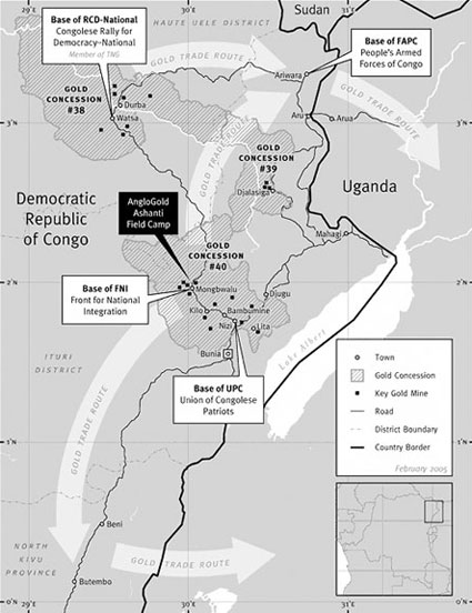 Trade and Control of Gold in Northeastern DRC
One of the projects he highlighted are the compelling and revealing maps of Gold Trade in the Democratic Republic of Congo he created for the Human Rights Watch report The Curse of Gold. The gold trade is fueling conflicts and atrocities for the last 20 years in northeast of the Democratic Republic of Congo. The maps makes clearer the relationship between gold concessions, paramilitary groups in the country and gold companies from all over the world.
The art crowd will probably have heard about a project he developed together with Trevor Paglen.
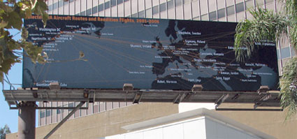 CIA Rendition Flights 2001-2006, Trevor Paglen & John Emerson on Wiltshire, LA
Paglen’s project ‘CIA Rendition Flights 2001-2006’ explores the practice of extraordinary rendition. Emerson designed the map that visualizes the movements of aircraft owned or operated by known CIA front companies in order to reveal the relationships that have been forged between the United States and other countries in the name of the ‘war on terror.’
Back in 2006, Paglen and Emerson installed a huge billboard displaying the map of the rendition flights on 6150 Wilshire Boulevard, in Los Angeles. The billboard, part of the The Clockshop Billboard Series. The reaction of the drivers passing by was not an unanimous feeling of revolt in front of the CIA activities, some felt proud and satisfied to see that the government was doing a good job.
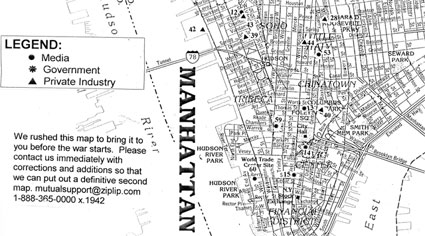 Detail from the NYC Guide to War Profiteers
Another great project Emerson discussed is the NYC Guide to War Profiteers. First published in March 2003, the map located precisely government and military agencies, weapon makers, corporations, media benefiting from the war, etc. The map was available at progressive bookstores around town, and was distributed at organizing meetings for various protest events. It also listed a series of like-minded websites. You can find a scan of the hard copy online.
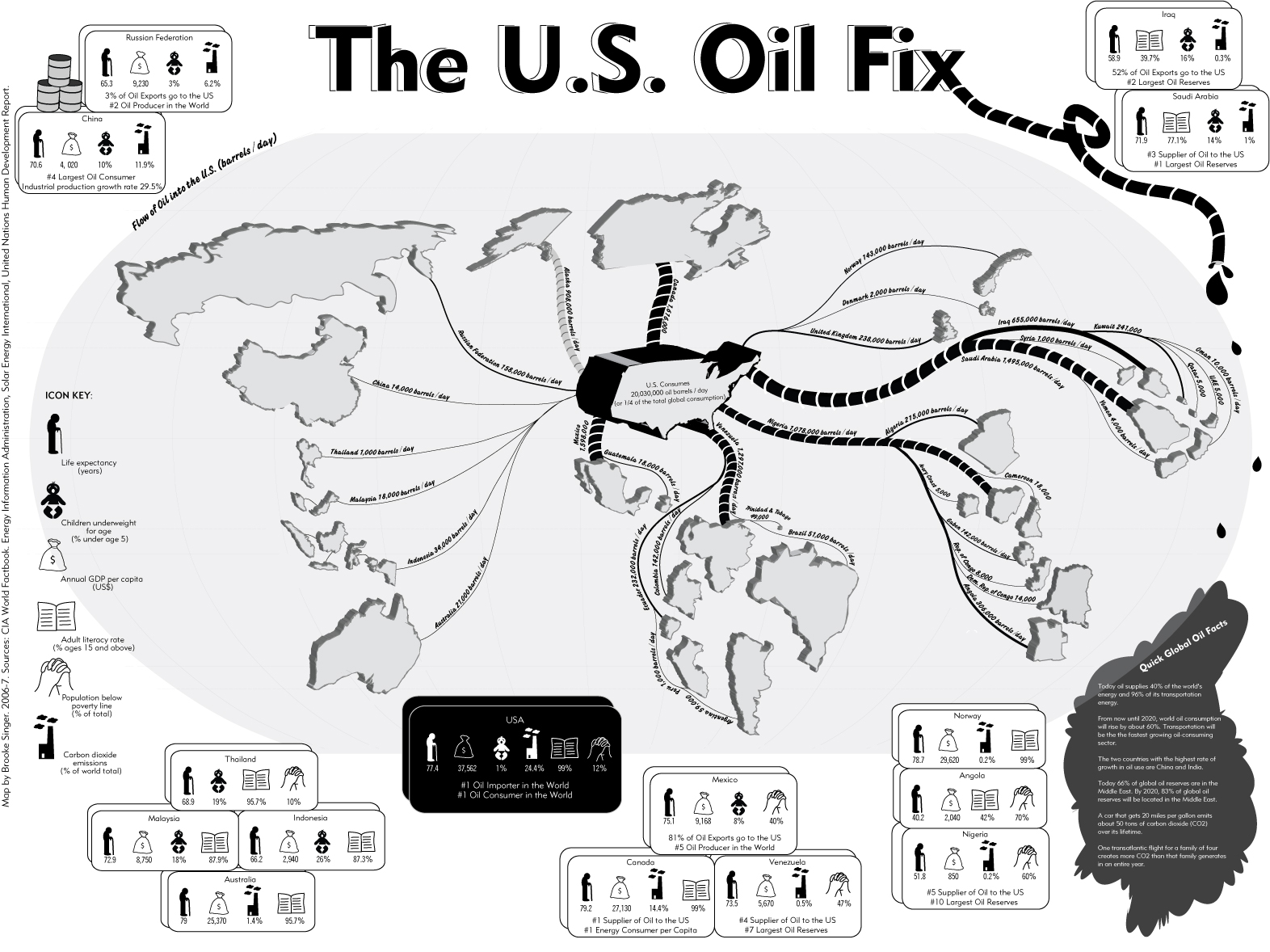
 Brooke Singer discussed briefly her contribution to An Atlas: the Map of U.S. Oil Fix as well as her fantastic project Superfund365, a website that chronicles 365 of the worst Superfund sites where Americans live at risk of exposure to toxins.
 Site entrance of Fried Industries manufacturing plant
In her introduction about map, Singer reminded the audience of a few relevant facts:
– mapping is more about representation than truthfulness,
– maps are often made by scientists and as such, are perceived as objectives. Artists don’t have the pretense to be objective, they do not assume that in the world of map making there is only objectivity going on.
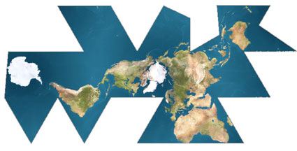 Buckminster Fuller, Dymaxion World Map-unfolded, 1946
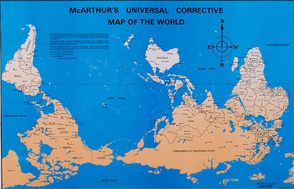
She showed also two thought-provoking maps that illustrate this idea of maps as representation: McArthur Universal Corrective Map of the World, designed in the ’70s by an Australian man who was upset by the idea that he came from the “bottom of the world”. The second one is Buckminster Fuller’s Dymaxion map, the first world projection to show the continents on a flat surface without visible distortion. The map highlights the fact that the earth is essentially one big island over one ocean.