
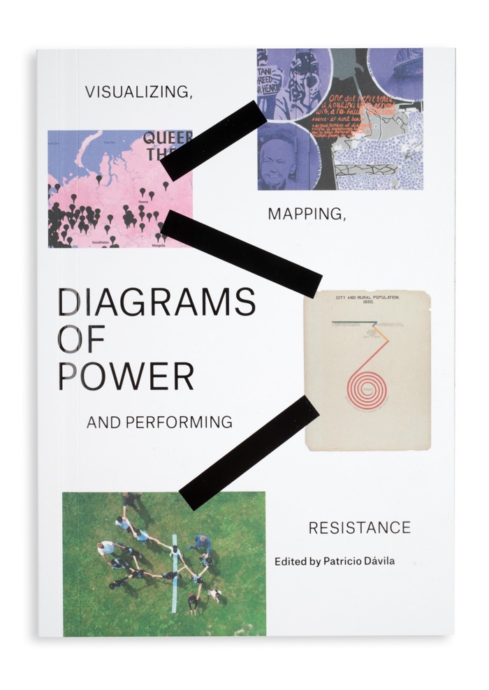
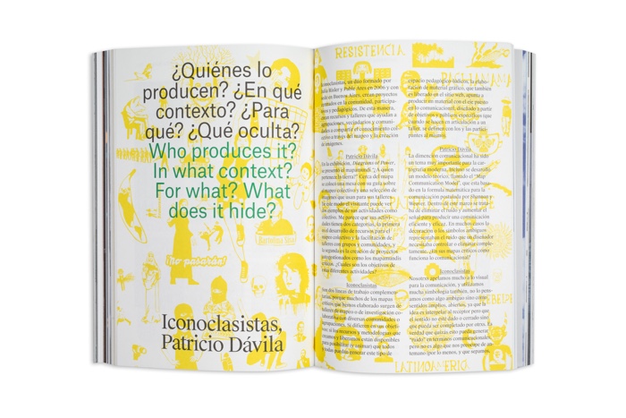
Diagrams of Power: Visualizing, Mapping, and Performing Resistance, edited by Patricio Dávila.
Onomatopee describes the book: We draw diagrams to help us think, communicate and put forth what we think is important or what we want to be true. While some diagrams are seen as statements of fact, they can also further agendas by discounting other realities beneath a cloak of perceived objectivity. Diagrams of power work against representations that claim omniscience by speaking from a position, and making visible what and who gets represented and who does the representing. They also make us consider how we create and maintain relations between producers and receivers of particular forms of knowledge.
Diagrams of Power: Visualizing, Mapping, and Performing Resistance, brings together the work of designers, artists, cartographers, geographers, researchers and activists who create diagrams to tell inconvenient stories that upset and resist the status quo.

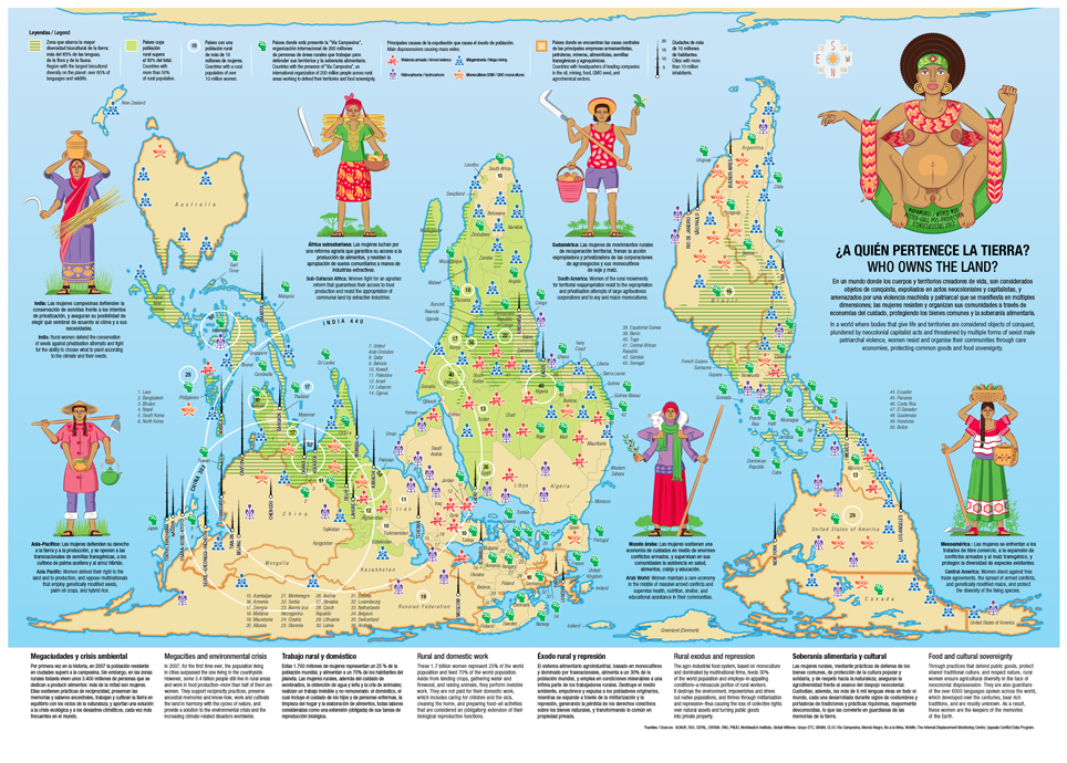
Iconoclasistas, ¿A quién pertenece la tierra? (Who owns the land?), 2017
I’ve reviewed books about cartography before. Like this one, these publications explore the work of artists, communities and activists who use maps as tools that give visibility and a sense of agency to disregarded issues. Who challenge dominant narratives, bring attention to neglected social problems, unearth hidden knowledge, reveal intricate connections, etc. In short, they reverse the top down approach to mapping.
This book is different from the others for several reasons.
First, it features the usual essays but also many transcripts of conversations between map makers. Guided by designer, researcher and educator Patricio Dávila, the exchanges reveal what makes these maps (or “diagrams”) invaluable: a sense of responsibility towards the people and territories visually represented, a close collaboration with these communities, the focus on a personal narrative rather than the claim of total (and totally unobtainable) objectivity, the need to distribute and make these maps accessibly to all, the importance of building multidisciplinary teams, the way maps can help even communities that need to remain invisible, etc.
And then there’s the cast! I already knew and admired the work of some of the artists, designers and activists involved: Burak Arikan, Joseph Beuys, Bureau d’Études, Teddy Cruz, W.E.B. DuBois, Forensic Architecture, Fonna Forman, Lize Mogel & Alexis Bhagat, Laura Poitras, Philippe Rekacewicz, Iconoclasistas and Visualizing Impact. I discovered others whose work and views were new to me: Josh Begley, Joshua Akers, Vincent Brown, Department of Unusual Certainties, Peter Hall, Alex Hill, Patricio Dávila, Catherine D’Ignazio, Fonna Forman, Terra Graziani, Lucas LaRochelle, Eliana MacDonald, Julie Mehretu, Ogimaa Mikana, Margaret Pearce, Sheila Sampath.
A quick walk through some of the works i discovered or rediscovered in the book should give you an idea of the breadth of perspectives and the diversity of voices Diagrams of Power presents:
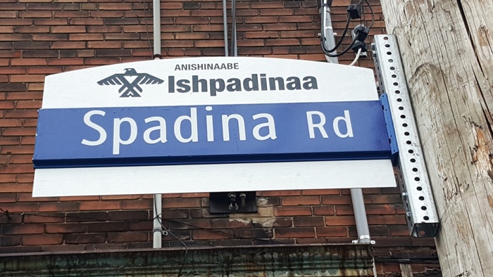
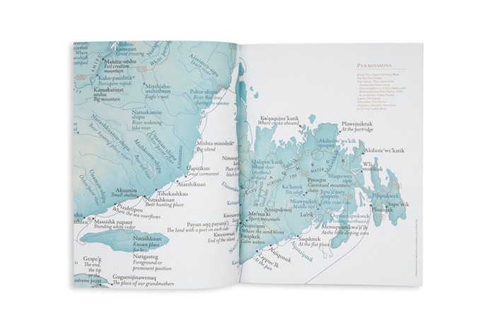
Ogimaa Mikana, an (unofficial) street sign in Toronto that displays its indigenous name. Credit: Tyana Grundig
Artist collective Ogimaa Mikana pushes back against the erosion of indigenous presence in Canada. One of their most famous actions consisted in installing billboards, street signs and plaques in Toronto to remind/inform passersby of what the First Nation peoples called these places long ago, giving them back a history and a visibility. They also mapped indigenous communities whose presence had so far been left out of mainstream cartography and thus navigation systems.
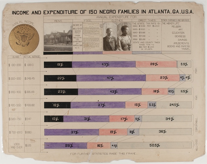
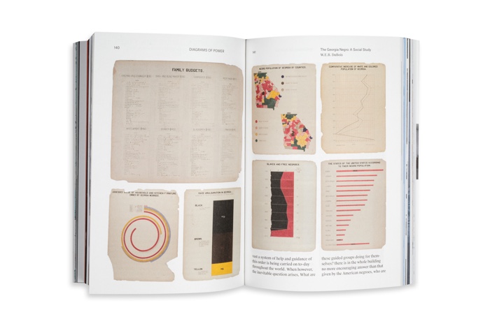
“Income and Expenditure of 150 Negro Families in Atlanta, GA, USA,” from W. E. B. Du Bois’s ‘The Georgia Negro: A Study’ (1900) (via Library of Congress)
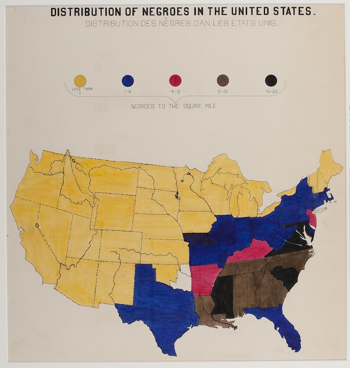
“Distribution of Negroes in the United States,” from W. E. B. Du Bois’s ‘The Georgia Negro: A Study’ (1900) (via Library of Congress)
W.E.B. Du Bois, the famous civil rights campaigner and writer, was also a talented infographics artist. In 1900, he led an all-black team who hand-drew stunning data visualizations for the exhibition, The Exhibit of American Negroes. The show, which took place both at the First Pan-African Conference in London and the Paris Exposition, also featured hundreds of photographs, patents and books by African Americans, a statuette of Frederick Douglass, etc.
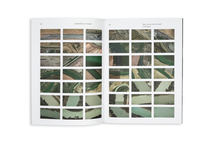
Josh Begley, Best of Luck with the Wall, 2017
Critical cartography doesn’t tend to fall for data and its myth of totality. Josh Begley, however, makes a powerful use of data with a short film that travels across the US-Mexico border. Stitching 200,000 satellite images together, Best of Luck with the Wall reveals the vast scale of the Earth as observed from the sky, the artifice of national borders and the dishonesty of a politics that feeds on oversimplification and fear of the other.
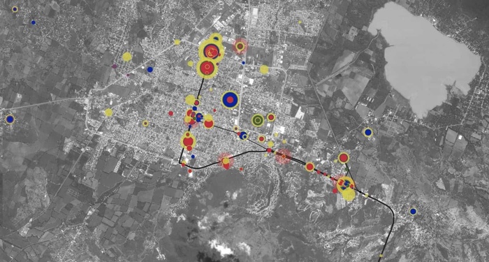
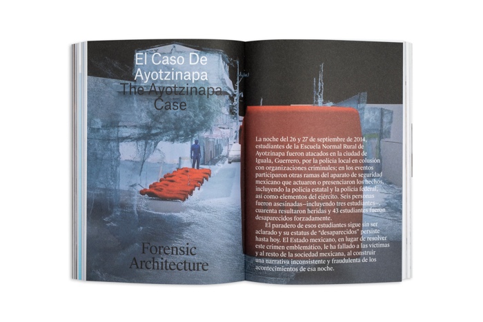
Forensic Architecture, Iguala (satellite image) from The enforced disappearance of the Ayotzinapa students
Forensic Architecture exposes a cartography of violence from street corner to an entire state. Their work meticulously documents the events that happened in a small city of Guerrero in Mexico where, on the night of the 26–27 September 2014, students from the Ayotzinapa Rural Teachers’ College were attacked by the local police, in collusion with criminal organisations and other branches of the Mexican security forces. Six people were dead, 40 wounded, 43 students were forcibly disappeared. We still don’t what became of them.
Collective civil society undertook independent investigation to help investigate crime and confront criminal impunity and failure of Mexican law enforcement. Forensic Architecture reconstructed the events and turned testimony, interviews, videos and phone records into data-points that can be explored on an interactive platform. The platform exposes the relationship between incidents and actors and gives members of the public a more nuanced and faithful narrative that contrasts with the inconsistencies and distortions presented by official reports.
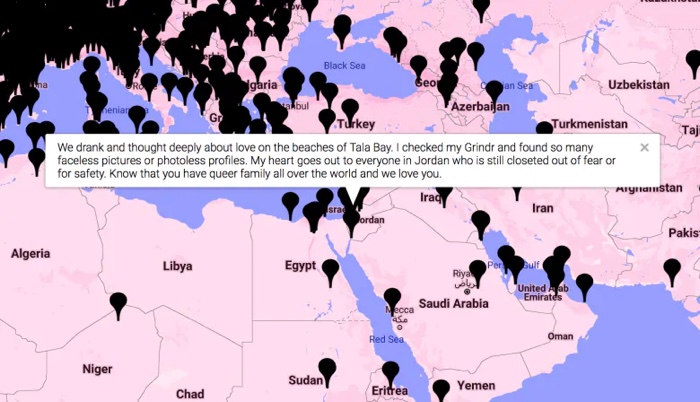
Lucas LaRochelle, Queering the Map, 2017
Queering the Map gives the queer community a platform to record and share experiences and memories in relation to places. The website spans all continents and many languages and operates from the perspective that queer existence is resistance.
In the early days of the platform, Trump supporters came out to troll and spam the growing archive with pop-ups reading: ‘Make America Great Again, Donald Trump Best President.’ A group of queer coders came to the rescue of Lucas LaRochelle, removed the malicious code added to the site and increased its security to protect it from future attacks.
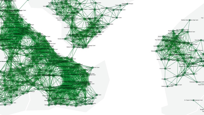
Burak Arikan, Islam, Republic, Neoliberalism, (Network of Mosques detail view), 2012
Burak Arikan mapped the 3 dominant ideologies of Turkey, Islam, Republic and Neoliberalism, and their respective areas of influence in Istanbul. Interestingly, the network of the 3000+ mosques in Istanbul is connected through overlapping call to prayer sounds which can reach ~300 meters in radius.
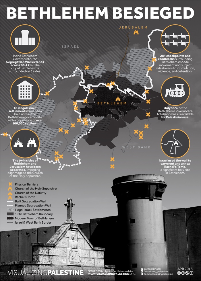
Visualizing Impact, Visualizing Palestine, Bethlehem Besieged
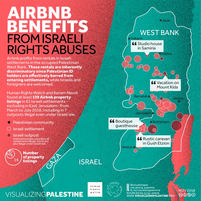
Visualizing Impact, Visualizing Palestine, AIRBNB benefits from Israeli rights abuses
Visualizing Impact‘s most famous project, Visualizing Palestine, is a growing body of data-driven tools that champion a factual, yet compelling narrative of the Israeli occupation of Palestine. Their visuals covering political and humanitarian issues such as land appropriation, restrictions to movements, hunger strikes, water appropriation, Israel’s discriminatory transport system, child prisoners, etc.
The best surprise of the book was the chapter in which Lize Mogel and Alexis Bhagat look back at An Atlas of Radical Cartography, a collection of 10 political maps and 10 essays about social issues they had edited in 2007. Although they reflect on how much things have changed since then (at the time digital cartography wasn’t as accessible as it is now), it remains one of my favourite books both for its design and its content.
I also need to mention the essay written by geographer and information designer Philippe Rekacewicz. I was particularly interested in his reflection on the power of invisibility and why we don’t have descriptive cartography that would lay bare the way authorities and structures of influence function.
More books on cartography: Ecologies of Power: Counter Mapping the Logistical Landscapes and Military Geographies of the U.S. Department of Defense, This Is Not an Atlas. A Global Collection of Counter-Cartographies, Drawing the Line: Maps that shaped the 20th century, Book review – Visual Complexity, Mapping Patterns of Information, etc.