
 Data Flow: v. 2: Visualizing Information in Graphic Design, edited by Robert Klanten, Nicolas Bourquin, Sven Ehmann and Thibaud Tissot (Available on Amazon USA and UK.)
Publisher Die Gestalten Verlag says: Data Flow 2 expands the definition of contemporary information graphics. The book features new possibilities for diagrams, maps, and charts. It investigates the visual and intuitive presentation of processes, data, and information. Concrete examples of research and art projects as well as commercial work illuminate how techniques such as simplification, abstraction, metaphor, and dramatization function.
The book also includes interviews with experts such as The New York Times’s Steve Duenes, Infosthetics’s Andrew Vande Moere, Visualcomplexity’s Manuel Lima, ART+COM’s Joachim Sauter, and passionate cartographer Menno-Jan Kraak as well as text features by Johannes Schardt about the challenges in creating effective information graphics and about the relationship between complexity, clarity, content, and innovation.
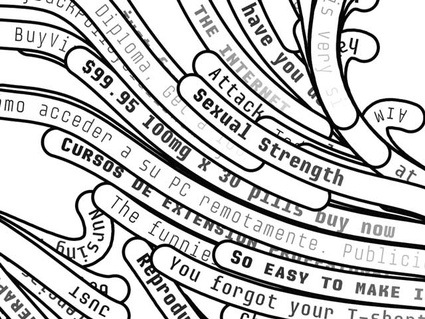
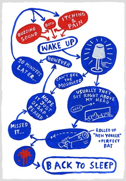 Christoph Niemann, I hate mosquitoes
If you still had any doubt that data were the sexiest thing this side of the Milky Way, Data Flow 2 might very well make you change your mind. The book was published only 18 months after its predecessor and i hope the publishers make an habit of it. It is jam-packed with innovative, smart and gripping examples of the way designers, programmers and artist are giving sense and beauty to the humongous mass of data that is overflowing our ‘digital age’. I guess i’m sounding over-enthusiastic here but truth is i am genuinely thrilled with this volume.
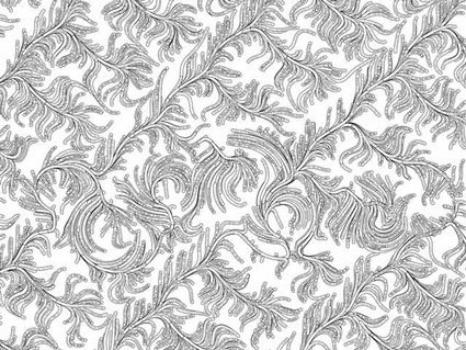
 Xavier Barrade, Models
Because information visualization is a flourishing, manifold discipline, the editors of the book have interviewed a series of experts who, each according to their own competence, shed light on a particular aspect of information visualization. Infosthetics‘s Andrew Vande Moere and Visualcomplexity‘s Manuel Lima aptly open the round of interviews. Bloggers are the ones who made the broad audience aware of the existence and wonders of data aesthetics after all. Steve Duenes, graphics director for The New York Times, talks about how the work at his department relies on a mix of journalistic research and pure design. Cartographer Menno-Jan Kraak explains why map matter so much that they can inform and influence important decisions. ART+COM‘s Joachim Sauter gives his view on the difference between operating information in a design context and using information for for art’s sake.
Here’s a fraction of the works i discovered in Data Flow 2:
In the chapter dedicated to Dataprocess…
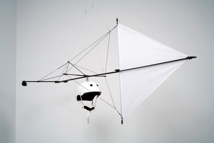
Tim Knowles, Windwalks, a series of walks directed by the ever-whimsical wind using an array of mechanisms, filmed and plotted by GPS.
 The Seed, by John Kelly, a two-minute animated voyage through nature’s life cycle, following the tribulations of an apple seed.
The Seed from Johnny Kelly on Vimeo.
In the Datablocks section
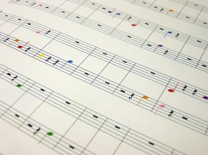
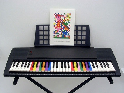
Aleatory Compositions is a book of sheet music written by people who had no idea they were composing. Hoagy Houghton asked people to fill a blank grid with 7 colours, shading the squares as they pleased. A colour scale translated their visual composition into musical notes.
In Datacurves
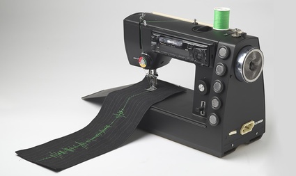
Visible Sound, by SOUNDS.BUTTER, is the prototype of a sewing machine that converts sound input into a sound wave of thread on textile.
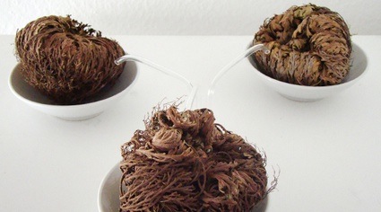
 Rose of Jericho, by Martin Kim Luge, is a series of data sculptures that team up a mySpace.com friend and with a rose of Jericho plant (also called Resurrection plant) in an attempt to convey a general feeling of the friend’s mood. This desert flower can survive very long times without water. When watered, the branches rapidly spread out. In Luge’s project, the water supply for the rose is controlled by the friend’s mood as described on mySpace. A computer program reads the mood adjective at the friend’s account in realtime. The adjective is compared against a database to map a numerical value to the emotion. This value defines the duration of the water pump controlled by a microcontroller, which is irrigating the rose of jericho. The higher the value the more water is arriving to the plant.
 Spamghetto, by [todo.to.it], is a spam-based wallpaper created using a generative software and based on up to 2000 different junk-mail subjects scraped from Gmail mailboxes.
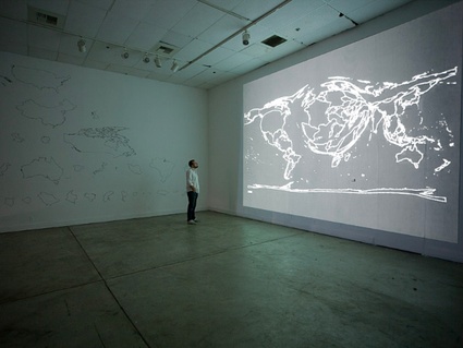
One of the works of Datamaps
Tim Schwartz‘s Geohistoriography exhibits the way the United States view the world. The data was collected from the New York Times, namely the number of articles written about a certain country for each year, starting in 1851. The result of his investigation shows how America’s perspective changed over the last 150 years. The last few decades, for example, have shifted the red button focus from the Iron Curtain to the Islamic states.
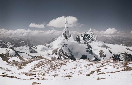
And finally some Dataesthetic
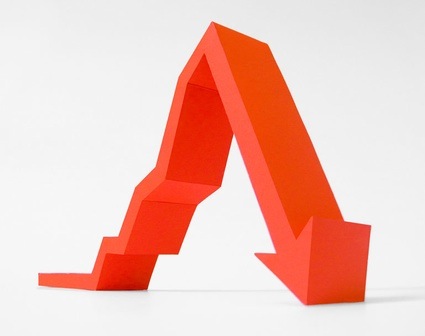
Michael Najjar‘s High Altitude is a series of virtual romantic landscapes in which cliff, slopes and rock formations represent the performance charts of indices of the world’s leading stock exchange over the past 20 – 30 years.
French, Spanish, and German editions of Data Flow 2 will be available End of March 2010.
Image on the homepage: Diana Cooper, Orange Alert, 2005.
Related: Visualizing: tracing an aesthetics of data, Data Visualization panel at OFFF, Lisbon, Conflux 2008: notes from the panel Cartography of Protest and Social Changes.
Book review: Tactile – High Touch Visuals.