Apart from Joshua Davis’ talk, the other main highlight of OFFF, the software and visual communication conference which took place last week in Lisbon, was the panel on Data Visualization curated and moderated by the European evangelist of the discipline: Jose-Luis de Vicente.
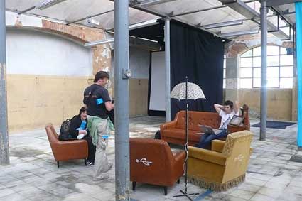 Lounge at the LX factory where OFFF took place this year
As the abstract of the panel reminds: data visualization is a transversal discipline which harnesses the immense power of visual communication to explain, in an understandable manner, the relationships of meaning, causes and dependency found among great abstract masses of information generated by scientific and social processes.
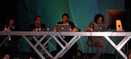 Aaron Koblin, Manuel Lima, JL de Vicente and Santiago Ortiz (image JL de Vicente)
Interaction designer, information architect and design researcher Manuel Lima discussed the story of the website Visual Complexity and the lessons he learnt since he launched it 3 years back. Visual Complexity is not a blog, it is a collection of (so far) over 570 projects of data viz, it is also a space for people to discuss about what is happening in this area.
The project started while Lima was following an MFA program at Parsons School of Design. While working on his thesis project Blogviz: Mapping the dynamics of information diffusion in Blogspace, he had to research extensively the visualization of complex networks, and found out that there was a need for an integrated and extensive resource on this subject.
Lima’s presentation was very very fast with a lot of information crammed in a small amount of time. But here’s a few elements from it:
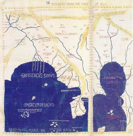 South-East Asia detail from Ptolemy’s geography. Redrawn in the 15th century
The transmission of information started with the wall paintings, got more sophisticated with the oldest registry of a written language (the Sumerian cuneiforms) and later with Ptolemy’s world map. More key landmarks for data viz can be found in Alfred W. Crosby‘s essay The Measure of Reality: Quantification and Western Society, 1250-1600.
One first important factor for the development of data viz is computer storage.
Our ability to generate data has by far outpaced our ability to make sense of that data. As someone at Razorfish said, everything that can be digitalized will be. When Lima started Visual Complexity, data viz blogs were just a handful. Today there are dozens of them. Kryder‘s Law draws from Moore’s law and declares that magnetic disk areal storage density doubles every 18 months. In 2001, iPod storage capacity was 5 GB, in 2007 it was 160 GB.
A second key factor for the development of data viz is Open Databases. Data has never been so widely available at minimal cost (not to say free).
See Swivel and IBM’s Many Eyes.
A third factor is online social networks.
Not as tools for mapping relationship between people but as instruments which help disclosing patterns within the abundance of shared content. Examples: uncovering music affinities like TuneGlue does; discovering how humans categorize information del.icio.us-like; human curiosity.
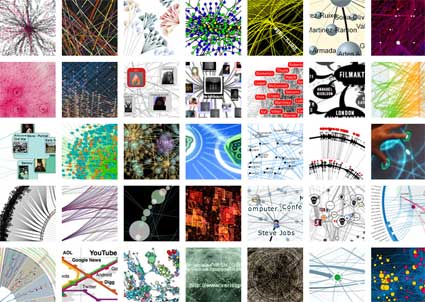
Over his three years observing dataviz, Lima spotted a number of trends: mapping blogosphere relationships, visualizing del.icio.us tags, terrorism, air routes, gps data, etc.
Next spoke Santiago Ortiz who started by presenting the spectacular website that Bestiario has put online a few days ago. The website gets a third dimension as you can “twist” and manipulate it in order to see its full length. The nicest feature is the navigation: you can browse Bestiario’s projects anti-chronologically of course but also according to the number of hours they spent working on the projects, by keywords, combination or exclusion of keywords, etc.
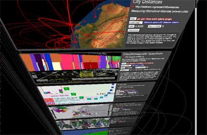 Bestiario’s brand new website
Founded 2 years ago, Bestiario is a small Barcelona/Lisbon-based company with a very impressive portfolio. Combining art and science (Ortiz is also a mathematician) they design interactive information spaces which follow their own moto: ‘making the complex comprehensible.’
It wasn’t the first time that i got to be impressed by Bestiario’s work and Ortiz’ thoughts on dataviz. One of Bestiario’s project was exhibited recently at LABoral as part of the Emergentes exhibition which closed a few days ago. The imaginary biological universe Mitozoos encodes and creates virtual organisms called “mitozoos” which interact among themselves. You can watch their life in a 3D environment that simulates birth, existence of a genetic code, the quest for food, energy dissipation, reproduction and death. Each variable and parameter of the model has a graphical representation.
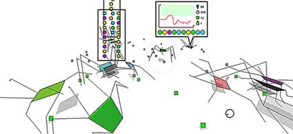 Mitozoos
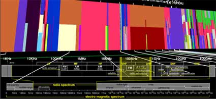
One of Bestiario’s latest projects was developed together with Irma Vila and JL de Vicente. The Atlas of Electromagnetic Space is an interactive representation of the services that use our electromagnetic radiospectrum, ranging from 10Khz “radio navigation” to 100Ghz “inter-satellite communication”. The activities which unfolds throughout the spectrum (e.g. mobile, satellite, wireless internet, broadcasting) are sorted by electromagnetic frequency. What totally won me over was the features showing the artistic interventions that are commenting on and/or taking place in the spectrum.
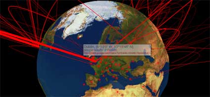
 City Distances illuminates the strength of relations between cities from searches on google. The main idea is to compare the number of pages on internet where the two cities appear one close to the other, with the number of pages they appear isolated. This proportion indicates some kind of intensity of relation between the cities. The “google proximity” is then divided by its geographical distance. The result indicates the strength of the relation in spite of the real distance, a kind of informational distance between cities.
Finally, Aaron Koblin took the stage to present his own work. Crap! this guy is so talented it’s scary. Aaron studied Design and Media Art with Casey Reas at UCLA and used processing a lot in his projects which not only represent huge amounts of data, but are also producing data to raise questions about a series of issues.
Narrative made sense for cultures based on tradition and a small amount of information circulating in a culture – it was a way to make sense of this information and to tie it together (for instance, Greek mythology). Database can be thought of as a new cultural form in a society where a subject deals with huge amounts of information, which constantly keep changing, said Lev Manovich whom Aaron quoted to further ask the audience:
If the database is the new narrative, then what is the role of visualization?
A first answer is that visualization help us understand what it means to have dozens of thousands of planes flying above North America every day. Video demonstrating how Flight Patterns does exactly that:
Data from the U.S. Federal aviation administration is used to create animations of flight traffic patterns and density.
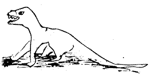
The Sheep Market is one of my favourite projects ever. The very Petit Prince work manages to be critical and poetical at the same time. Thousands of workers on Amazon’s Mechanical Turk webservice were paid two cents to “draw a sheep facing to the left.” Their sheep drawings were collected over a period of 40 days, selected and printed on stamps. You can also head to the project website and spend the evening counting the animals.
Video showing Aaron Koblin explaining The Sheep Market:
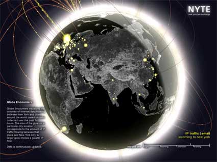
Aside from his purely artistic works, Aaron also works for Yahoo and collaborate on research project. For example, he developed the visualizations for the New York Talk Exchange, a project by the Senseable City Lab at MIT.
Based on a principle similar to The Sheep Market, Ten Thousand Cents has thousands of individuals working in isolation from one another painted a tiny part of of a $100 bill without knowledge of the overall task. Workers were paid one cent each via Amazon’s Mechanical Turk distributed labor tool. The total labor cost to create the bill, the artwork being created, and the reproductions available for purchase are all $100. The project, which has been developed in collaboration with Takashi Kawashima, explores the circumstances we live in, a new and uncharted combination of digital labor markets, “crowdsourcing,” “virtual economies,” and digital reproduction.
Video of Ten Thousand Cents:
The panel ended with JL de Vicente reminding the audience of the Visualizar workshops he periodically organized at Medialab Prado in Madrid. A new call for project proposals will be launched later this year.
Related: Coverage of Visualizar workshop.

