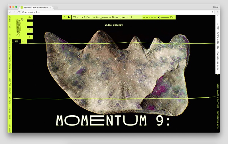
Tuomas Kortteinen and Heikki Lotvonen, webpage of MOMENTUM 9
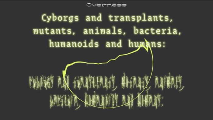
Tuomas Kortteinen and Heikki Lotvonen, visual identity for MOMENTUM 9
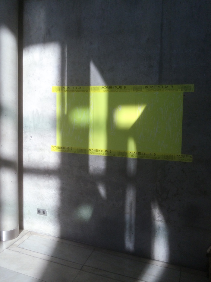
Tuomas Kortteinen and Heikki Lotvonen, visual identity for MOMENTUM 9. Image courtesy of the artists
I don’t often mention the website of biennial, festivals and exhibitions. They are usually designed to look edgy, efficient and user-friendly. They are also remarkably easy to forget. The website of the Momentum 9 biennial website is a bit different. First of all, it is an art destination in itself where you can listen to podcasts from Third Ear that explore the Alienation theme of the biennial (i listened to one about space travel) and read Ylva Westerlund‘s graphic novel The New Hird.
But the reason why i wanted to write about the website of MOMENTUM 9 the Nordic Biennial of Contemporary Art is that it doesn’t look like anything i have experienced before. First of all, it doesn’t seem to pride itself in being user-friendly. I remember cursing my way through the website when i first opened it. Where was the list of artists? And what’s with that barely decipherable typeface?! At the same time, the design of the website was so intriguing and appealing i really wanted to master it. It’s actually not difficult at all, just a bit disconcerting. Later, when i arrived in Moss for the press view of the biennial, i kept being drawn to the posters advertising the biennial in the city. They were fluoro green with enigmatic white doodles on it, the information texts had been printed on the duct tape used to hold the poster on walls. The more i saw of the visual identity of the biennial, the more i loved it and the more i wanted to talk to the designers responsible for it.
Their names are Tuomas Kortteinen and Heikki Lotvonen. They are listed, and rightly so, among the biennial participating artists. Their work for MOMENTUM 9 involved designing a cacographic -yet strangely elegant- typeface, playing with subtitles and filling your retina with blazing green. Here’s our little Q&A:
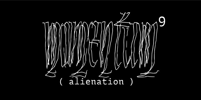
Tuomas Kortteinen and Heikki Lotvonen, logo for MOMENTUM 9
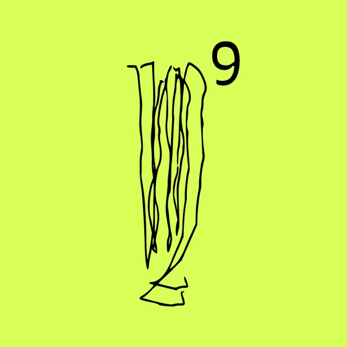
Tuomas Kortteinen and Heikki Lotvonen, logo for MOMENTUM 9
Hi Heikki and Tuomas! What was the influence for the visual look of the biennial? i’m guessing sci-fi and old movies with green aliens but would you mind explaining if you were inspired by specific movies, books, ideas, atmospheres, artworks?
Tuomas: I think the conscious influences we tried to take cues from were all more historical than sci-fi. The sci-fi thing is always there I guess though, as we both enjoy our bit of anime and/or cheeky sci-fi novel. But for this I think we consciously departed from the notion that an alienating distance can be found from the past as well as from the future. In this case, it was specifically the weird form the Latin alphabet took in Medieval times after the breakdown of the Roman empire, and especially the forms of a script called Merovingian cursive from the 6th and 7th centuries (the image is a scan from Nicolete Gray’s book Lettering as Drawing):
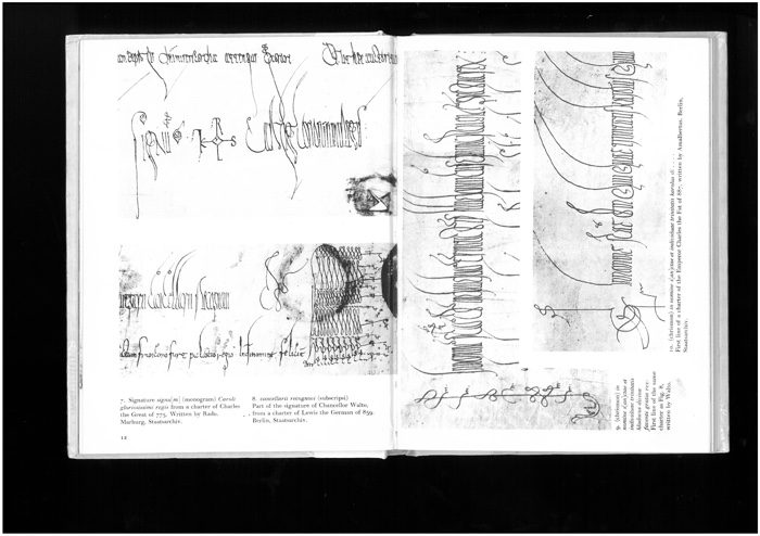
Further than that, in terms of the theme of “translation”, we were inspired by Jean-Luc Godard’s use of subtitles in his Film Socialisme. There the subtitles only translate a few keywords of the dialogue into English — thus forming a ‘Brechtian’ alienating effect — and force upon the English speaking viewer that, for them, rare condition of not completely understanding what is going (and not having thing always translated to your native language).
The green colour was a bit of an afterthought maybe? At least I don’t think we had a clear, rational reason for suggesting it. In the end the high-vis fluoro works quite well (when it is actually fluorescent), and I think the pairing of the colour and the weird type makes it feel way less historical — which is good and what were after I guess.

Tuomas Kortteinen and Heikki Lotvonen, visual identity for MOMENTUM 9. Photo: Istvan Virag © PunktØ/Momentum 9
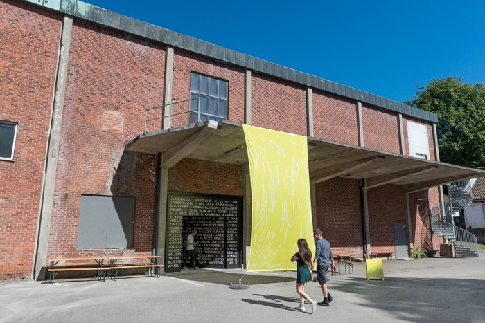
Tuomas Kortteinen and Heikki Lotvonen, visual identity for MOMENTUM 9. Photo: Istvan Virag © PunktØ/Momentum 9
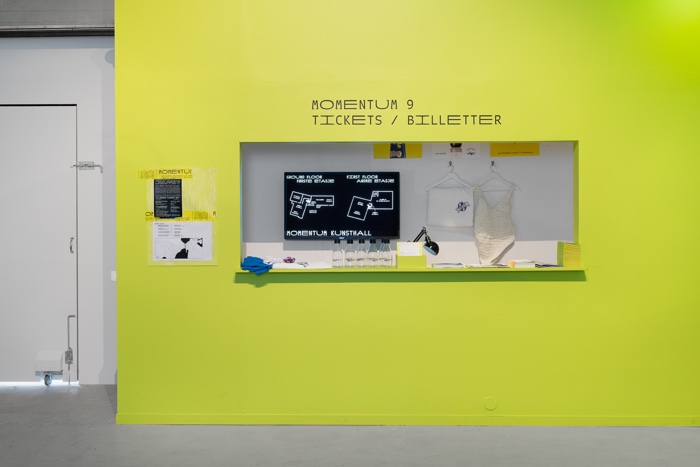
Tuomas Kortteinen and Heikki Lotvonen, visual identity for MOMENTUM 9. Photo: Istvan Virag © PunktØ/Momentum 9
You are both listed among the participating artists. That’s quite unusual for an art event to do so. Was it an idea that the curators had right from the start? And did it influence the way you approached the commission?
Tuomas: Yes, it was something they approached us with straight from the beginning, but it is something Heikki and I have done before. We’re both part of this Finnish design collective GRMMXI, where, in 2015 and 2016, we designed the visual identity and all other relevant material for Baltic Circle, a festival of theatre and performance art in Helsinki. Like the Baltic Circle people, the curators of Momentum asked for an identity that would 1) fulfill the necessary communicative requirements of a visual identity, and 2) have something (expressive, conceptual, alienating) to say of its own. This naturally affected the way we approached the project — we didn’t really need to hold back — but then the things the identity ended up “saying” as a whole had, in the end, travelled quite a distance from the original ideas that we begun from. And that’s not a bad thing — I think we both hate the kind of graphic design that first lists out its conceptual premises and then goes on simply to fulfill them. That way can easily get quite cold, austere and humourless.
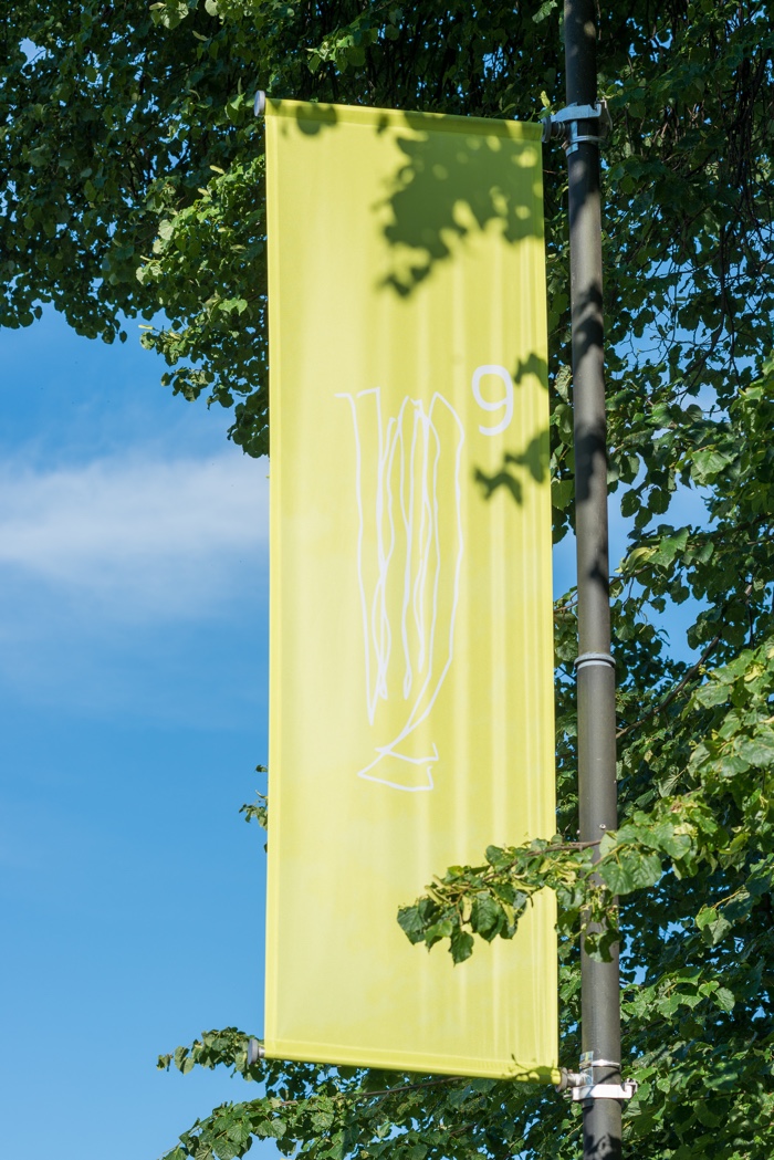
Tuomas Kortteinen and Heikki Lotvonen, visual identity for MOMENTUM 9. Photo: Istvan Virag © PunktØ/Momentum 9
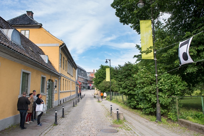
Tuomas Kortteinen and Heikki Lotvonen, visual identity for MOMENTUM 9. Photo: Istvan Virag © PunktØ/Momentum 9
Was the visual identity of the biennial the result of a conversation with the curators? Or were you given free wheel?
Heikki: Both actually. While we were given completely free wheel on everything, we worked closely together with Ilari Laamanen, one of the curators. During the design process, we would skype almost every Saturday, bouncing ideas back and forth about the concept and execution of the designs and he would encourage us to experiment with even crazier ideas than what we sometimes proposed. This combination provided to be very fruitful. It was a fresh break from typical service provision or client-centric problem solving that graphic designers usually face into a more collaborative but still very autonomous work that felt meaningful.
Now i’m going to confess that i found the website a bit disconcerting at first. I wasn’t sure where to click (yet, once i started clicking everything felt into place), the logo on the left upper corner was very unusual and there was this puzzling typography. Were you hoping that the website visitor would feel a sense of alienation when the page opened? Could you explain the choice of typography, symbols, etc?
Heikki: Yes, definitely! The website (and the whole identity) tries to challenge the often narrow confines of established (web) design practices, and the contemporary human conditions in digital environments by disrupting the experience users are expecting and accustomed to. This is something that goes hand in hand with the theme of alienation, and because the site is partly made as an “art piece” we didn’t want to present it in the form of slick, start-up style web design or follow the template of other exhibition sites. We wanted to make the user stop, get maybe a bit perplexed or annoyed, but curious, and to explore the many materials on the site, while still getting the necessary information.
Tuomas: About the typefaces:
The weird, almost unreadable, uncial-inspired typeface was based on old Merovingian models. In addition to the peculiar looks and to the stuff stated earlier, we found it interesting because, while it still is a model of the Latin alphabet, it really did not fit into existing categories of lettering or type (such as humanist sans serif, slab serif, transitional serif, etc.). As such, it can be said to exist within a queer space — a space that challenges the legitimacy and semblance of natural order conveyed by taxonomic systems (I’m super grateful to Sheena Calvert, my RCA tutor, for informing of the notion of ‘queer type’).
The other typefaces are attempts to place something else in that space, although while making them a bit more readable. So the basic typeface is a slightly inverted contrast, semi-serif, calligraphic monospaced, with a duospaced alternative. This means that in the basic form of the typeface, each letter, number and punctuation mark is of equal width, but then that in the duospaced version there is a corresponding symbol for everything, only twice as wide. (One could here state that the fact that the typeface can actually be described this way, with taxonomic descriptors, makes it actually way less queer than it could be if it went completely beyond, but then again, I cannot think of another existing typeface that would combine all these features, and in the end one can only do so much.)
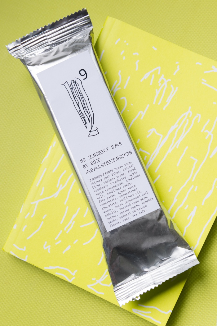
Tuomas Kortteinen and Heikki Lotvonen, visual identity for MOMENTUM 9. Photo: Istvan Virag © PunktØ/Momentum 9
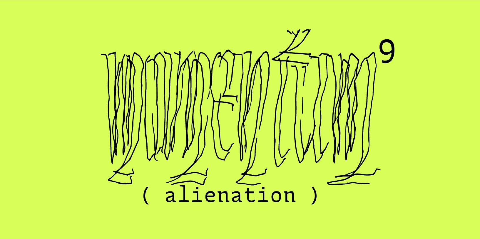
Tuomas Kortteinen and Heikki Lotvonen, logo for MOMENTUM 9
How did you translate that visual identity into physical objects (I particularly loved the posters and the video) and communicate this sense of alienation into the ‘physical world’?
Tuomas: We wanted to stay away from compositions as much as we could. Often, graphic design is so much about picking a nice, unobtrusive typeface and then making strong compositions, where positive and negative space counteract to create something larger than the sum of their parts. And I think we didn’t want to do that here. So instead of compositions, we thought of the physical applications of the identity in terms of their texture. So some stuff is full of type, while something else might just have the logo or a bunch of lines. But almost everything is either quite empty or then full of stuff — there’s no golden ratios or grid systems at play really. For us, texture is a much more malleable, vague and ambiguous term than anything along the point, line, plane -axis, and it was something really interesting and rewarding to explore.
Furthermore, the Momentum typefaces themselves were a fruitful starting point for this exploration. Usually what type designers and typographers aspire towards is an even typographic texture — that when you squint your eyes, a block of text transforms into a uniform block of grey, without any lighter or darker bits and pieces. This means is supposed to mean that a page is easy to read and easy on the eyes — that nothing pops out in an obtrusive way. For Momentum, we wanted to see what happens when you have a typeface that does produce an even colour, but where the lettershapes themselves are barely legible (the Uncial), and another typeface, where the individual characters are easily readable, but the overall texture of a page is super jumpy and uneven because of differences in letter widths.
Tuomas Kortteinen and Heikki Lotvonen, webpage of MOMENTUM 9
Trailer for MOMENTUM 9: BerlinARTlink Productions. Monica Salazar and Peter Cairns. Overness animation by Heikki Lotvonen and Tuomas Kortteinen. Music by Victoria Trunova
Finally, Momentum is “The Nordic Biennial of Contemporary Art”. Do you think that your work (this one in particular but also other projects you’ve made) have some particularly Nordic characteristics?
Tuomas: I don’t know really. I never thought of my own identity as specifically Nordic or even Finnish, but then I moved to London, where both have suddenly become easy ways to explain things. I do think many UK graphic designers have an aversion to formal expression — they want to make things nice and tidy so that the content is ‘framed’ in appropriately conceptual, but still very inconspicuous ways. And I don’t think an aversion like that exists within Finnish graphic design, at least not one quite so prevalent anyway.
While we worked on the project primarily in Finnish with Heikki and Ilari, none of us were actually in the same place (I was in London, Heikki in Amsterdam, Ilari in New York), and everything happened through skype and gmail. So we were submerged in quite different physical environments, which then leads to the question of how much of Nordic design project this was. Usually the way old school Finnish designers talk about their inspirations is not in terms of language or community, but specifically in terms of the natural landscape: the forest, the archipelago, the northern tundra. If you take that away, what is left of the ‘Finnishness’? For us, I guess one could say it was a question of straddling borders, of having one foot out and the other one in.
Thanks Tuomas and Heikki!
Momentum 9, The Nordic Biennial of Contemporary Art curated by Ulrika Flink, Ilari Laamanen, Jacob Lillemose, Gunhild Moe and Jón B.K Ransu remains open in various location in Moss, Norway, until 11 October 2017.
Previously: MOMENTUM9 – “Alienation is our contemporary condition”, MOMENTUM9. Maybe none of this is science fiction and The Museum of NonHumanity.
