 I have never met Rory Hamilton (so far) but i’ve blogged the works of several of his students. Some of them told me i should have a look at his website which in turn lead me to asking him if he had time to answer my questions. Rory Hamilton is a design consultant, and educator in Interaction Design at the Royal College of Art till 2005, and before that at the Bartlett School of Architecture. He’s now a visiting lecturer in Innovative Product Design at Duncan of Jordanstone College of Art and Design, Dundee.
Together with Dr Jon Rogers (Dundee University), he’s doing a research about “Art, Design and Visual Perception” working on projects with the University of Sussex and University of Manchester. He even finds some time to work in fine art collaboration with Suky Best and recently showed at the Tate Britain, in London.
How did someone with a background in fine arts land in the merry world of interaction design?
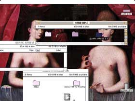
I went from a Sculpture BA to an MA in Multimedia mainly because that was the only field where computers were being use in the early 90s. It was then, at Central St Martin’s that I came to love design. Working with Maxine Gregson, I created a work called Cognitive Overhead. It dealt with the possibilities of the screen-based interface and playing with the familiar metaphors we all accept as the only way things can be. I was also teaching computing at the Bartlett School of Architecture. These two influences were a great introduction to the world of Interaction Design. Then of course going to teach at the RCA with Gillian Crampton-Smith was an education in itself. At that time the emphasis was mainly on screen based work, new metaphors, new software and some physical interaction. I find now that not many students are interested in the screen or just in a superficial way; personally I find the idea of designing software, (I mean the function as well as the look and feel) how it can link with the web and physical objects really exciting. But these things are cyclical and so it’ll change again. I think web 2.0 is helping that. But designers have to stop thinking that the onscreen world of Windows and OSX is fixed and kick it about a bit.
 Does your art practice influence your teaching to future interaction designers?
Not really, if anything it’s the other way around; techniques and processes I use in teaching tend to come into my artwork. I find design more exciting and fluid as a pursuit. Most of my recent artwork is bloody hard work (the cowboy animations have around 8000 drawings). Art wise I’d like to be the most successful Sunday artist in the world. It¹s like therapy to me and it’s a bonus when others like it. Art can be solitary but design has to engage with people and technology and that’s what I really love.
How many years of experience are there behind the everything i know website?
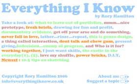
Eight years of Interaction teaching with five years at the Bartlett and the fine art before. I’ve grown up with the technology and seen Interaction go through many phases. I’ve also changed my own focus, design teaching remains a passion but I’ve started doing corporate consultancy and this feels like an area where I have a lot to give. I like to think of my experience as not just mine but also the collective experience of hundreds of student projects I have worked on, the technical issues we¹ve had to overcome, the search for inspiration, the need to communicate sometimes quite difficult projects to the public. When I stopped full-time teaching I felt like my head was going to explode. It was so full of facts, stories, techniques, so to get them all out I created everything i know.
 How much does the feedback from readers of everything i know incites you to modify the content of the website?
I do get a lot of mail from people (students, designers, tutors) thanking me for putting this stuff up there, it’s the kind of information that can’t really exist in academic institutions- it’s too informal and anecdotal. I’d like to do it as a book at some point but for the moment the site seems to have something for everyone. I sometimes get requests for topics and I try to cover them, I’d actually really like to get more of that. I’d also like to show some past projects form former students but I wanted everything i know to be more neutral to begin with. I don’t want people to be distracted by projects and lots of images but to read and digest the stories and methods I have to share.
My favourite emails of course come from my old students, and they all say one thing; “When I read it I can hear you talking as though you were right there”, which is great because it’s that informal, friendly, slightly ranting feel I was going for.
 The never fall in love with your user chapter in particular strikes a chord with me. Do you have real example(s) to illustrate that idea? I have the feeling that the “never fall in love” concept must be hard to combine with that other piece of advice you give in the Gonzo design chapter that invites interaction designers to become part of their subject group.
What I’ve seen happen is students (and professional designers) getting too influenced by their user group. From taking everything they say as gospel; like: “It should be green and purple” to feeling that they can’t possibly design anything for this group because the users are so perfect (especially with very niche users, hobbyists etc). But everyone has to remember that THEY are the designers and their opinions matter too.
A student last year (Sohui Won) did a great study of Goths, but after doing that she was really stuck because she had come to like them and respect their lifestyle so much that she was overwhelmed. Me and my teaching partner, Sarah Pennington asked her to pick out her favourite anecdote and work from that. It was about a guy with wrist tattoos who bought ladies jackets because the shorter sleeves showed off his tattoos better. Sohui then went on to design clothing that had automated “revealing” functions. We also encouraged her to take the design idea away from the Goth group and into a wider user group. This approach worked well, showing that a little help to step back and see detail rather than the overwhelming mass of information could work wonders.
Still, I do encourage people to get involved with their users and even slightly too involved can be useful. But you always need to be able to take that step back. This can be done with help from others or by getting someone outside of the project to look at your findings. You’ll start to see it from a different perspective and begin to generate ideas, inspired by, not prescribed by your user group.

 Can you give us one or several example of products or design studio that best embody the everything i know approach?
Products is hard, I love the iPod shuffle for its integration with a mental model created by the earlier iPods (see my page about it). It’s that building on success but not being afraid to do something that others might consider a step back that’s so great. Another “product” I¹ve loved recently isn¹t a product at all but a TV programme. BBC’s Making Slough Happy was a social experiment in trying to make the people of Slough happier, using many different methods, physical, spiritual, psychological. I thought it was really inspiring and backed up an idea of Sarah Pennington and I that design should get more optimistic and a bit less critical. Using people’s welfare and wellbeing as you inspiration can really help with this.
I think for openness of approach and a genuine interest in people, process and innovation I’d have to mention the service design company Livework. They
continue to develop new research and inspiration techniques and aren’t scared to tell others about them. That’s the same with IDEO, the best thing they ever did was to be open, to show others their process, their research projects and business methods. All the other companies jealous of IDEO¹s reputation should keep that in mind.


Some student work I’ve really enjoyed so far this year is by Ed Lewis from Innovative Product Design in Dundee. He’s dealt with micro-generation of electricity in the home and made wind turbines from recycled materials. But he’s done it all with a great sense of humour and dedication. There seems to be a real commitment to sustainability and the environment with current students which is really impressive. I can remember when it was not “cool” to deal with those issues. Jon Coombes at Central St Martin’s is another example, his subtle changes to existing products, and services attached to those products, really show possibilities for the future of manufacturing and consumption. And on the inspiration gathering side- I think Murray Sim from Dundee has done a fantastic job which should serve as an example of applying almost every method from “everything i know” in one year. Check out his site and get inspired.
 You’ve given workshops and talks at businesses round the UK, in India, and Korea. Are businesses receptive to bold creative ideas? If no, do you think it might change?
I think it is changing. I recently worked with Microsoft in Cambridge and was really impressed by their openness to new design approaches and possibilities. I think the kind of techniques I talk about in everything i know can be applied to many situations and it only takes minimal risk to implement. I don’t expect companies to change into colleges, but sometimes their staff could do with a break and a different kind of design challenge. I don’t think companies really appreciate how difficult inspiration is to find on your own or how easily a few small challenges can stir up creative juices.
It’s funny going to talk in other countries or in other fields. I often show lots of old work by myself and my students and the audience loves it. Then at the end the questions always go: “But how is this relevant to the real world and our work?” I always ask “Did you like it?” They say, “Yes,” and I then say, “Well what’s the problem?” What I have to explain is that the kind of proposals that you see coming out of places like the Innovative Product Design course in Dundee, RCA Interaction Design, Central St Martin’s, and Ivrea aren’t always meant to go straight into the real world. College is a time to experiment and invariably those people who did experiment at college and took risks end up being great employees- the really creative people that companies need to drive them on.
I read that you’re “a keen fan of western movies,” yet in your Wild West work you seem to denounce the cliché and repetition within the genre. So what’s in western that you find so fascinating?
Clichés don’t have to be bad, they make up a common language of our media experience. I’d say that we (Suky Best and I) are pointing out just how nice it is to see the familiar scene: “Stranger in Town” or “Village Gunfight”.
The next film we are making is the “Rodeo” and is a great big cliché but works for us as a powerful metaphor for masculinity, sexuality, man and nature, America’s place in the world and global culture. Clichés can be really useful, in the right place.

 Any film or actor you’d recommend to someone who’s not a fan of western?
Clint Eastwood in Outlaw Josey Wales, will give you action, drama, humour, weird romance (on screen and off) and a nice seventies feel to it.
Anything with Clint Eastwood is worth watching.
Thanks Rory!
Don’t miss Rory Hamilton students’ degree shows:
Dundee 19th-27th May (but they are coming to show at New Designers too 6 July – 9 July)
Central St Martin’s (Southampton Row) 23rd June – 1st July
RCA (part2) 23rd June – 2nd July


