Photo: The British Library
The British Library in London is currently running one of its typically satisfying exhibitions where you learn a lot, discover exquisite artifacts and exit questioning what you thought you knew about the world around you.
Maps and the 20th Century: Drawing the Line covers 100 years of maps, reminding us of all the traumas, cultural revolutions, social mutations and technological advances the world has gone through over the course of the 20th century. It’s been a fierce time and mapping technology has echoed and sometimes even shaped every moment of it.
The exhibition covers war cartography, travel itineraries and propaganda documents but it also explores popular culture. One moment you delve into intricate maps of imaginary places. Next, you are reminded of the intrusive power of everyday technologies that track your every move into a city.
Drawing the Line is an ambitious, illuminating and engaging exhibition. I could write a lengthy report of the show that would be so extensive and time-consuming, it might never even get published. Or i could play it safe and just list down some of the most impressive maps i saw while i was visiting the show. And then i’d list them in no particular (and certainly not chronological) order:
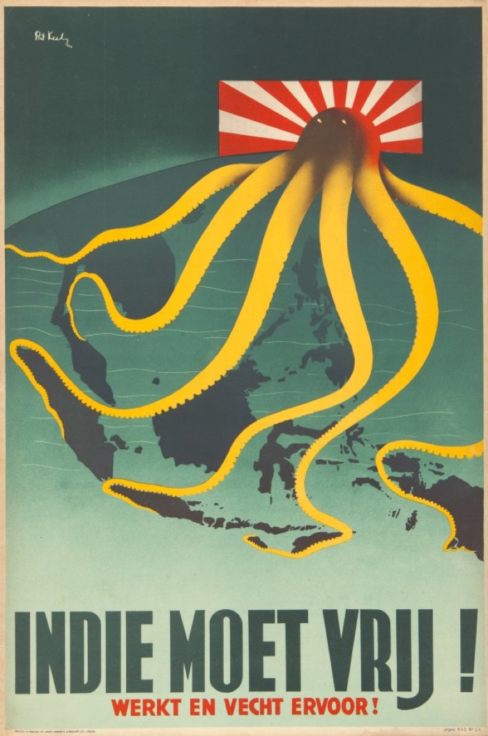
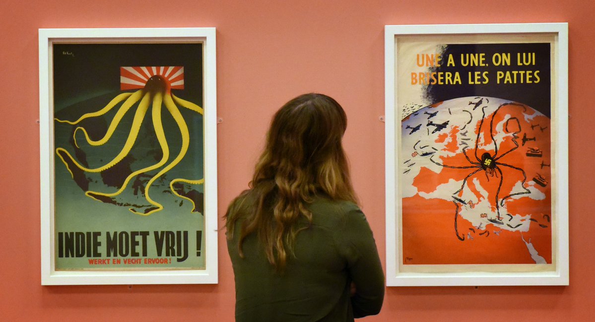
Patrick Cokaine Keely, Indie moet vrij, London, 1914
In this 1944 propaganda poster, a Japanese octopus extends its tentacles over Dutch colonies in Southeast Asia, occupied by the Japanese since 1942.
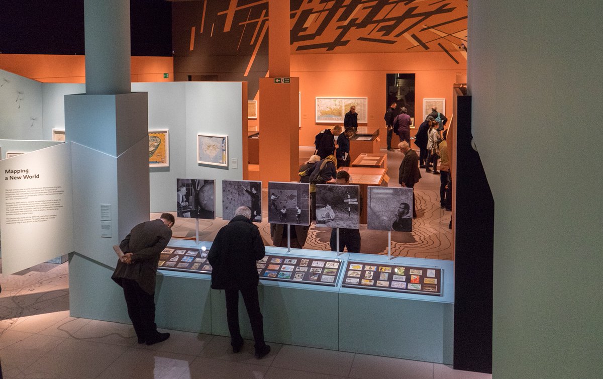
Photo: The British Library
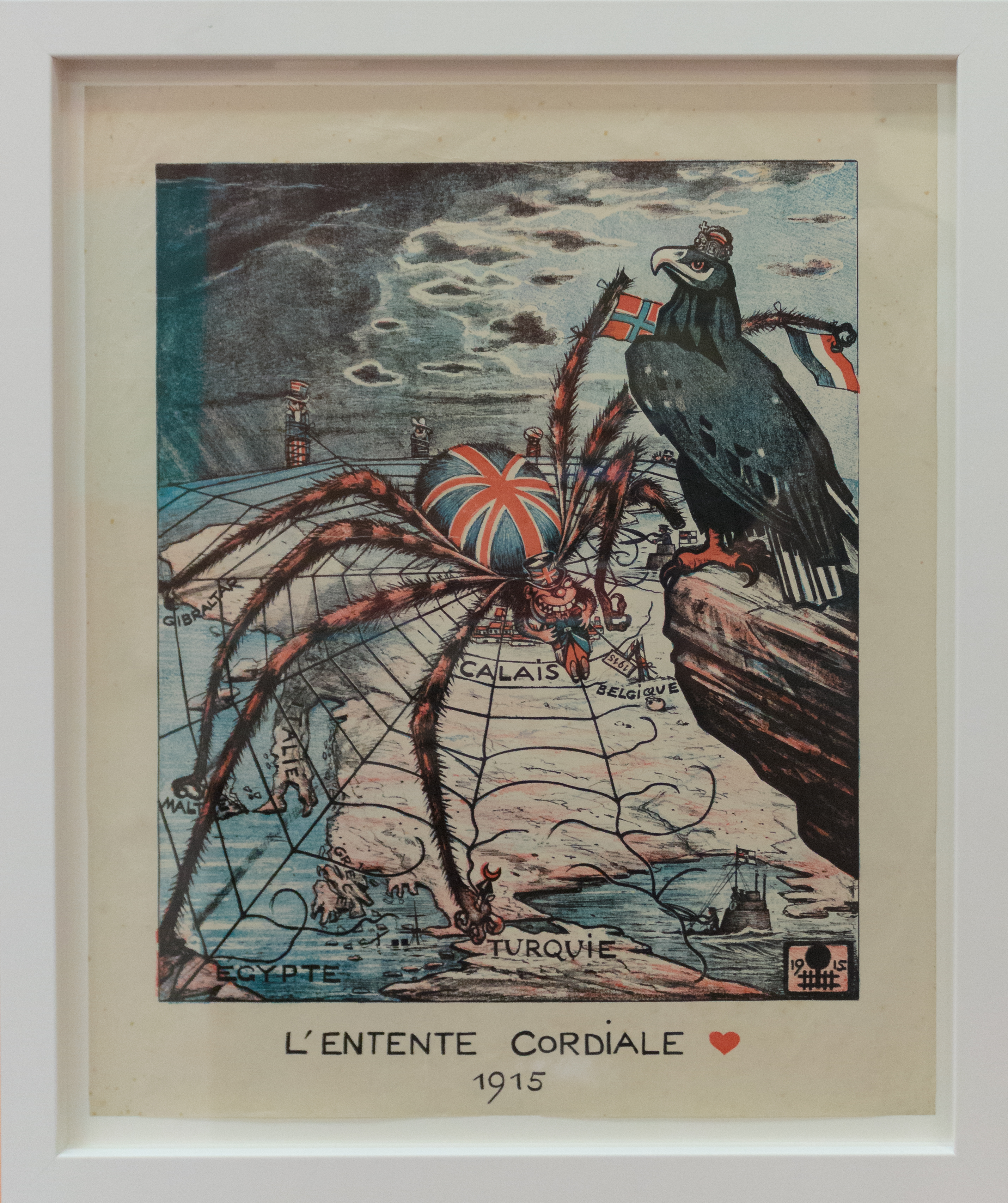
L’Entente Cordiale, 1915. Copyright British Library. Photo by Jon Ellis
German propaganda poster depicting Britain as a spider, German eagle sitting overhead, Uncle Sam and two others tied up in the web. The Entente Cordiale was a diplomatic agreement signed in 1904 by France and Great Britain which adjusted the colonial disputes between the two countries.
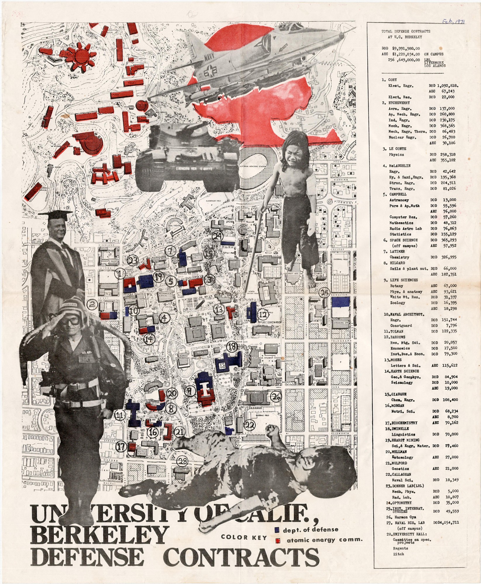
University of Calif. Berkeley Defense Contracts, Berkeley, CA, c. 1971. Photo: Boston rare maps
A protest map of the Berkeley campus, overprinted in color to indicate offices believed to being paid for their research by the Department of Defense (blue) and the Atomic Energy Commission (red). The chart on the right identifies the programs and lists the dollar value of their contracts.
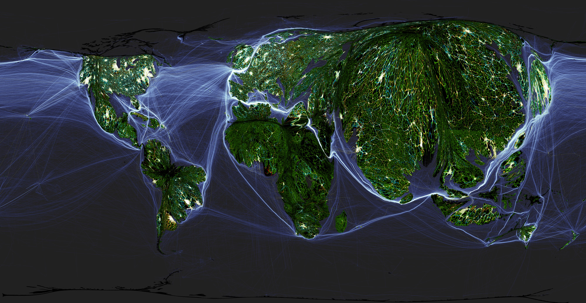
Benjamin Hennig, Anthropocene Worlds, 2016
Geographer Benjamin Hennig’s world map is a cartogram, a map of a territory which is distorted to reflect complex data related to a specific economic, social, political, or environmental factor. The map blends area information with population figures to create a world map in which the densest and most populous areas are bigger. Most prominent are the vast populated regions of China, Japan, and India, and the white-coloured metropolitan areas of Beijing, Chicago, Paris, Mexico and Moscow. According to Hennig the world is now critically influenced by humanity, and so humanity has become the appropriate scale to measure it.
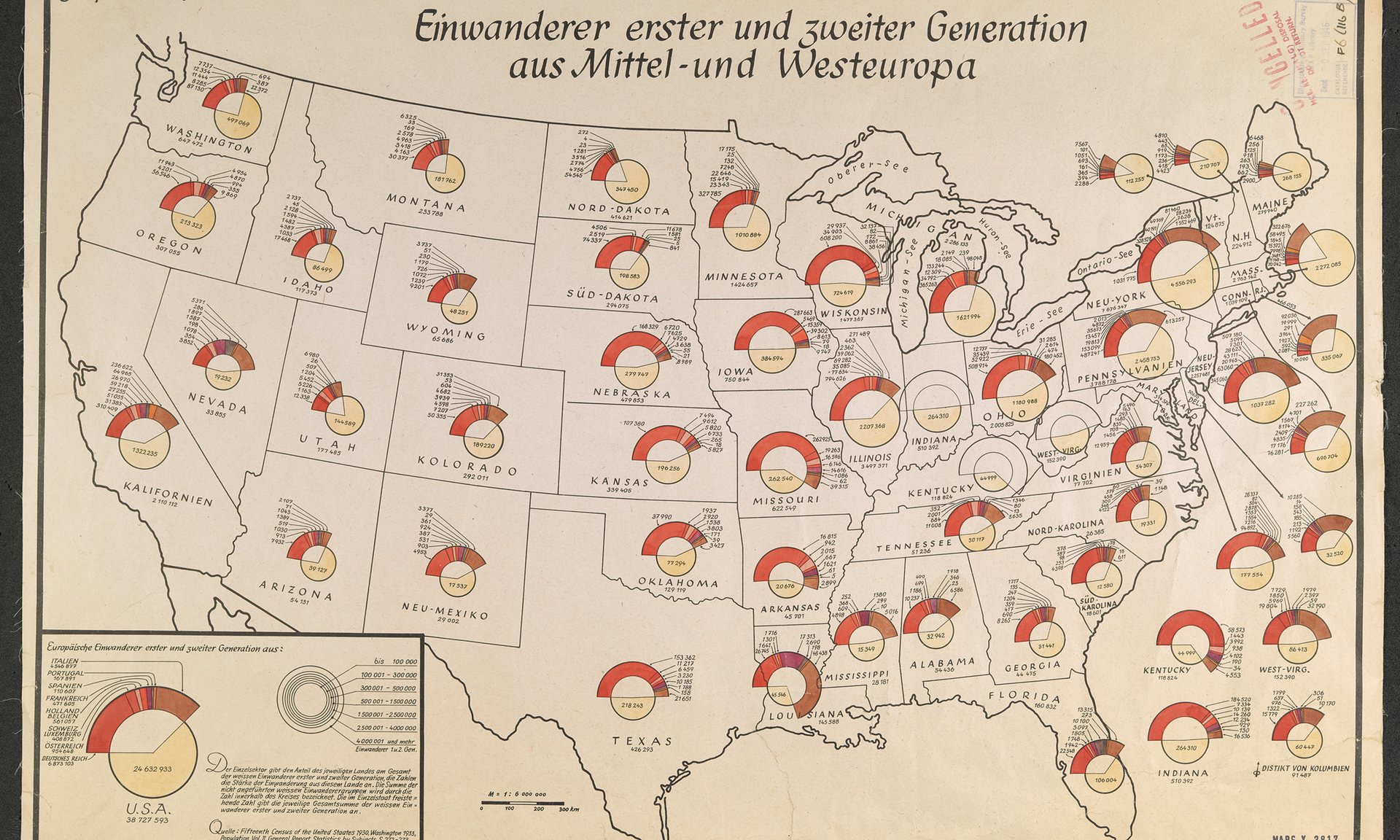
1940 Nazi map plotting locations of European immigrants living in the US. Photograph: British Library, via The Guardian
This WWII map, produced by the Nazis, showed the distribution, by state, of first and second generation immigrants to America. The information would have helped Joseph Goebbels’ propaganda ministry to direct adverts urging the US to stay out of the war.
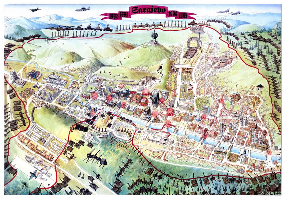
Sauda Kapić, Sarajevo Escape map, 1996. Copyright Miran Norderland
The ‘survival’ map of Sarajevo was produced in the city while it was under siege by the Bosnian Serb army between 1992 and 1996. Compiled from photos, documents and other maps, it shows the ring of steel surrounding the city but also the details of survival inside the city, including secret tunnels, corridors to avoid sniper fire and parks turned into vegetable gardens
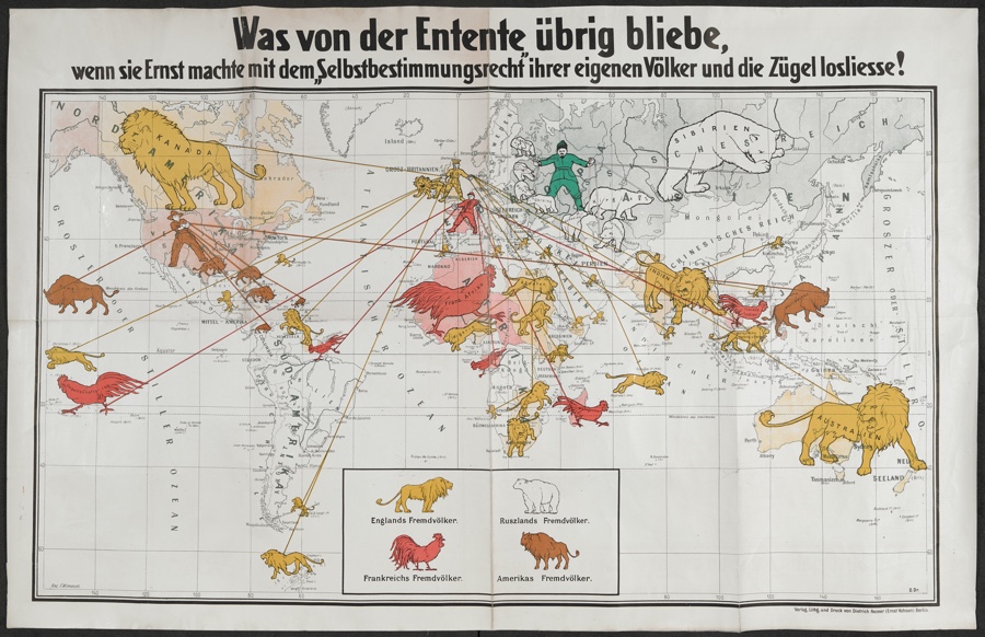
F. Klimesch, Was von der Entente übrig bliebe, wenn sie Ernst machte mit dem Selbstbestimmungsrecht ihrer eigenen Völker und die Zügel losließe! (What would be left of the Entente if they were serious about their own people’s ‘right of self-determination’ and let go of the reins!), c. 1919 , Berlin
A propaganda poster published in Germany in 1919. Among the terms imposed on the defeated Germany at Versailles in 1919 was the loss of its oversea territories on the claim that these regions had the right to statehood for themselves. The map shows the four victorious powers of Britain, France, Russia and the United States of America hold onto the reins of their respective national beasts (the British lion, the French cockerel, Russian polar bear and American bison or buffalo) positioned over their imperial holdings.
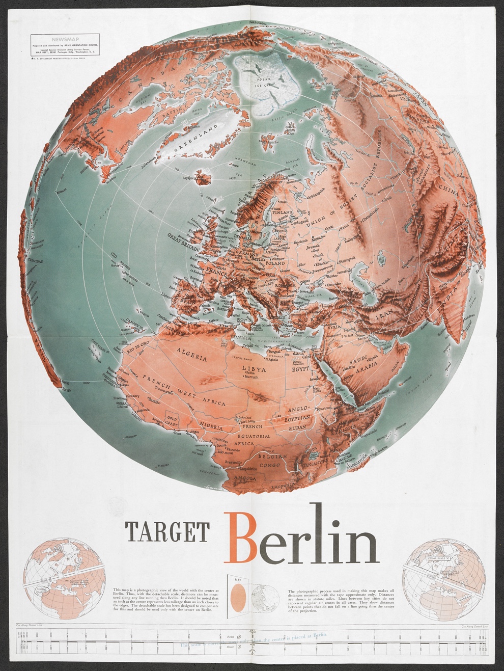
Target Berlin, 1943. Copyright British Library.
American World War II propaganda poster ‘targeting’ Berlin, then the capital of the Third Reich.
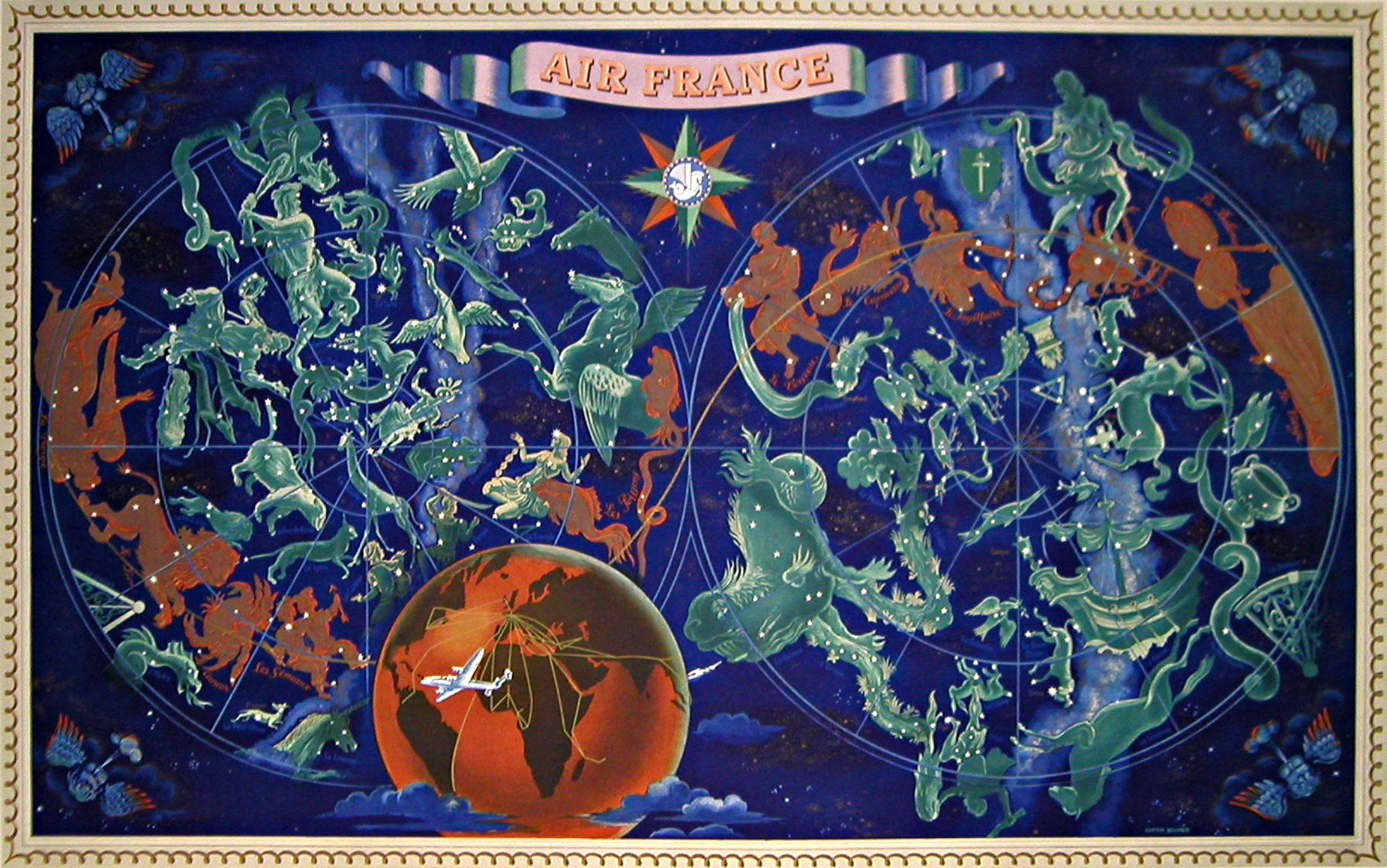
Lucien Boucher, Air France, 1950
Both before and after World War II, Air France issued a series of posters advertising their air routes. Designed by Lucien Boucher, the planisphere above portrayed the heavens under which the airline flew.
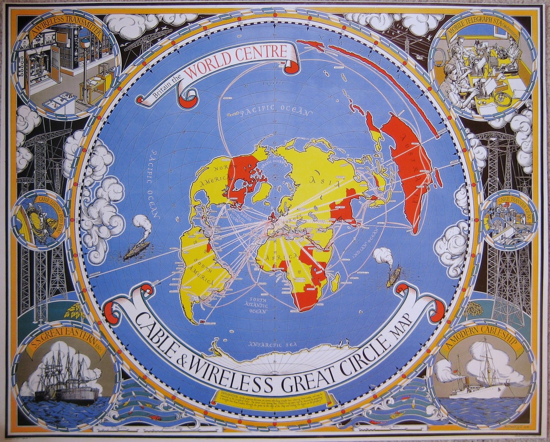
MacDonald Gill, Britain the World Centre. Cable & Wireless great circle map, London, 1945
MacDonald Gill map shows the network of undersea and wireless cables which connected Britain to its empire and to the rest of the world.
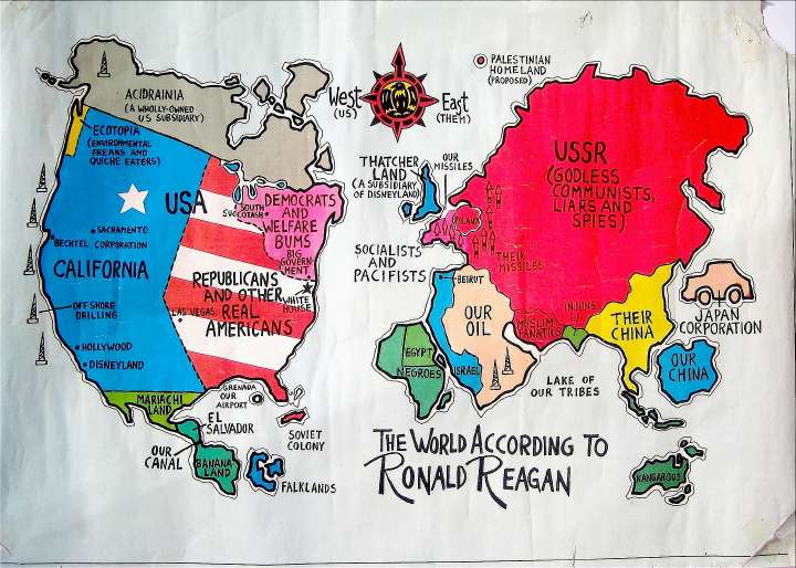
World Peace Council, The world according to Ronald Reagan, Helsinki, 1984. Image: zombietime
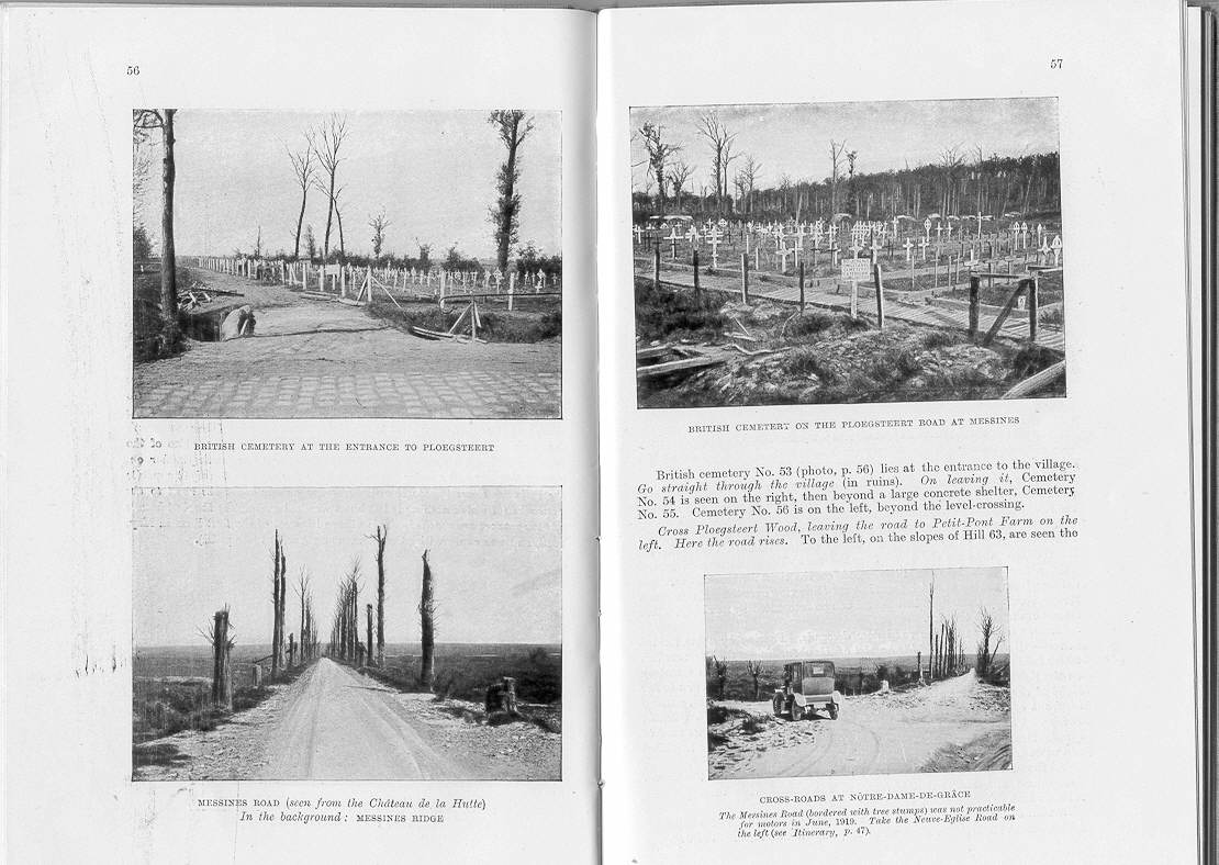
Pneu Michelin, Guide to the Ypres battlefield, 1919. Image: FirstWorldWar
The Michelin Tyre Company published motor tourist guides to the battlefields of the Western Front even before WWI had ended. Visitors traveled to the battlegrounds either out of curiosity or to see the area where a loved one had fallen or to visit their grave.
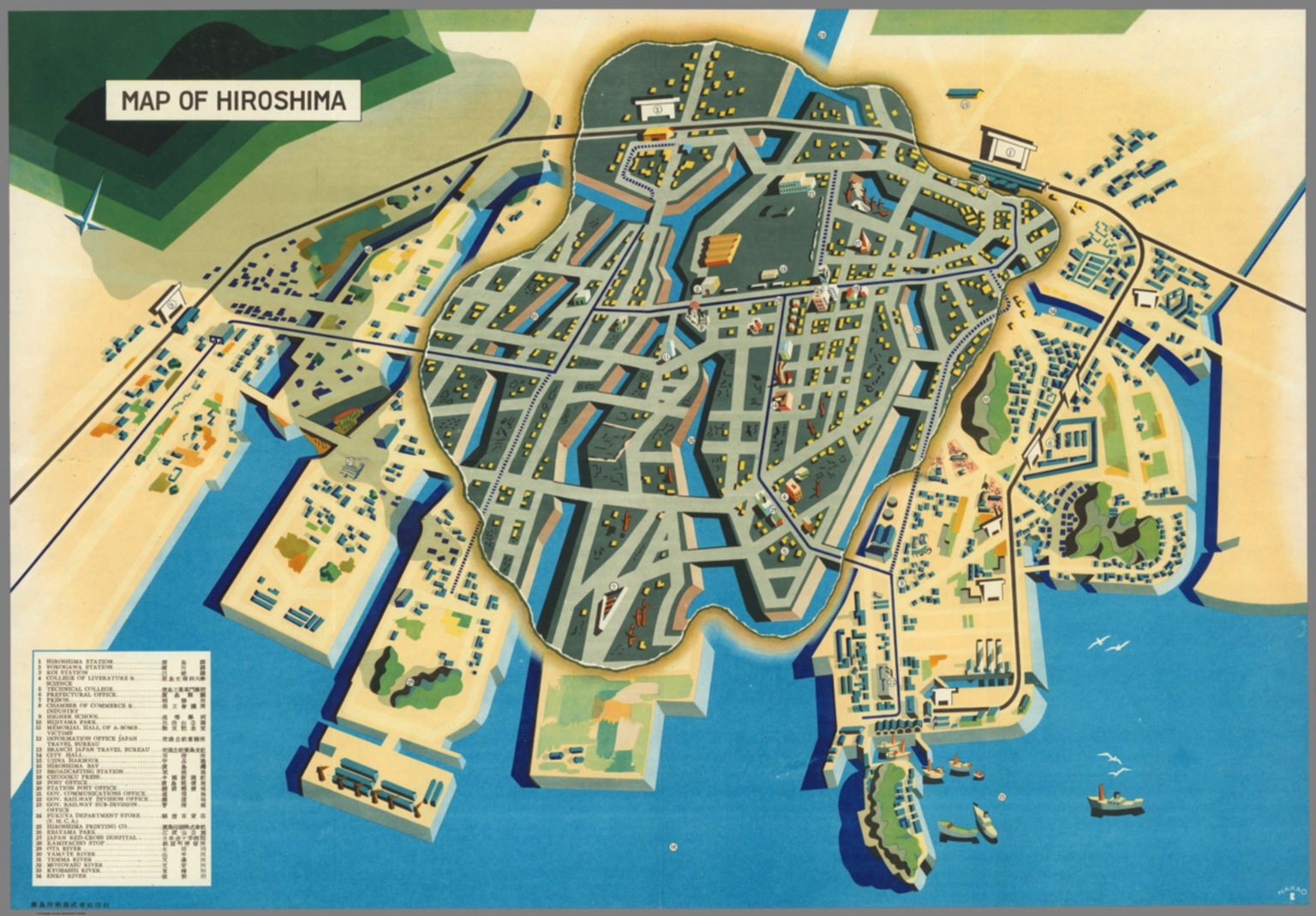
Japan Travel Bureau, Map of Hiroshima, Hiroshima, 1947. Image: David Rumsey
The map was produced by the Japan Travel Bureau for Western visitors who came to witness the devastation done by the atomic bomb dropped on the Japanese city in August 1945. The grey area at the center of map indicates the main area of A-Bomb devastation.
Maps and the 20th Century: Drawing the Line remains open at the British Library in London until Wed 1 Mar 2017.

