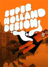
 SHD Super Holland Design, edited by Tomoko Sakamoto and Ramon Prat.
(Amazon USA).
Publisher Actar says: The anxiously awaited follow-up to Holland Design, Super Holland Design explores new functionality in contemporary Dutch design. Featured designers transform concepts into strong messages, using new techniques and technologies. Dutch designers are inspiring exciting interactions between design and its users, compelling us to re-think the meaning of design itself. They question every aspect of design, creating new concepts, processes, and formats, bravely pushing the limits of user participation and the designer’s role.
If you thought that instruction manuals and statistical graphics could never be sexy, think again. SHD is focused on the best of Dutch graphic design and gets the cover it fully deserves: it’s ironic, witty, stands out from the (bookshop) crowd and it’s orange, like their football and euh… William the Silent.
The book draws a panorama of Dutch graphic design in 10 chapters: Re-Mix, Drawing the Letters, Statistical Graphics, Polititcal Graphics, Instruction Manuals, Story Tellers, Read Me, 2D Space, Behave in Digital Language and Space Design. Bonus! There’s also a section featuring postcards. The editors asked the designers to send them by snail mail a postcard, bought or hand-made, with a small message on it. The last part presents all the designers mentioned in the book with their portrait, a picture of their (most of the time remarkably ordered) studio, their address and a bio.
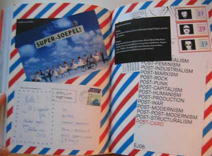
SHD is one of those nice books you come back to again and again when you are looking for inspiration. A few examples:
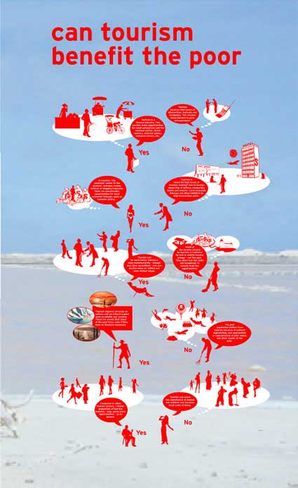
Mare Nostrum, by Minke Themans & Roger Teeuwen, focuses on the rise of mass tourism that relies on the presence of water. Moderate and subtropical coastal regions are a favourite destination for holidaymakers and temporary migrants who stay for the winter period. Coastal tourism is slowly spreading around the world and is a mixed blessing for local culture, ecology, economy and politics. The designer created a two-layered datascape. The first one shows enlarged skyline photographs of beaches form around the world. As the observer approaches the poster, this layer becomes vaguer, and the second layer, the data layer, becomes legible.
Since October 2006 De Designpolitie have been responsible for a visual column on the front page of Dutch newspaper De Volkskrant. Together with Lesley Moore and Herman van Bostelen, they form the collective “Gorilla� and react to the news of the day in words and images. If you visit the Gorilla page, you will be able to react to their graphics, print the PDF or send it an an email to someone else.

 18 April 2007 and 6 September 2007
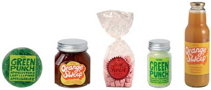
I was reminded how much i sometimes judge a book by its cover. The designers from Studio Kluif are responsible for making me buy food products at Hema just because they look so cute and i blame Koehorst in’t Veld for having me spend money on Frame magazine even if the content of these glossy pages only remotely interest me. People like Machine made me buy Mark Magazine, bless them because that’s how i discovered this wonderful publication.
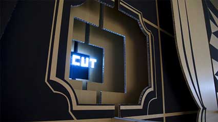
Over the course of 5 weeks, Strange Attractors Design manually produced a 5 layer thick, 2.83 metres high and over 17 metres wide typographic installation as part of the exhibition Cut for Purpose, at the Museum Boijmans van Beuningen in Rotterdam. The aim of the BIG TYPE SAYS MORE installation was to merge contemporary technology with traditional craftmanship while representing the multi-cultural, multi-architectural city of Rotterdam. Custom-programmed microcontrollers sequenced LEDs which were mounted to add what the designers call “a touch of Vegas” to the type.

What i found particularly interesting is that the edgiest, most stylish or humoristic campaigns designed by these studios were not necessarily made for art festivals or biers. Many were designed to carry out messages from places which you wouldn’t expect to be very rock ’n’ roll: medical centres, banks, or supermarkets.
