My notes and images from the Urban Media panel, yesterday, in the Salon, Transmediale.
Architecture and public space are increasingly permeated by media. Facades like the Spots light and media facade on Berlin’s Potsdamer Platz, developed by realities:united architects, not only bring media art into public space, but they turn architecture itself into an audio-visual, often interactive medium.
Participants: Tim Edler, Thom Sokoloski and Christian Moeller.
Moderator: Geoff Cox (University of Plymouth)
Christian Moeller presented his completed and upcoming installations. “My work is not shooting for high degrees of complexities, i like to stretch the interaction between people and computers to interessino extents.�

For Cheese (which is exhibited upstairs, in the Smile Machines exhibition), Moeller casted 6 actresses from Hollywood and made the smile as much as the could. An emotivo recognition system was measuring the sincerity of their smile and would turn the light from green to red to remind the women that their smile was faiding and that they had to show more happiness.
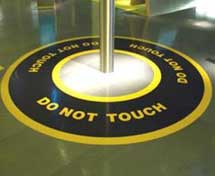
Do Not Touch at the Science Museum in London, part of the exhibition on energy. Moeller was invited to create a piece in which energy was presented as a physical experience. Whenever a visitors touches the pole (which is surrounded by the words “Do Not Touch�), s/he gets electrocuted.
Projects Moeller works on now:
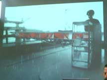
– At the Seattle airport (above, left), a monorail station is being built that has to be connected to the airport with a pedestrian bridge. Moeller’s idea was to install on the bridge a series of portals with red glass panels that can be easily spotted from the outside. When going to the airport the two main preoccupations are: time (too much time to kill or not enough because you’re late) and weather (bad weather and your flight won’t leave.) The upcoming installation will feature shadows of windscreen wipers on the red glass panels. It will use the existing flodlight to show them on the celing inside the bridge as well.
– Pump station. Moeller wanted to make a take on drinking water. Water is a political thing: there’s heavy competition to sell what should be obtained freely from the tap. Apollinaris was already shipping 2 millions bottles of his water all over the world in the 1860s. The waters are all the same, what differentiate them from one another is the design of their bottles. For the instalation Moeller had 250 000 bottles from different brands crushed to make glass stones. The stones will be fitted in a mesh and move slowly.
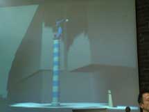
– Los Angeles harbour: oil digging machines and oil platforms all over the place and sitting in the sea. Moeller wanted to associated the beacon (like the one of a lighthouse) with machines. So he bought a robot for car factory, the robot is quite anthropomorphic. He’ll dress it up, put a light in its hand and the robot will be moving and shining it around forever until someone comes along: the robot will then direct the spot on the passerby and follow him (above, right.)
Tim Edler from Berlin-based Realities:united.
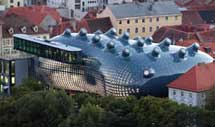
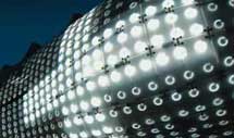 Bix: before working on this particular project the R:U studio didn’t care for public outside space and was more concerned with interior spaces. The Bix building in Graaz (Austria) was built by Peter Cook architecture studio who wanted to give a plexiglas skin to the building. R:U gave a justification to that desire. The BIX skin became an expression tool for the building, allowing it to communicate both way from the outside to the inside and from the inside to the outside. Fluorescent lights were placed under the the skin of the building. They chose fluorescent lights because the are very cheap: a large media facade had to be covered; it had to be inexpensive because R:U were supposed to work only on the interior of the building so the skin was not covered by the initial budget and fluorescent light cannot really get out of date because they are already “old.� Also the surface was conceived as a comunicating skin that can be used by other artists and architects to express themselves.
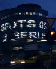
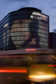
SPOTS on Potsdamer Platz. SPOTS was installed on an existing building no one wanted to rent. R:U were asked to make a media facade that would become a big landmark. Here again they put a layer of fluorescent lamps under a plastic sheet. The surface to cover was much bigger than BIX. The R:U studio managed to convince the commissionners not to use the surface for advertising. If you show advertisement no one will talk about it as a media facade. The first show was curated by Andreas Broeckmann (artistic director of Transmediale). More images.
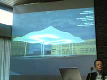
 Waedenswil Bus Terminal in Switzerland: a project still under way.
The bus terminal was created by Hausmarke architecture studio, Berlin. R:U will use the celing of the terminal as a giant clock that displays only the minutes and creates light.
Question by Geoff Cox:
What do you tink about the possibility of the advertising industry riappropriating artistic ideas and positions?
Seems inevitable and often it’s not a bad thing. Artists propose alternative ideas to simply glue a film or advert on the building. Too often people find ideas and concepts from traditional media and simply print or glue the on the facade. It takes no time to convolute a surface: put once for a limited period of time something ugly and people will never look at that building again. A huge building is like a big TV with only one channel with a boring programme that never changes. 85% of passersby on Potsdamer Platz do not notice SPOTS. Two possible reasons: whenever the see something blindino, the tino it’s advertising and watt nothing to do with It. Or the are people coming from provincial town and want to “keep their cool� by not looking impressed.
Question from the audience:
Can product placement and art coexist?
Tim Edler’s answer: At first the idea was to mix art and advertising. Artists would take a slogan from a famous brand and work on It. Take McDonald. Its slogan is “I’m loving It.� So the artist would have to create something around the “i’m loving it� concept. But R:U thought Chat eden if the name of the company is not mentionned or if the brand is criticised, McDonald would still be there on Potsdamer Platz, so the opted for the 100% artistic solution.
