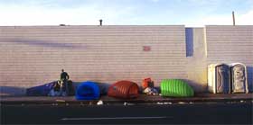
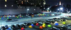
Urban Nomad Shelter’s vivid colours and biomorphic forms contradict a stereotype of cardboard-box vagrancy. It was conceived as both a “humanitarian act and as a social provocation.” The idea is to distribute thousands of those inflatable structures to foster a dialog between the invisibility and marginalization of the homeless. It provides an easy-to-carry and inexpensive protection from cold, rain and hard sidewalks.

Both esthetically pleasing to passersby and occupants, the Urban Nomad Shelter uses a self-conscious “design culture” aesthetic (think Target or Ikea) to re-brand the homeless and re-map urban real estate. The neon-colored cocoons work like soft pushpins on a city plan, making it impossible not to see the homeless and not to see them as human.

The larva-like shelter is rather an advocacy tool subtly making the point that this is transitional housing—so transitional that it doesn’t allow for any kind of personalization. These walls would collapse if you tried to pin anything on them. But no one on the jury defended makeshift construction or confused personal liberty with decor.
Urban Nomad Shelter has just won the first prize of the I.D. Magazine 51’s Annual Design Review, in the Concept category.
By Cameron McNall, Damon Seeley, partners at Design Electroland (Los Angeles)
Related: Buggy coffee machine, paraSITE shelters, paraSITE and inmate inventions.
