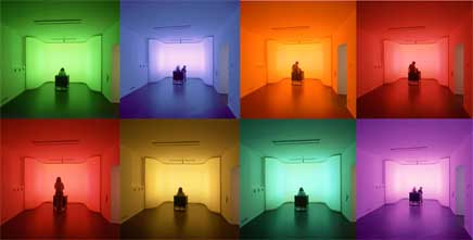
Alexander Wiethoff‘s Colour Vision, installed at the Museum of Perception, in Rohrbach (Austria), allows the visitor to change the room colour with the position of his body. Each posture symbolizes a different status like activity, calmness, reflectiveness and is visualized by different colours.

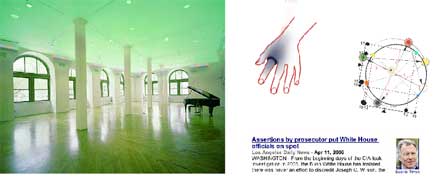
The installation made me think of Will Pappenheimer‘s Public Mood: Light Temperature. When installed at ZeroOne San José, the system will allow Internet users to change the light temperature of the cafe space. The artwork is inspired by the mood ring, which displays the emotional condition of its wearer as color hue. In this case it is a public issue which must be chosen by the Internet participant and then translated into color temperature for the cafe space. The accompanying website will present a simple question about a current public issue. Once web users have submitted their answer to the question, a search engine will retrieve key words from a Google NEWS search associated with the public issue “mood.â€? The user then chooses a cultural color model, which aligns the chosen color with the public issue “mood.â€? This color is then translated to a server in the cafen space, which translates the designated color to a DMX controlled system of LED lights projected on the ceiling. When online users are not engaged in mood selections, the system will automatically search the web for public issue “moodsâ€? to change the colorcast.
 The installations transform the directives of surveillance, home automation and open-sourced Internet applications into possibilities for network participation in architectural mood.
But let’s get back to Colour Vision, the installation raised my curiosity and as i couldn’t find much information about it on the website, i asked Alexander Wiethoff, a German interaction designer currently based in Italy to give me more details about it:
Which technologies did you use for the installation?
A video camera and a DMX system. It works like this: the camera is positionned directly above the chair and tracks the movement of the visitor, we laid a grid of the recorded image and defined in photoshop the areas for the different seating positions. The camera is then connected to a pc with a video and a dmx card. Using a dmx signal we connected the rgb tubelights with digital dimmers and mixed the different colours. There are also approximately 200 colours available when you walk around the installation or mix them with your arms and legs.
When working on this installation, how much freedom did you have? Did the museum trusted you totally and gave you “carte blanche”?
The museum gave me a lot of freedom and trusted me, i had sponsorship from two lighting companies who paid for the material. At first, i wanted to do an interactive LED matrix which reacts to touch sensors, then i developed the concept into a more “intrinsic” way and combined colours with psycholgical status. I met some guys from timesup, also from Linz and decided to work with them.
You live and work in Milan, Linz and Munich. From my experience and feelings, Linz is a small but incredibly active city in the fields of media art or bold installations, Milan is more shy and traditional and i don’t know Munich enought to have any opinion about it. In your view, how different are the “markets” or working potentials in these three very different European cities?
Linz provided a very good platform to do a lot of experiments because the city is very open to new things, but then after 4 years it got too small, Munich is very conservative and in my opinion a bit “narrow minded” regarding art and design, but originally i am from there and also work there from time to time. I like Milan because it´s not one of those fancy touristic cities, it´s a bit dirty and you have to search for the nice places, just like Linz. It’s also a good place for interaction design and it is developing right now. A lot of very interesting people pass through this city, that is the main difference compared to Linz.
Any other installation or art piece in the Museum of Perception you’d like to recommend?
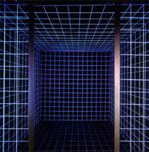
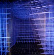
Yes, there is also one really cool interactive installation from a guy called Harald Freudenthaler, it is called “drunken cube” and is a 3D space which deforms itself, so you get an imression that the floor is moving.
Thanks Alexander!
Harald Freudenthaler designed the “drunken cube“ for the museum of perception “Villa Sinnreich� in Rohrbach, Austria in 2004.
Vertical and horizontal lines as well as right angles play an important role in our spacial perception, because they mediate stability, balance, equilibrium and provide security to the viewer. Whenever we deviate from these parameters, irritation, insecurity and even gidiness arise. The Drunken Cube tries to evoke these emotions.


The museum visitor enters through a light tunnel into a darkened room. The floor, walls and ceiling are covered with black surfaces, there is also a black box illuminated with UV-Light (blacklight).
Inside the blackbox is another cube (2,25 meters on each side.) The cube surface consists of a reticule made of white rubber strings. When the gallery visitor enters the inner cube he/she is surrounded by a beamimg white netting, as only the white horizontal and vertical lines can be percieved due to the UV lighting.
As the visitor enters the inner cube, sensors are released and the space starts to warp. The edges of the room misalign, the side walls bend, the hight of the room shrinks and the whole space seems to modify its shape according to the movements of the person in the space. The walls and the ceiling start to move in a threating manner towards the viewer. By that time the viewer will become aware of the meaning of horizontals and verticals in spacial perception.
Thanks again to Alexander for having patiently answered my questions and helped me to dig up information and images.
Related: Hallucination software, Ecstasy: In and About Altered States.
