Clip/Stamp/Fold: The Radical Architecture of Little Magazines 196x-197x is a traveling exhibition that started its journey at Storefront for Art and Architecture in New York City back in 2006, flew to Montreal, Oslo, Kassel, Murcia, Vancouver and London. It has now landed at NAiM/Bureau Europa in Maastricht (NL.)
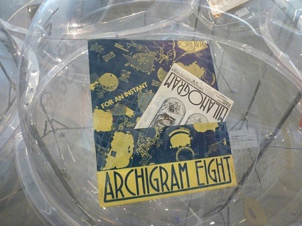
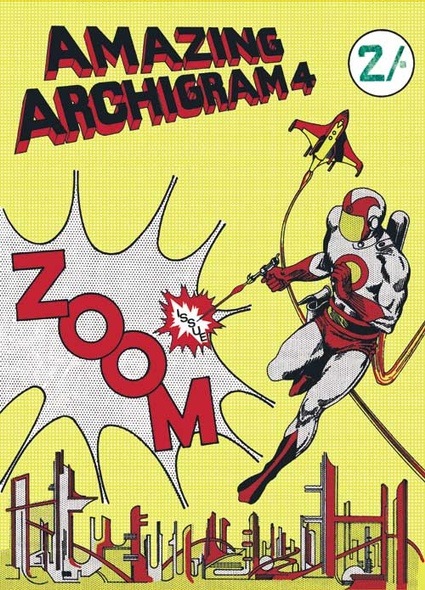 Cover illustration of the fourth issue of Archigram magazine. Credit: Archigram
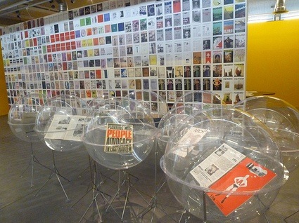
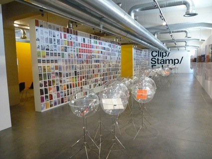 View of the exhibition space
Clip/Stamp/Fold chronicles the eruption on the architecture scene of the 1960s and 1970s of architectural little magazines that challenged the discipline and saw it as a space for experimentation and debate. The term “little magazine” doesn’t refer to the size of the publications. It was coined in the mid-twentieth century to designate progressive literary journals, produced without concern for immediate commercial gain.
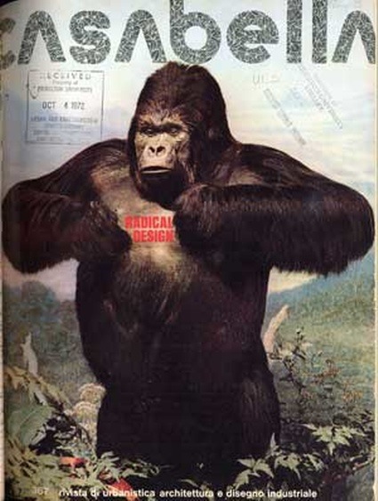 Casabella no. 367, July, Milan
The exhibition was conceived by architectural historian Beatriz Colomina whose fantastic work i discovered 2 years ago through one of her books Domesticity at War. She researched the Clip/Stamp/Fold show together with her architecture students at Princeton University. More recently, Colomina sent some of them to Playboy’s archives in Chicago to investigate the critical role that the magazine played in promoting modern architecture and design in the ’50s, ’60s and ’70s. I wouldn’t mind a book or exhibition describing the result of that exploration.
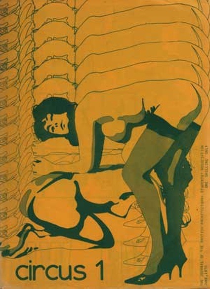 Circus no. 1, London
Many of the radical magazines featured in the exhibition were self-published and short-lived, they were written by dissatisfied student, architects who championed a more political approach to buildings and cities, theoretician, etc. Others are commercial and professional magazines still printed today that, at some point in their history, were influenced by the graphics and discussions of their avant-garde contemporaries. In addition to a selection of rare originals displayed inside plastic bubbles, and a timeline following the evolution of little magazines over two decades, the exhibition screens video interviews with some of the editors involved.
The covers and names of the magazines have a punk attitude that still attracts the eye, their content ranged from the presentation of experimental architecture to dry theory and articles akin to political pamphlets. Some critics have claimed that the energy and inventiveness of that era has long been glamored away by swanky design and glittering starchitects. I’m not so sure of that, sometimes i have the feeling that blogs such as BLDGBLG bring a new spin on the architecture discourse by the way they constantly and often unexpectedly go back and forth from past and future and introduce in the discussion ideas from different disciplines and perspectives.
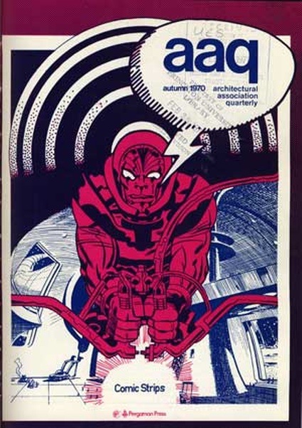 Architectural Association Quarterly, Autumn, London
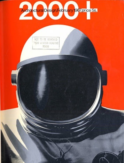 Architectural Design, February, London
It was interesting to see how much Archigram popped up throughout the exhibition. Not only because they had some of the most flamboyant and catchy graphics but also because of the way other magazines would refer to their work.
From Ron Herron’s 1964 Walking City advancing onto the cover of both Aujourd’hui: Art et Architecture and Design Quarterly in 1965….
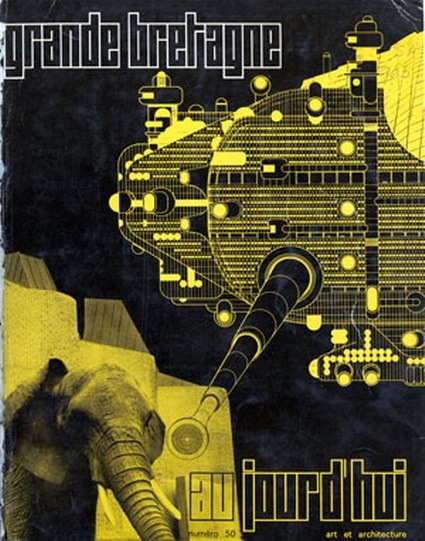 Aujourd’hui: Art et Architecture no. 50, July, Paris
To the photomontage on a cover of ARse from 1971. Much more critical, this one stars Peter Cook commenting a drawing of Archigram’s first commissioned project, the Monte Carlo Entertainments Centre, to other members of Archigram. The sub-title “Archigoon Wins at Monte Carlo” implicates Archigram as part of contemporary architecture’s fixation on consumer culture at the expense of social issues, during a time, ARse argued, that demanded architects’ political engagement.
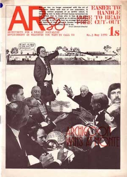 ARse no. 3, London
By the way, the elegantly-named title ARse was the acronym for a variety of words that changed from issue to issue – “Architects for a Really Socialist Environment,” or “Architectural Radicals, Students & Educators” – but was always followed by the invitation, “Or Whatever You Want to Call Us.”
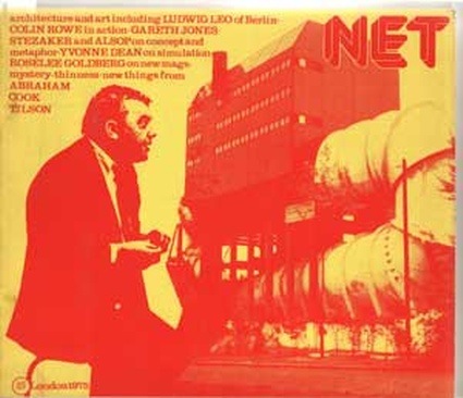 Net no. 1, London
Every new installation brings a local or regional addition to the core of the exhibition. The stopover in Maastricht extended the focus to Dutch magazines published from the 80s up to the present, in an attempt to investigate how little magazines continued to act as vehicles of critical expression after the ’70s.
Volume reviewed the opening of Clip/Stamp/Fold in Maastricht.
The images i took are on flickr.
Clip/Stamp/Fold: The Radical Architecture of Little Magazines 196x-197x is at NAiM/Bureau Europa in Maastricht until September 26, 2010.