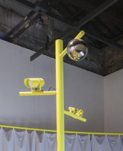
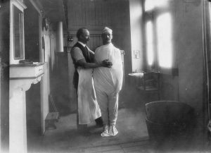
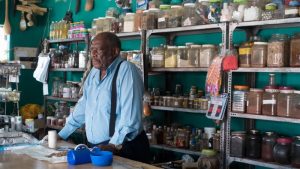
NAI (the Netherlands Architecture Institute) in Maastricht, one of my favourite venues to see how architecture fits into the broader context, is currently running an remarkably well-curated exhibition called Changing Ideals: Re-thinking the House.
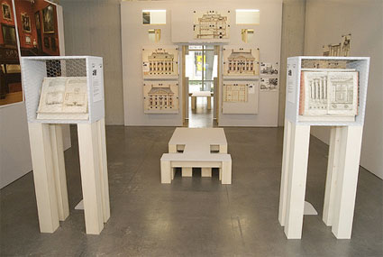 The Mauritshuis of Jacob van Campen, photo Moniek Wegdam
Architects consider the house the best place to test and demonstrate new concepts. Some even go so far as to claim that the history of modern architecture coincides with the search for the ideal house, which is why the house is sometimes called the ultimate paradigm of modern architecture.
The exhibition assumes that innovation of the architecture of dwelling can only be based on the interaction between ‘container’ and ‘contained’, that is, between architectural invention and changes in living ideals. As conditions vary, this notion gives rise to completely different designs.
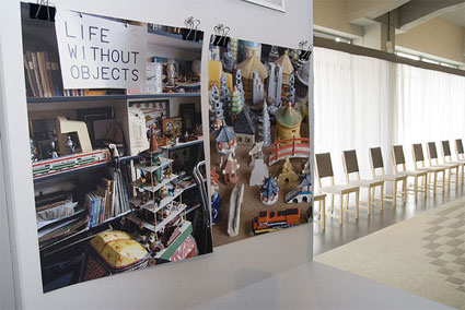 Photos of collection of Madelon Vriesendorp made by Charlie Koolhaas, photo Moniek Wegdam
Changing Ideals: Re-thinking the House consists of two parts:
– 8 different housing concepts presented downstairs, in the Column Hall under the title Le Salon Imaginair.
– upstairs Rianne Makking and Jurgen Bey set out the installation Living with Things, a carefully orchestrated chaos that reflects their idea of the ideal house.
The selection downstairs combines historical examples with contemporary designs. Every house in the exhibition corresponds to a specific lifestyle and highlights the most radical, fiercely mainstream or thought-provoking positions. Each of them not only represents a formal language, but has also been given a speculative quality. The Mauritshuis stands for representation, the Soanes’s Museum for the collection and the Big Brother house for voyeurism.
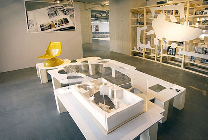 The House of the Future in 1956 of Peter and Alison Smithson as exhibited at NAI, photo Moniek Wegdam
One of these houses is the iconic and most commented House of the Future (1955-1956). With this work, Alison and Peter Smithson attempted to give a face of what the average house would look like in 25 years’ time. Designed to be a plastic structure which could be mass-produced in its entirety, the house included ‘futuristic’ features, such as a self-cleaning bath, remote controls for the TV and lighting and a series of high tech gadgets supplied by the sponsors, such as an electrostatic dust collector and a ‘Tellaloud’ loud-speaking telephone (via.)
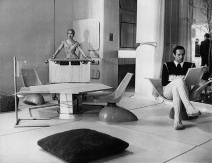 The House of the Future – living room, 1956, Daily Mail Ideal Home Show, London
The other houses are the Mauritshuis, by Jacob van Campen; GWS 497 (Greenwitch Street) by Winka Dubbeldam; House VI, by Peter Eisenman; Visser house by Gerrit Rietveld and Aldo van Eyck; the Soane’s Museum, one of the most curious art spaces in London, IKEA’s BoKlok. And then there is Endemol’s Big Brother house.
The BB House is not only world famous but its structure, while meant to convey a sense of domesticity, is also very different from a ‘normal’ house. The house was one big show box with special areas for cameras. The centre of the house was a cross-shaped corridor area that was not accessible to residents but reserved to camera work. One-way screens were all around the house and to ensure good footage, the interior was fitted with cold and halogen lighting with a day and evening setting.
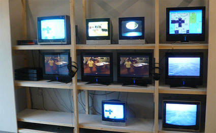
And almost paradoxically, the very televised house didn’t contain any tv set. While the outside world knew almost everything about them, no matter how intimate, the residents were cut off from the outside world.
When the programme was first broadcast in 1999, the BB house was noting more than a couple of cheap prefab containers surrounded by a tall fence. In subsequent editions, both in The Netherlands and in other countries, new rules and new themes were introduced and translated into new layouts for the house. Some series saw a section reserved for ‘the rich’ and another one for ‘the poor’, a prison, a sauna, special love rooms, etc.
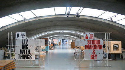
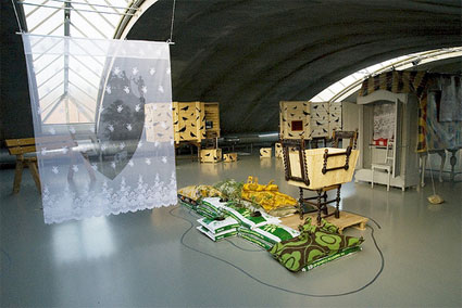 The Arched Gallery with ‘Living with Things’ of Studio Makkink & Bey, photo Moniek Wegdam
In the Arched Gallery upstairs, Rianne Makkink and Jurgen Bey‘s charming installation evokes the industrial hall where they lived until recently. The space served as a home, office, garage, storage facility, guest house, gallery, country house, farmyard, school, garden and laboratory all in one. They regarded it as the ideal house.
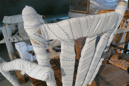
In this ideal house, the order of living is dynamic, not static. its composition and arrangement keep changing according to its use. It’s part a part nomadic, part settled life. Single pieces of furniture participate to the transformation process: a packing case morphs into a desk, a walking cane is affixed to a chair that needs its fourth leg, another chair is wrapped in bandage to make it sturdier. Almost anything can be re-combined and re-purposed.
Although Studio Makkink & Bey’s work belongs to the world of design, it also criticises consumer culture, throw-away society and the depletion of natural resources. Their work suggests a more sustainable economy where discarding objects is unthinkable thanks to a strategy of alternative production and consumption cycles.
Storing, piling up and collection is a crucial part of their working method. The objects are more than just a pile of objects. With each transformation, they acquire new meanings, life and narratives.
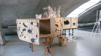 Living with Things, the installation in the upstairs gallery illustrates Makking and Bey’s ideas and working methods. It is divided up in 3 thematic zone:
– The studio zone contains the study, workspaces and a storage space.
– The production zone contains a workspace specially designed for the exhibition and a kitchen. The workspace features storage cupboards where preserving jars line up. They are filled with models of assorted projects.
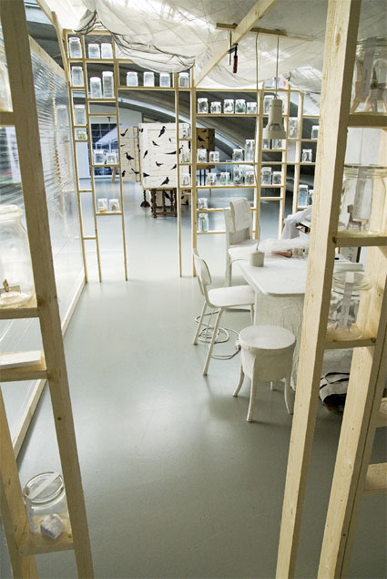 The Arched Gallery with ‘Living with Things’ of Studio Makkink & Bey, photo Moniek Wegdam
– The rural and relaxation zone contains a “Sandbag Garden”, various gazebos, two ‘Birdwatch Cabinets’ (one for a girl, the other one for a boy.)
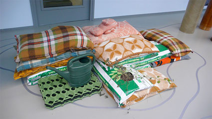 Sandbag Garden
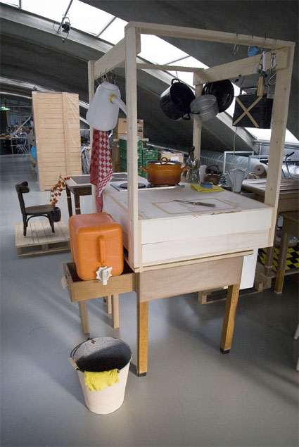 The Arched Gallery with ‘Living with Things’ of Studio Makkink & Bey, photo Moniek Wegdam
In parallel with the exhibition, various ‘salons’ – meetings between designers, critics and experts in the area of dwelling – are exploring further the issues raised in the exhibition. In the spring of 2009, a conference will be held as part of the exhibition.
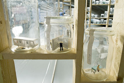 The Arched Gallery with ‘Living with Things’ of Studio Makkink & Bey, photo Moniek Wegdam
The exhibition has been designed by the very talented EventArchitectuur, with photographs by Johannes Schwartz and graphics by the always elegant Experimental Jetset.
Changing Ideals: Re-thinking the House runs at NAI Maastricht until 29 march 2009.
Slideshow:
Previously at NAI Maastricht: Edible City – Part 1, Edible City – Part 2 and State Alpha, on the architecture of sleep at the NAI in Maastricht.
More Jurgen Bey: Designing Critical Design – Part 1: Jurgen Bey, Dust furniture and Blob art pavilion.

