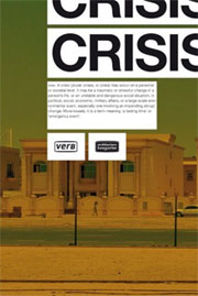
 Verb Crisis, edited by Mario Ballesteros, Albert Ferré, Irene Hwang, Michael Kubo, Tomoko Sakamoto, Anna Tetas and Ramon Prat. Design by Twopoints.net (Amazon UK and USA).
Publisher Actar says: Verb Crisis examines architectural solutions to the extraordinary conditions of an increasingly dense and interdependent world.It presents innovative projects and research through original photos, essays, and exclusive interviews with key figures from architecture and urban planning to environmental, economic, and global affairs. Confronted by shifting densities and uncharted urban transformations, Crisis tackles the conflict between the physical limits of architectural design and the demands on the practice for an updated social relevance.
With a description like that and coming from one of the most fashionable publishers in Europe, Crisis could only raise very high expectations and, of course, fail to fulfill them. Granted that i’m not an expert in crisis, i’d say that the book doesn’t disappoint, it is a fantastic source for reflection and inspiration. The editors invited first class urbanists, thinkers, researchers and architects to explore some particular projects in order to illustrate the “crisis issue”: FOA, Teddy Cruz, Shigeru Ban, Elemental, Boris B.Jensen, Hilary Sample, John May, Jacobo García Germán, Markus Miessen, Interboro Partners, MVRDV, and Takuya Onishi. There are some brave statements, some very critical views on what is being regarded as “urban crisis management” today, some inspiring examples of practices coming from Chile and other locations over the globe, etc. But what’s Crisis about exactly?
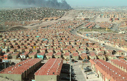 Tijuana (image Teddy Cruz for the new york times)
Crisis is one of Actar’s boogazines, hybrid volumes that combine the flexibility of a magazine with the depth and format of a book. While previous boogazines were focusing on the most promising aspects of innovation and technological progress, this one takes a step back and questions current models of urban developments. Crisis states that to remain relevant, architecture must not connive at the economic, social, cultural and environmental challenges our world is currently facing.
The volume opens with an etat des lieux of Dubai and the many ambitious promises the city of superlatives is likely to make or break. At the risk of sounding like the usual sneering Europeans, the authors demonstrate that there are as many hopes as cracks in the glossiness of one of the most talked about real estate adventure: no matter how much money is poured in the mammoth project, the sand is an everyday reality likely to tarnish the pristine surface of the buildings, badly paid workers live in ramshackle housing, the thematically designed sets of dwellings might not always dialog well one with another, etc.
However, the chapters that fascinated me most were dedicated to:
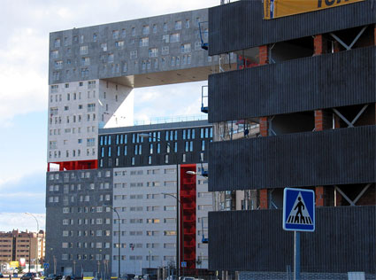 MVRDV‘s Mirador building in Madrid (image)
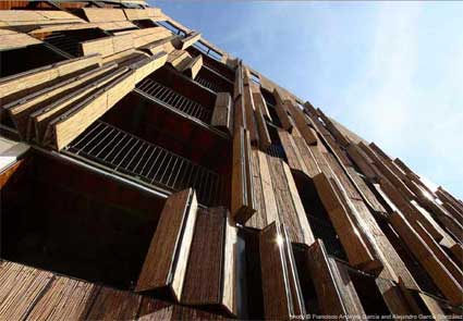 Foreign Office Architects‘ bamboo social housing in Madrid
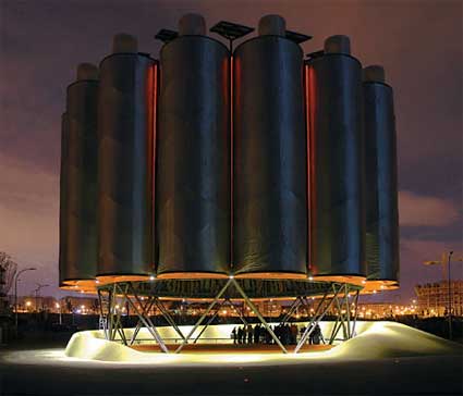 Ecoboulevard of Vallecas near Madrid, designed by [ecosistema urbano]
– Madrid’s urban sprawl and the transformation of the periphery into a space for endless rows of off-the-shelf brick and mortar apartment buildings interwoven with soulless shopping malls and a playground where edgy architects throw in some examples of their most experimental works. Jacobo Garcia-German as well as architects from MVRDV and FOA share their personal experiences, strategies and views regarding a periphery which grows at a rate of thousands of square meters per month
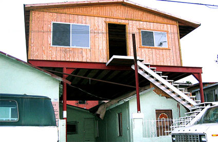 Tijuana (image Teddy Cruz for the new york times)
– California suburban housing properties being exported as symbols of wealth and progress in China or, even better, massively reproduced on a miniature scale or dismantled and loaded onto trucks to find a new life on the other side of the US-Mexico border and forming “non-conforming patterns of development.”
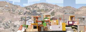 California-based architect Teddy Cruz comments on the characteristics but also on the opportunities offered by border urbanism. Estudio Teddy Cruz’s Manufactured Site takes its cue on “the resourcefulness of poverty.” Families would receive a kit with an assembly manual, a snap-in water tank, and 36 frames that can be placed in a variety of configurations, serve as frames for concrete poured on site, or to incorporate materials found nearby. Cruz would pair San Diego non-profits with local Mexican government officials to funnel money to the “maquiladora industry” – corporations that have built plants in Mexico to take advantage of a labor force characterized by low wages, no health care, and no unions – which would fabricate and distribute the kits, “to give back to the communities it exploits.” (via Lynn Becker).
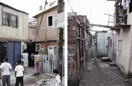 Iquique barrio before transformation
– Chilean architecture studio ELEMENTAL was asked by the government to knock down Iquique‘sinner-city slum and turn it into a viable neighbourhood for the 100 families who had occupied the space illegally for 30 years. Interestingly, the architect decided to regard the housing as an “investment”, he provided the families with a minimum life unit but left enough room for them to improve, build upon and customise their housing according to their own needs and tastes.
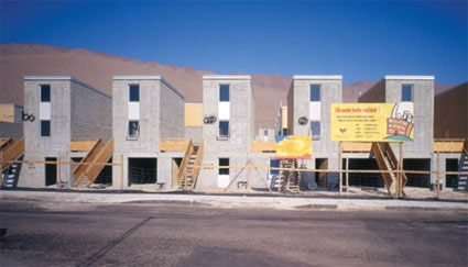
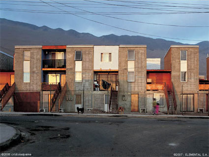 Iquique (images by Cristobal Palma for Elemental)
– the pages dedicated to Detroit invite readers to redefine their definition of crisis and of what could constitute a solution to it by forcing them to see Detroit as a place for healthy suburbs in the making rather than a city in decline. Urban design, planning and architecture firm Interboro Partners have been investigating the Detroit suburbs and discovered what they call “blots” – lots that that get bigger and better when homeowners take, borrow, or buy adjacent lots. The phenomenon give rise to a new form of “suburbanism”.
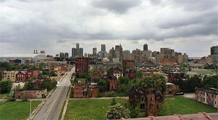 Image Forgotten Detroit, via Land+Living
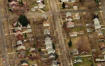 Blot opportunities
– the “BioMed City” scheme regards cities as prone to public health crisis and argues that cities worldwide need infrastructures dedicated to studying and fighting infectious diseases.
– there’s a gripping story about Fresh Kills landfill (Staten Island) set to become the 2,200 acres Fresh Kills Park. Far from being all cheerful and optimistic (that would be hard to achieve with a name like that), the pages remind us that if the life of a consumer goods inside our houses is quite short (there’s always a model which has the virtue of being shinier and full of even more promises), its synthetic corpse disappears after a very slow and hideous process. Set in 1948, the dump could be regarded as being the largest man-made structure on Earth, with the site’s volume eventually exceeding the Great Wall of China.Closed in March 2001, the landfill had to be temporarily reopened in order to receive and process much of the debris generated by the 9/11 attack (via). The debris was later removed into various locations, including museums and steel mills. The happy green plan to create a public park three times bigger than Central Park has to meet with system able to control leakage of methane gas and toxic leachate.
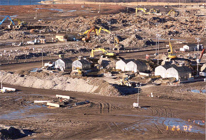 Image cryptome
Along with the spotlights on several crisis location there are interviews with urbanists and architects:
– Shigeru Ban explains why architects do not get much respect in Japan, discusses how he creates strong and resistant architecture using weak materials, like paper tube to build emergency shelters for Rwandan refugees, bridges, churches, houses and offices, how he manages to finance his social contribution architectural projects and why he hates the hype built around the “sustainability” label.
 Paper bridge over the Gardon River in Southern France
– i also discovered the work of Takuya Onishi. The architect designs mobile, ultra-light, inflatable, air-delivery or foldable structures that respond to challenging and emergency situations. Because in his view, private companies take decisions much faster than governments, Onishi developed some fascinating way to hijack commercial powers in order to finance and develop his project (most notably with the FedEx Pak Project.)
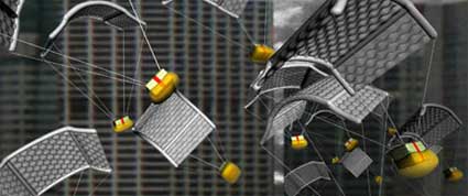 Air Drop Bubble Shelter
Previous boogazine review: Verb Natures.
Related stories: Global cities, DLD panel on Future City (Part 1 and Part 2)
Image on the home page by Cristobal Palma for Elemental.


