Three D: Graphic Spaces, edited by Gerrit Terstiege, the editor-in-chief of European design magazine form. Includes a design-historical essay by Steven Heller, an interview of Stefan Sagmeister about his typographical installations and various interviews with graphic designers by Sophia Muckle.
(Amazon UK and USA)
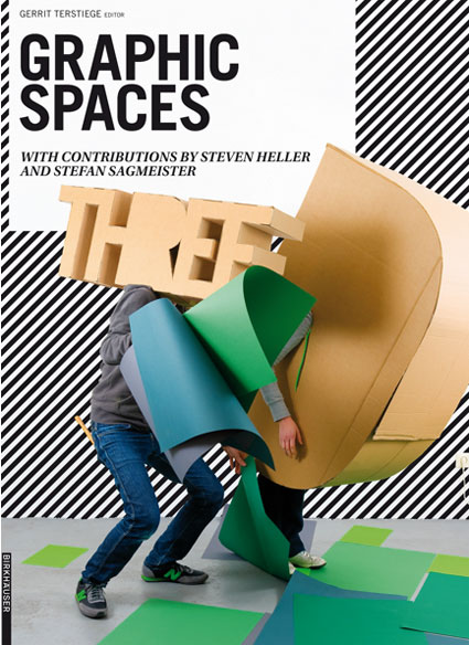
Publisher Birkhäuser says: Three D – Graphic Spaces highlights a current trend in international graphic design: more and more visual designers are staging their compositions as three-dimensional scenarios, in order to turn them into posters, magazine covers, web sites, and animated films. The result is a host of suggestive new pictorial worlds that range from playfully arranged still lifes to room-filling installations. Edited by Gerrit Terstiege, editor-in-chief of the European design magazine “form”, and designed by the prizewinning German studio Pixelgarten, this book offers an inspiring look at the various modeling techniques and means of expression involved.
The book collects designs of about 50 international creative individuals and studios. A volume on a similar subject, Book review: Tactile – High Touch Visuals, was published last year but Three D: Graphic Spaces is way more talkative, offering essays, deeper analysis and descriptions.
The projects are grouped into 4 main categories: Still Lifes Come Alive, Intricate Installations, Touching Type and Thrilling Animation.
Nice touch: at the end of the book, you’ll find a small description of the design studios as well as the contact address and url of their website.
A few examples. In no particular order:
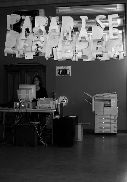
Rebecca Stephany‘s Paradise is Made of Paper, an XL origami installation in the library of the Gerrit Rietveld Academie, Amsterdam.
 Damien Poulain, 3-D illustrations for Uniqlo paper no.3, 2007. Tokyo, New York and London are neatly and unmistakably represented using just a couple of landmarks and key elements of the local culture.
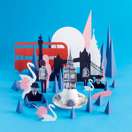 Uniqlo paper no.3 (worldwide). Photography: Lacey
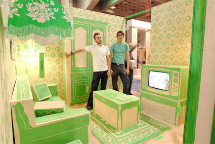
Rita’s Living Room sketches the typical style of a Québec living room. Nothing glamor or ready for the pages of trendy design magazines, just simple, archetypical decoration and lay out. Ultimately, the designers ask: ‘Where is the design? What is design anyway?’
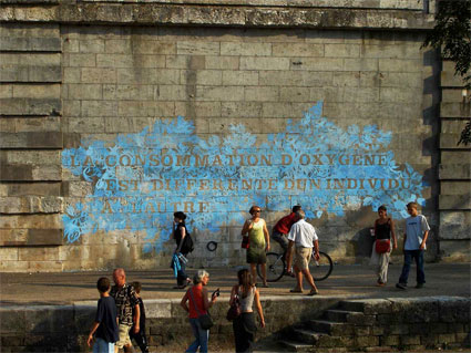
 Jocelyn Cottencin‘s practice stands at the intersection of photography, video, installation and graphic design. Her 2004 wall drawing La consommation d’oxygène est différente d’un individu à l’autre (‘the consumption of oxygen differs from one individual to another’ video) is based on the typo ‘Floréale’ that she created in 2003. Convinced that the fate of her work was to disappear swiftly, she used chalk to draw the floral pattern. Surprisingly the work remained intact for 3 years.
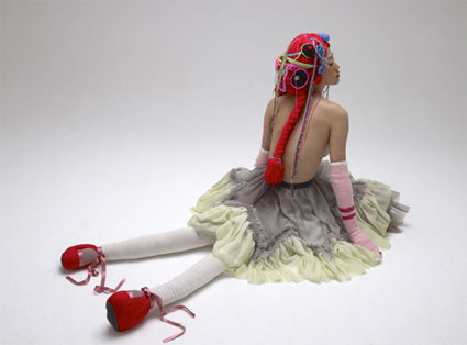
 Elene Usdin‘s La Barbe Bleue series turns the most terrifying aspects of Bluebeard‘s butchery of his wives into dolls limbs and threads of wools.
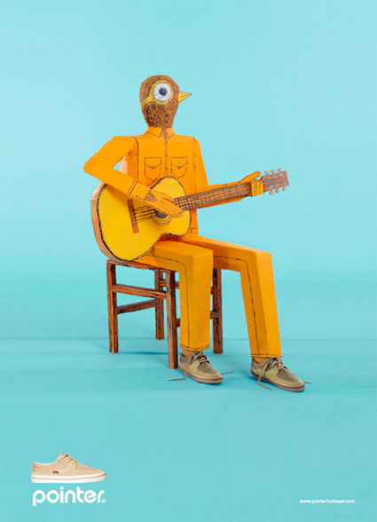
 Playarea for footwear Pointer. Models are robots given the illusion of 3D life with the help of soft shadows.
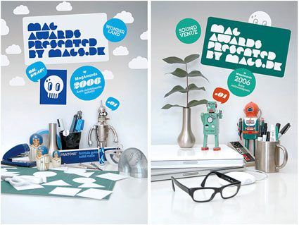
 Emil Kozak‘s work for MAG, a competition for the best magazines in Denmark. All the posters Kozak designed for each award have a connection to the medium of the award.
Graphic comes to life in a more literal way in this video by Colors and the Kids and in another one shot by Jared Eberhardt for Cansai De Ser Sexy:
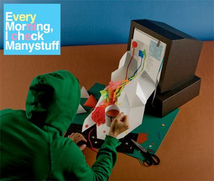
Julien Valle and Nicolas Burrows’ explicit paper metaphor of the way digital existence spills over our physical life.
Related stories: Book Review: Super Holland Design, Book Review – Enter Spanish Creativity, Book review: Hand Job: A Catalog of Type, Book review: Tactile – High Touch Visuals, Joshua Davis at OFFF – Lisbon.

