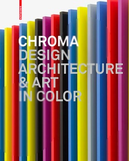
 Chroma: Design, Architecture and Art in Color, edited by interior architect Barbara Glasner and independent author and consultant Petra Schmidt (who is also the author of Unfolded – Paper in Design, Art, Architecture and Industry.
The book is available on Amazon USA and UK.
Publisher Birkhauser says: Designers and architects have to make decisions regarding color every day. But how does one find the necessary inspiration? The appropriate color? How do other designers and artists deal with the issue? With “Chroma,” the Greek word for color, as its title, this illustrated book provides answers to these questions and makes it clear that color is much more than mere decoration – it is one of the central problems of creative work. In the process, “Chroma” embraces the sensuous experience of color, inspiring and seducing the reader with unusual projects, from industrial products to color field painting. The book presents works by younger designers like Stefan Diez and Arik Levy as well as famous artists like Ellsworth Kelly.
All of the works are presented in large-scale reproductions and also in a kind of color gradient, in which they are assigned to the chapters “monochromatic,” “multichromatic,” and “achromatic.” The spectrum encompasses all conceivable shades and combinations, from brilliant and colorful through tasteful and subdued all the way to black-and-white contrasts. An additional chapter analyzes the work of outstanding artists, architects, and designers like Gerhard Richter, Konstantin Grcic, and Sauerbruch Hutton, who grapple with color to an unusual degree and have formulated characteristic chromatic worlds. An alphabetical index provides background information on the artists and studios selected.
 Carsten Höller, Rhinoceros, 2005
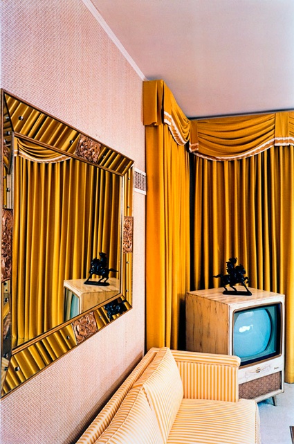 William Eggleston, Untitled, from William Eggleston’s Graceland, 1984. © Eggleston Artistic Trust
The book is delightful and colours are dangerous. They’d make you buy and like almost anything. Hundreds of photos illustrate the importance of colour for turning buildings and vases alike in drab to fab and glorious. The first 273 pages immerse you in colours. The volume begins on a pale mayonnaise hue and evolves gradually to the deepest black via the most vibrant or faded pink, red, yellow or blue. I didn’t see much turquoise, that so-called ‘colour of 2010‘, though. Without any text to disturb the chromato-orgasm, you’re left to make your own conjectures and connections.
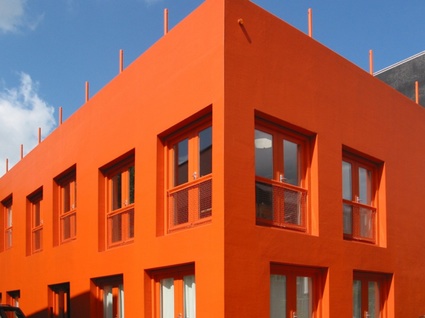 MVRDV, Studio Thonik, Amsterdam, 2001. Image by Maarten Helle
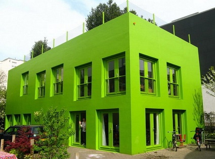
Following the complaints of the neighbours, the orange building had to be repainting in green:
(image)
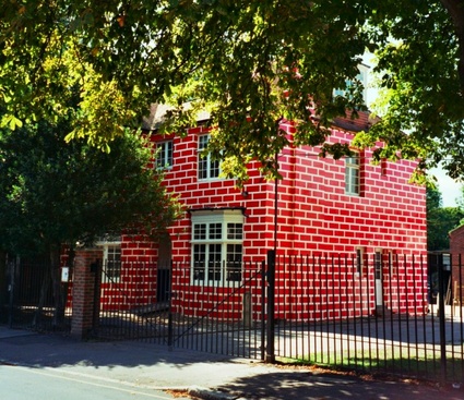 Richard Woods, Renovation, Wimbledon, 2005
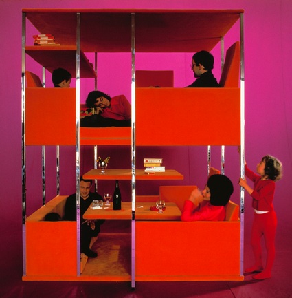 Verner Panton, Multi-functional living unit, 1966
 Carsten Höller, Hippopotamus, 2007
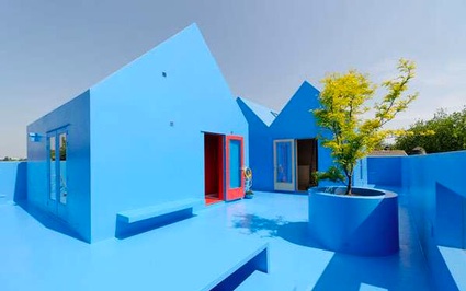
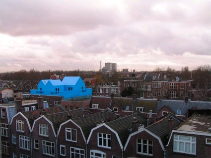 MVRDV, Didden Village, Rotterdam, 2007
 (image)
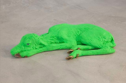 Carsten Höller, Reindeer, 2008
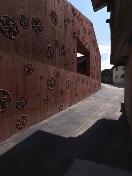 Valerio Olgiati, House for a Musician, Scharans, 2007
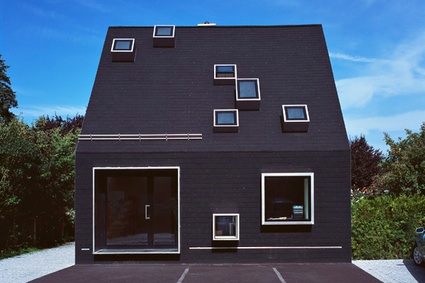 Peter Haimerl, Das schwarze Haus, Krailing, 2006
Did you ask for multichromatic?
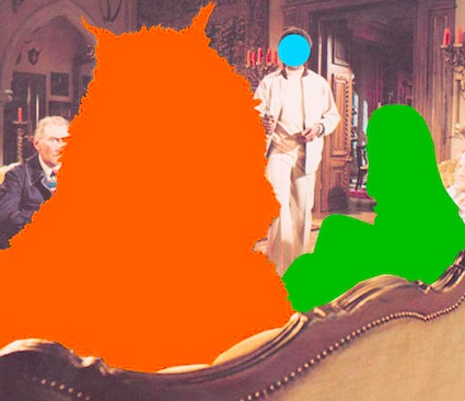 John Baldessari. Beast (Orange) Being Stared At: With Two Figures (Green, Blue), 2004
The purely chromatic experience is followed by interviews with or essays about mighty colour-wizards: designers Fernando & Humberto Campana, Konstantin Grcic, Ronan & Erwan Bouroullec, architects Sauerbruch Hutton, UNStudio and artists Rupprecht Geiger, Gerhard Richter, Anselm Reyle. No a single woman then. The texts reveal the role of colour in their work, the way they combine it with shapes and materials, the control they might or might not have on the shades they use, the ones that intimidate them or those that have had a particular importance in their own story.
Nothing will prevent me from closing this story with yet another Carsten Höller:
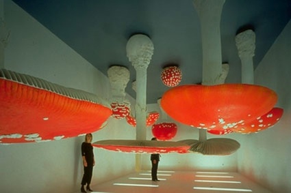 Carsten Höller, Upside Down Mushroom Room, 2000
