(Blogging from Innovation Forum Interaction Design. Not exactly live but hopefully more complete)
 According to the keynote speaker Bill Moggridge, the co-founder of IDEO, phones used to be simple. Modern phones however are much more complicated and there’s lots of complexity to be taken into account. Now, phones can access the Internet which makes it even more tricky because its services weren’t really designed for such devices.
I-mode was an amazing success in Japan. Moggridge met with Takeshi Natsuno, one of its key designers to find out more. He says, the keys were to simplify the services enough to work on the tiny screen, including designing a range of icons. Why the accessories dangling from virtually all phones? A Japanese woman told him that you would use them to wipe make-up from the screen. Buying a drink with I-mode still proves to be difficult, tough. In a video-taped test, it took about 35 minutes to finally get a can of 7-eleven, including calls to customer support. Transplanting the same services to the US proved difficult, though. In Japan, lots of commuters sit on trains twice a day with lots of times at hand while in the States, people primarily use cars with no opportunity to use a device with a small screen.
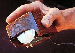
 Many of those topics are covered in Moggridge’s book Designing Interactions which he recently published. In there is also an interview with Doug Engelbart who invented the mouse, of which Logitech recently sold their 500.000.000th unit. In his interview, he says that initially, the cable used to run out of the back towards the user, thus the name mouse. One of the other inventors of today’s computer technology is Tim Mott who at Xerox PARC was one of the researchers who conceived the desktop-metaphor. To design it, he put editors in front of an imaginary screen and asked them how their ideal work process would be. Through this prototyping, the realized that they could simply mirror the space around the workers which they called the “office”.
Bill Verplank together with Moggridge coined the term interaction design. For him, interaction with technology consists of three questions: How do you do things? (For instance the use of buttons) How do you feel about media? (McLuhans cool and hot paradigm.) How do you know? (With computers, it’s very difficult to know what is going on inside.) Furthermore, according to Verplank, there are three phases that every new technology goes through: The enthusiast phase (exploitation of new possibilities), the Professional phase (it helps us work) and finally the consumer phase (it helps us to enjoy).
Paul Mercer was one of the original developers of the iPod. He says that Apple started very slowly to develop the involved technologies, from acquiring a company to create the iTunes franchise. Then came the iPod which is very simple yet very sophisticated. In 2003, Apple launched the iTunes Music Store which hadn’t existed before at that scale. For Moggridge, this is more evidence of his point about complexity: everything lead to the other and in this world of complexity we should aim for systemical solutions.
The Internet has changed everybody’s life to a dramatic extent and the most vivid example is Google. They started when “dot-com madness was going on” and while everybody had crowded pages, they put up the simple search-form they still have today.
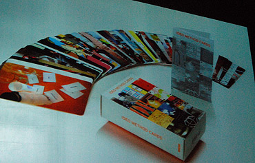
 Over the years, IDEO developed their 51 method cards for user-oriented design processes instead of them being only business-oriented. Prototyping is a very important and complex process and also can include storytelling and other techniques to simulate an individuals experience of interacting with a system. A good analogy for our brains is the iceberg with all that’s underneath the water surface being the unconscious. In Bill Moggridge’s view, a good design process can help us harness all this power (and the best design prototype is one’s life itself).


