Jürgen Mayer H. has designed a mensa (dining hall) for Karlsruhe University (Germany) which he defines it as an “elastic space”.
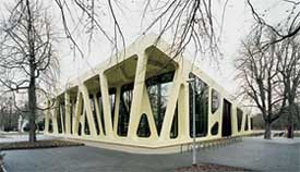
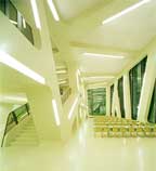
Drawing on an interpretation introduced by Sanford Kwinter in Architectures of Time, the German architect’s latest buildings follow the axiom that all architectures are technical objects. And conversely, every technical object is architecture.
The Karlsruhe canteen thrives on a 3D grid of supports and beams (which are identical in their vertical and horizontal planes). The conceptual diagram underlying the project is constituted by two slabs stuck together and detached due to the effect of a force. The filaments left between the two surfaces allow a modulation of different levels of porosity on the exterior, thereby linking the building to the campus’s circulation routes and to the forest opposite. The diagram’s translation into reality is achieved by means of load-bearing frames in layers of lamellar wood, which significantly reduce costs. These are clad with a special elastic insulating material that conceals the seams while emphasising the project’s abstract and graphic appearance.
Via domus. Edgar posts faster!
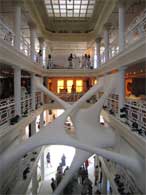
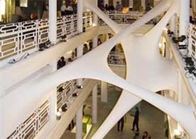
This idea of an elastic space made me think of Elastika, a chewing-gum-like installation that Zaha Hadid realized for the Moore building during DesignMiami 2006. Archinect and designboom have the images.
I also recently found out about the very elastic-looking winning project for the National Library of the Czech Republic in Prague. Designed by Future Sytems.
Now, the last building i wanted to mention has nothing to do with elasticity (i think) but what it has in common with the Karlsruhe canteen is that it is responsible for making me dream of visiting otherwise unglamorous places.
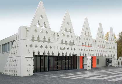 Sint Lucas Art Academy in Boxtel, southern Netherlands sexed up by the FAT guys (where FAT stands for Fashion Architecture Taste.)
The front layer is taken from a Venetian original, cut through with modernism and redrawn in VectorWorks to form a kind of 21s Century Folly.
Via strange harvest, archined and building design.


