After a few posts about the Arsenale section of the VVenice Biennale of Architecture , let’s go straight to the Giardini, the historic exhibition venue which hosts most of the national pavilions.
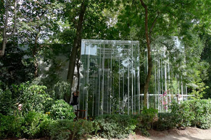
One of the most popular pavilions this year is probably the Japanese one, surrounded as it is by greenhouses, little wooden benches and tea tables for visitors to have a rest.
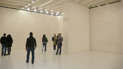
The pavilion, called Extreme Nature: Landscape of Ambiguous Spaces, is a joint project by ex-SANAA architect Junya Ishigami and star botanist Hideaki Ohba. Its interior is sleek, luminous and looks empty… until you notice the delicate pencil drawings traced on the cream walls. They illustrate an architecture entirely made of natural elements (trees, flowers, other plants, mountains, lakes, etc.). The real nature is just outside the pavilion, in the neatly trimmed garden and inside four vertical greenhouses where Ikebana-inspired garden arrangements grow without air conditioning systems, creating an imperfect artificial environment.
The pavilion spreads outside its walls, its spills in the garden and it’s hard to delineate its exact boundaries. There’s no dualistic relationship between inside and outside, between architecture and landscape. The furniture which one would expect to find inside a tea room are distributed in the garden. The doors are left open, not even the temperature difference can be used as a factor to differentiate between the inside and the outside. The only structure built specifically for this edition of thee architecture biennale are the delicate and transparent greenhouses and they are not located inside the pavilion either.
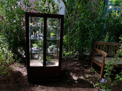 The Japanese Pavilion itself is made to appear as an artificial environment or an element of topography. The original outdoor space overlaps with the space that emerges between the ephemeral steel structures covered with glass, causing the appearance of a doubled, ambiguous space. The condition of space produced here makes us aware that everything in it – the plants inside and outside, the furniture, the architecture, the topography, and the environment – exists simultaneously.
Previous works by young Ishigami show a similar attention for the smooth blending of nature and architecture. A spectacular example of that practice is the KAIT Studio designed earlier this year for the Kanagawa Institute of Technology.
Slideshow of the pictures i took at the Japanese pavilion last week:
Source for images 1 and 3.
The Venice Biennale of Architecture continues until Nov. 23, 2008.

