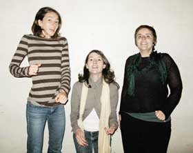
 The British collective Milk and Tales is made of three young women who design interactive environments for cultural venues. I don’t know how they do it but each of their new projects manages to enchant everyone: kids and their grand parents, Londoners and tourists, people for whom interactive environments is a new expression and old grumpy blasés like me who keep on complaining that interaction is getting tired and tiring.
Who is Milk and Tales? How did you get to work on interactive environments?
We are Arlete Castelo, Melissa Mongiat and Kelsey Snook.
We met on the MA Creative Practice for Narrative Environments (CPNE) course at Central Saint Martins, in London, and started working on projects together, in parallel to the course activities.
– We also have a set of rotating collaborators for different projects. We have been working with Dan Harris, Charles Ward, Matthew Olden and Rakhi Rajani on some projects, we are currently working with Chris O’Shea on a new project.
We started to work on interactive installations together as an offshoot from the course where we were fine-tuning our skills in creating narrative environments. A narrative environment is an experience or a place designed to communicate a story, is hopefully engaging and a place for dialogue. Interactive environments are inevitably linked to narrative environments. We’ve got a mix of skills and are very happy designing both.
 Hidden Love Song
Your installations seem to manage to get the broad public immediately engaged and entertained. At the same time, your works are very elegantly designed. Is one of you responsible for the “look” of an installation and someone else works more intensely on the sound technicalities or on the experience side of it? How do you work?
Arlete and Melissa have a background in communication / graphic design and Kelsey has one in in product and installation design. In concept phases, our skills blend to work on the experience of the user/visitor/passer-by – that is our focus and what attracted us to the MA CPNE. For design detailing and production though, we may be working separately on different parts depending on our expertise and we usually seek extra help for technological development, but this is always done in a collaborative spirit, so that in the end, we all have a say and all make sure we are working towards a cohesive whole.
How much do you manage to control the way people interact with your work? Which kind of unexpected behaviour have you witnessed with your installations? Any bad or good surprise? What have you learnt from the way people interact with your works?
We like unexpected behaviours, we see our role as providing a medium for people to be creative. However, for the interaction to work, we feel there needs to be a careful study of the context. We carefully plan the first spark, and then let it go from there.
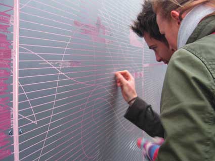 Hidden Love Song
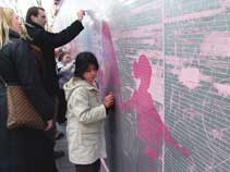
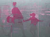
When we study the context, we’re looking at factors such as the environment, the user, and the existing types of behavior in the environment. This enables us to set the foundation for a successful interactive piece, however, we enjoy when people find new ways to use our work and take ownership over what we do. For example, in Gamelan Playtime, we took time to study how people moved in the space and understood that everyone was in a hurry with no time to stop. We made it a priority for people to only have to stroke the wall while passing by for the interaction to work. However, when the installation was up, we realised people were stopping to pull and twist the buffers and were spending a lot of time discovering the different instruments and creating their own piece. They were seeking much more engagement than what we had anticipated. For the following installation of the same ‘Keeping in Touch’ series, Hidden Love Song, we provided a much more flexible and empowering medium, the scratch-off layer. People could scratch the wall to reveal hidden words or sounds, but they could also scratch in their own messages or simply draw. The piece was particularly nice because it wasn’t precious, the whole wall was fair game for manipulation.
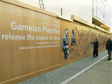 Gamelan Playtime
Gamelan Playtime was created for the Royal Festival Hall in London. What was the brief for that project? How easy or difficult is it to get such a prestigious and probably a bit conservative institution to accept your unusual ideas.
First we have to mention that we have been working with the Learning and Participation team at the Royal Festival Hall, who is one of our very innovative and most forward thinking clients. Their way of doing and thinking has been an inspiration for our work, and was really a true collaboration. We met Shân Maclennan, head of L&P through the MA CPNE network and she asked us to come up with an interesting experience using the RFH hoardings while the building was closed for refurbishment. The initial thought was that we could start with communicating Gamelan workshops held with primary school children in Lambeth. They wanted to bring back the life that usually inhabited the area when the building was open. Typical marketing posters campaign didn’t seem to do that.
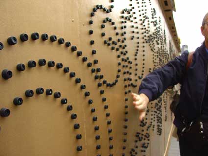 Gamelan Playtime
We came up with a broader program that we called ‘Keeping In Touch’ which would aim to communicate ongoing activities to the general public via an interactive system on the RFH hoardings for the entire duration of the refurbishment period. This system was made up of a tactile surface, sensors and a sound system which would enable a series of hoarding to go up every 2-3 months. This would keep a momentum with the audience until the re-opening of the hall, and maximise the use of the interactive system. Even though Shân could not commit to the program at the start, we ended up having 3 cycles on the hoardings, up until they took the hoardings down. Then followed PLAY.orchestra on the Riverside Terrace. Now the RFH is open, and we are still working with them on various interactive systems.
Where does the idea of PLAY.orchestra come from?
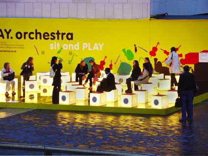
The brief came from the Royal Festival Hall (RFH) in collaboration with the Philharmonia Orchestra (PO). The PO wanted to communicate their Sound Exchange website, which enables the general public to download sounds from the orchestra and upload their own.
This installation was to take place on the Riverside Terrace which was not very busy, though a lot of people would pass by. Some people were using the seating in the area to take breaks. We needed to make it a destination point, for all audiences.
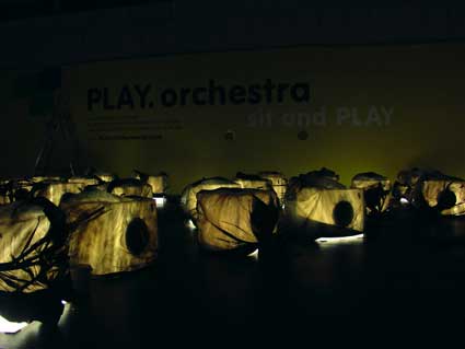
The Philharmonia initially thought of having their website on the hoardings for people to take part in the sound exchange. We thought it was all a bit too abstract for people to come by and want to ‘exchange sounds’ through a website interface on a hoarding. So we thought through what a sound exchange meant to begin with: it was about taking part in the Orchestra, learning about the sounds and sending your own for a composition to take place. We noticed on the website there was a page of the orchestra scheme with all the instruments laid out in their particular spot and the sound they each make. So there, we decided to recreate the orchestra scheme on a stage with only seats. Each seat was labeled with its instrument. When people would sit, they would activate the sound of the instrument. All together, they would hear an entire piece, either classical or specially commissioned pieces. Once comfortably sitting and engaged, people could further take part in the orchestra by sending their own sounds via their mobile phones. A composition was made with all the sounds received and took place on the PLAY.orchestra installation in the last two weeks of its showing.
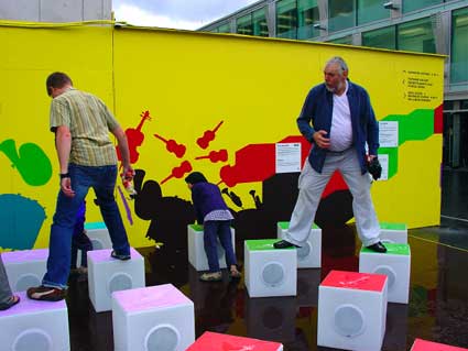
It turned out to be a huge success that the Royal Festival Hall directors could witness from their office windows not very far away. We also have had quite a lot of demand for it from around the world. We are now in discussion with the RFH and the Philharmonia to make a touring version.
In general, how much do you have to battle to get your vision of a work accepted? Do you get carte blanche?
It is very rare to get carte blanche, we feel the biggest trick is to be resourceful! Our process is pretty rational and directly responds to a client’s need, so it’s does not feel like a battle to have our ideas accepted. The biggest challenge is always to fully understand the context, the client’s desires and apprehensions, and then of course to make the idea work within budget…
Which kind of advice would you give to young designers who would like to work on similar projects? What are the pitfalls? What worked well for you?
We feel we’ve been pretty lucky with our opportunities, but our advice to new designers in the field— to see the opportunity to do something great in every brief, to think ahead and make the opportunity exciting even when the brief might not be. Gamelan Playtime’s initial brief was just a hoarding design that could have seemed somewhat boring, and made with a very small budget. But where there’s a will… Our first design had a great response and so the idea was allowed to grow. We also were careful to plan a basic interactive system that could be changed in a series of different installations, and luckily we were able to produce a series!
 Is there any spot in London where you´d love to install a work?
Many spots… of course the Tate would be nice. An installation for the Olympics as part of a celebration, that would be great. The New York City Subway has a great art installation and tile art programme, which has really changed the experience of using their transport system. We would love a chance to do something similar for Transport for London. Tube journeys are just torturous, the NYC subway isn’t a whole lot better, but when you are navigating the subway maze or arrive at stations where there is some kind of installation, you feel at least that your journey hasn’t been all that bad. It’s an opportune ‘dead’ time and space where people have the time to engage, if you can pique their interest.
Thanks Arlete, Melissa,and Kelsey!
All images courtesy of Milk and Tales.


