On the second day of OFFF, I walked in to a super-crowded presentation of the Graffiti Research Lab. It’s probably unnecessary to introduce their work as such, so just a few notes. GRL are obviously most well-known for their Throwies, which they themselves call “the most loved and the most hated project on the internet”, since they received a lot of criticism for tossing around batteries. While this is certainly true, the popularity of their work proves that it definitely strikes a chord with many people and if we’re talking about expanding existing cultural practices through technology this is something that they’ve certainly achieved for graffiti.
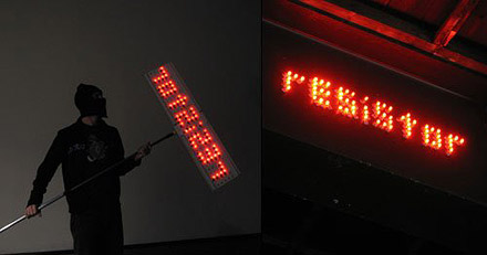 Night Writer
Their project Night Writer for instance uses Throwies to form words which then can be attached to metal walls, bridges, etc. (This was later copied and led to the infamous Boston bomb-scare for which GRL temporarily even were suspects because some related dude stole one of the Mooninites and posted himself on Flickr). These glowing pieces have something about them which makes them much more of a screen and thus creates a simple device which can actually compete with the ever-spreading urban screens which visually, at least at night, vastly outgun traditional graffitis. Another example of their work enabling artists to compete with modern advertisements is an incident when mineral water-makers Perrier were projecting ads in NYC, “guerilla”-style and coincidentially used GRL’s building as a screen. In response, they rolled out their Mobile Projection Unit and started to write over the ad. Eventually the “Perrier Krew” gave in and GRL scored in probably the first projection-battle ever.
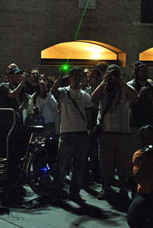
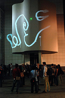
Writing on MACBA on the first night (notice the beam!)
In Barcelona, there’s now a mobile projector unit too which might be for rent at some point. GRL planned to use it in the city every night and were told off by the police at MACBA the first night (see previous post), announced they would project on El Corte Inglés (to cheers from the audience) the second night what they successfully did and were later told off again. But you can’t arrest people for playing with light, right? The third night they stayed at the CCCB, allowing people to try out the new brushes that Zach Lieberman had contributed.
The second talk of the day I attended were the guys from raster-noton (Carsten Nicolai aka Alva Noto, Frank Bretschneider and Olaf Bender). Their highly acclaimed label was formed in 1999 as a fusion of the two Chemnitz-based labels “rastermusic” and “noton.archiv für ton und nichtton”. From their very beginning, they agreed that they would regard the music they release as a series in order to be putting ideas about music and sound in the foreground rather than the persons who make it. This notion became even stronger when Carsten Nicolai joined since he had already had a background in fine arts where similar approaches are more common. One of the first releases was designed to be more an acoustic magazine with one statement per issue, eventually there were 12 releases. For the design they collaborated with BLESS who created almost translucent CDs and put them in extremely simple cases. What proved to be more difficult though, was how to design what will be holding the CDs together, the braces if you want. The solution was simple and effective: a 13th issue just contained 12 round neodymium-magnets to be put in the individual cases which could then be joined to a whole. Other series included the “static”-release with antistatic bags known from computer equipment and the “clear”-series that focusses on the same ultra-minimalistic packaging. However, over time they slowly moved towards a less strict style and also adopted cover designs, including a design by Japanese scientist Takashi Ikegami that depicts errors in loop systems. A beautiful project on the graphic design-side was Notationen Archiv that Nicolai’s students at HGB Leipzig created together with Cyan. They had half a year to each create their own notation systems from provided audio-tracks. The result was an amazing collection of booklets each from which could actually be played. In fact, everyone was so happy with the result that they eventually were produced in a small series.
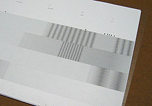
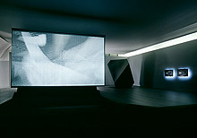 Notationen Archiv and spray
Carsten Nicolai’s own artistic work focuses on similar topics and maintains the same aesthetic quality some might find too rectangular but which has a great clarity about it that allows the underlying concepts to be perceived. In 2005, he has had his first retroperspective antireflex for which he designed two rooms: A black room in which the video spray and objects which intentionally alluded to the aesthetics of stealth technology. In return, the other room was bright white and thus revealed all the mechanics of the pieces it contained. The work which might best reflect raster-noton’s and Nicolai’s explorations into audio-visual perception is syn chron, which was shown at Mies van der Rohe’s modernist Neue Nationalgalerie in Berlin in 2004.
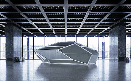 syn chron
A crystal-shaped object which the visitor could enter, its membrane-walls were equipped to be speakers while at the same time white laser-projectors textured them with patterns that related to the sound, rendering it a kind of synaesthetic sculpture. The lecture concluded with a performance that employed similar black and white patterns as video-projections, to great effect on the retinas of everyone who had managed to sit through the whole two hours.

