Staging Space: Scenic Interiors and Spatial Experiences, edited by Robert Klanten, Lukas Feireiss and Sven Ehmann (available on amazon UK and USA.)
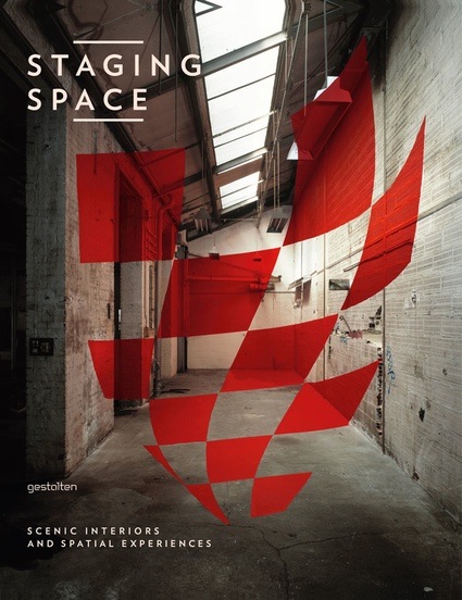
Publisher Gestalten writes: Staging Space presents an extensive collection of work in which images and space meld seamlessly into a single narrative entity. The spectrum of examples includes exhibition and event architecture, interior design, art installation, and stage design as well as multimedia brand concepts and light projections on city surfaces. The book also features an array of hybrid solutions whose focus lies on using space to achieve pre-defined dramatic effects.
The diverse international work collected in Staging Space demonstrates inspirational new applications for aesthetics, information technology, and sales pitches. Because this work crosses boundaries between creative disciplines and defies convention, it gives us the opportunity to appreciate the added value of a well thought-out presentation in physical space. This insight is especially relevant for those working as designers, interior decorators, and set designers, but also for those in advertising and marketing.
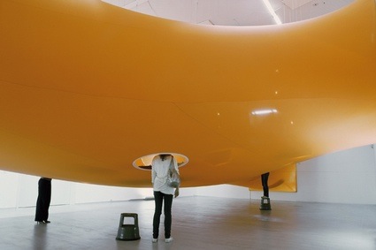 Magma Architecture, The head in | im kopf, Berlinische Galerie, Berlin, 2007
Another great volume by Gestalten. This one, however, features even less text than other books from the publisher i’ve reviewed in the past. If loads of images and a scarce but adequate amount of words is what you’re looking for as a Christmas present to yourself or cousin, go ahead!
The volume starts nice and clean with inventive interior design for office and home but it gets increasingly exciting, surprising and unbuttoned as you turn the pages. The last chapter, Spatial Explorations – Redefining Space in the Contemporary Arts brings wild constructions made of kilometers of string, sleek splashes of paints or trash. Shapes and materials swirl, break, hang, glow, bend or decay.
As usual, the book review provides me with an excellent excuse to show projects i’ve discovered along the pages:
The opening chapter, Scenic Interior – Indoor Spaces for Living and Working, looks at innovation in office spaces and private houses.
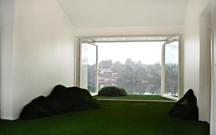
Visiondivision was commissioned to design an extension to a villa for two kids in southern Stockholm. Hill Hut is all about the landscape surface, with enhanced elements around and inside the house for the kids to play with.
Next, Brand Experience – Indoor Spaces for Corporate Communication from fair stand to retail store, moves decisively into the commercial sphere. The chapter reminded me that on a Saturday afternoon, no shop -no matter how wonderfully designed- can ever live up to the glossy images that emerge in magazines right before the store opens to the public. After that, it’s heaps of unfolded clothes, ugly wet boots staining the carpet floor, and big red stickers that advertise the Winter sales. Still, as the examples below will prove, brand experience is more than just fancy boutiques.
To celebrate the 100th anniversary of an English tea brand presence in Japan, nendo designed a cafe based on the Mad Hatter’s Tea Party in Alice in Wonderland. The size of the long table and rows of chairs was distorted to heighten the room’s sense of receding depth. Some of the chairs were so tiny visitors could barely squeeze into them. Other were so big that their feet couldn’t touch the ground. Silhouettes of characters from the novel were covering the wallpaper.
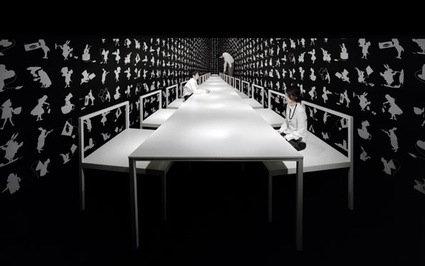 Nendo, Alice’s Tea Party, Tokyo, 2006.07
Gabriella Gustafson and Mattias Ståhlbom, founders of TAF designed Soft Parcel, a furniture range wrapped in fabric like parcels. The high-quality fabric looks like paper and the product becomes both a gift and a soft module that can even be loaded on a trolley to become an easy chair.

Third section, Themed Environment – The Art of Exhibition Design demonstrates that the art of designing an exhibition has started to be recognized as a form of creative expression in itself.
Cardboard Cloud by Fantastic Norway. A giant pixelated cloud made of some 3000 suspended cardboard boxes installed a couple of years ago at the Centre for Design and Architecture (DogA) in Oslo, Norway.

Viewcones –inspired by ‘ViewMaster’ toys– distributed around NAU‘s Matterball reveal flat screen monitors that showcase Alex McDowell’s original designs for films like ‘Minority Report’, ‘Fight Club’ and ‘Charlie and the Chocolate Factory.’
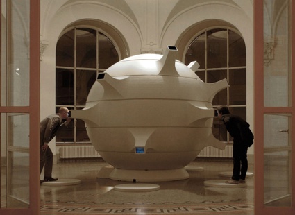 NAU, Matterball, Alex McDowells exhibition, FMX Stuttgart, 2007
Performative Spaces – Scenographic Environments for Stages and Shows is all about drama, fashion, theater as well as electronically enhanced environment. At this point, the book starts to get really exciting.
Thom Browne staged his fashion collection at Pitti Uomo Fashion Fair in Florence inside the Istituto di Scienze Militari Aeronatiche. In a 17 minute performance, male models gave an interpretation of a 1950s office environment in perfectly synchronized movements. They carried the same briefcase, hung their coats at identical stands, typed at identical desks, ate the same packed lunch.
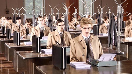 (image via trendland)
For the 2008 edition of the “Nuit Blanche” in Amiens, François Wunschel and Pier Schneider (1024 architecture) designed the BOOM-Box, an oversized ghetto blaster where the DJ stage takes the shape of a tape recorder.
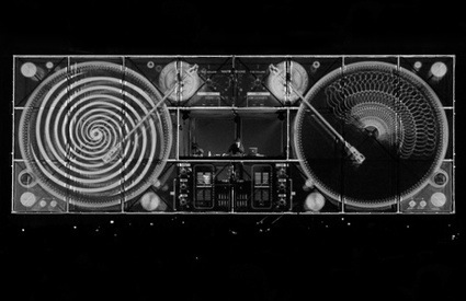
Final chapter, Spatial Explorations – Redefining Space in the Contemporary Arts is even more experimental than the previous ones.
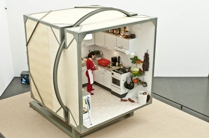
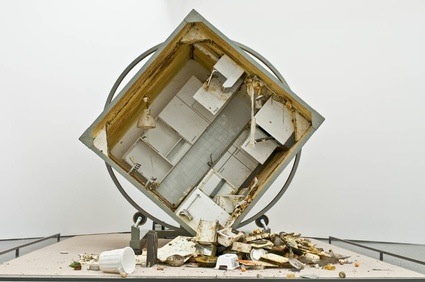
I’m quite sure i don’t have to give you explanation about what Zeger Reyers’ installation Rotating Kitchen is doing exactly.
 Marc Anthony-Polizzi explores ‘the domesticated chaos of the post-consumer world.;
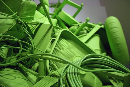
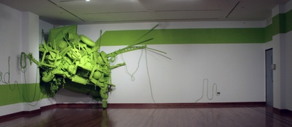 Marc Anthony-Polizzi, In Over My Head, 2010
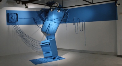 Marc Anthony-Polizzi, Sleeping Arrangements
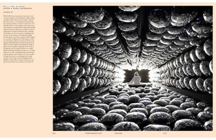
Views inside the book:
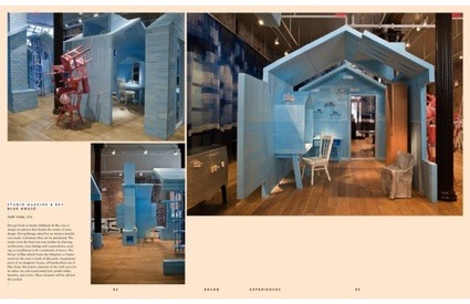 Studio Makkink & Bey, Blue House Droog

