 Andy Cameron is the Head of the Interactive Department at Fabrica, the Benetton research centre on communication located near Treviso, in an old villa wonderfully restored by Tadao Ando. Each year Fabrica invites young artists, photographers, designers, musicans, writers, interaction designers from all over the world to closely collaborate to “uncover the future.” His role at Fabrica alone justifies an interview of Andy Cameron. But there’s more to Cameron. He is also a founding member of the Hypermedia Reseach Centre at the University of Westminster in London. In 1994, he co-founded Antirom, a studio that investigated the nature of interactivity – how it operates as a language, what forms and figurations of rhetoric it makes available, and what novel structures of spectatorship it offers. The award-winning interactive agency worked for clients like Levi Strauss (more information about their Levi’s kiosk and its interactive toys), but also as an arts collective, with productions and performances at, among others, Sonar in Barcelona and the International Film Festival in Rotterdam. IN 1999, with two founding membes of Antirom, Andy Allenson and Joe Stephenson, he participated to the creation of studio Romandson Interactive Design in London.
Andy Cameron also edited one of the books which was most useful to me when i started investigating what interactive art and design could mean. The Art of Experimental Interaction Design is a great presentation of works by Ryota Kuwakubo, Antenna Design, Boutique Vizique, Ear Studio, ART+Com, Tmema, and other individuals or collectives whose works have left a mark on the interaction field.
I’d just advise that you browse through their website to get an idea of what they are doing at Fabrica. One of their latest projects i really liked was Home Entertainment at Colette in Paris, constructed out of industrial storage shelving and stacks of obsolete technologies from the 1980s – dial telephones, VHS tapes and old school ghetto blasters, recreated in perfect detail in flawless white ceramic. Like a place where old technologies go to die. Oh, yes! And please do waste some of your precious time on doodle.
In the center of all this obsolescence flickered an electronic screen, the only sign of life within the installation space, that showed a moving image sequence of hundreds and hundreds of ghostly faces, peering out of the window and trapped in a never ending video loop. These are the faces of passersby in the street who, by touching a sensor set into the window, have triggered a video camera to record a short sequence of themselves to add to the exhibition.

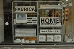 Home Entertainment at Colette in Paris
One of the goal of antirom which you founded in 1994 was to “explore interactivity and try to understand what made an interactive experience engaging.” You admitted at the time that it was “a simple question but one that proved difficult to resolve.” 12 years on, is the answer to that question any clearer?
It’s one of those questions where the answer seems blindingly obvious from one perspective, and yet it’s hard to work out what the answer actually means. The short version is that interactive experiences need to be playful to be successful – if you want people to use your stuff and keep using your stuff, make it playful. Play is the thing. Play is the basic drive behind interactivity – it’s the big ‘what if?’ aspect that keeps a good interactive experience humming along.
So now everyone’s talking about play. It reminds me of the 90s, how everybody used the word ‘narrative’ all the time – everything had to be narrative this and narrative that – but nobody really explained what it meant or why everything had to be narrative. Narrative is actually a very simple thing at one level – a format for telling stories – but it became this almost metaphysical quality, this magical, indispensable… something.
 Now the buzz words are play, playfulness, ludic and so on. I find myself using these words all the time and hearing these words all the time and yet I’m not sure we really know what their implications are.
In one way play is like narrative – play is a simple, formal thing, a way of setting things up. It’s a way of positioning your audience in front of something so they know how to deal with it. So too is narrative, even if the formal methods of narrative and play are pretty much the opposite of each other. They don’t mix very well. They are like two sides of the same coin – play is a technique that helps people construct stories, and stories are a way for people to recount and give meaning to what happened when people played a particular game at a particular time together. But formally they are very very different and very hard to mix together.
I’m increasingly interested not so much in what play is, but in trying to work out what makes it good – what makes this toy, this game, this installation, better than others. Thinking of interaction design not in terms of novelty or innovation but rather looking at each piece critically, in terms of the values and meanings and pleasures it can offer us. Are there any great works of interactive art? Which are they? Why are they so good? These are the questions I’m interested in finding answers to at the moment.
Has the interaction design scene changed since you joined it?
It’s changed and it hasn’t changed. There’s still the same crossover between commercial design and more experimental artistic design – people doing corporate websites in the morning and insane installations in the afternoon. I think this is a good thing and I hope it stays like this. You can read about this kind of crossover on your lovely website every day. There’s lots of superficial, technological change, but I don’t think this is as important as it seems. The fundamentals of good interaction design don’t seem to change much.
People are more and more interested in connecting interaction design with everyday life, everyday play. I mean in not really starting with certain kinds of technology in mind, but starting with certain kinds of activity in mind. And finding that interaction design, or making up games, doesn’t always need complex technology.
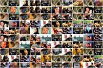
 10×10 and Barcode Installation
How much has the reaction of the audience evolved over time? Are they used to interactivity now, is it more difficult to surprise and entertain them? Is their feedback different from place to place (more difficult to please in London than in Bologna for example?)
I haven’t noticed it evolving. It used to be really hard to surprise and entertain people and it still is. That’s not going to change.
There are some cultural differences but I guess they’re kind of obvious. Ross Phillips, who used to work at Fabrica, and who now heads interactive at ShowStudio in London, made a wonderful project with me at Fabrica called Face – the installation lets people control a camera to record a few frames of themselves and add it to a kind of collaborative ever looping ever growing movie. It’s really simple and very deep at the same time – a really rich piece of interaction design. We did it in a gallery in New York as well as Benetton store windows in Italy, Hong Kong and Istanbul. We did a version in Colette in Paris. Ross did the same thing in London – in Liberty’s window just off Regent’s Street – and London was the only place where women flashed their breasts for the camera. It’s something to do with the way they booze it up in London. And the fact that English women never seem to feel the cold.
How do you think interaction design/art is to evolve over the next few years? Do you see new frontiers, new aspects to explore?
I think ‘frontiers’ is the wrong word. I think we have to get over the whole idea of exploring new territory and boldly going where no man has gone before… Maybe this is a personal thing, maybe I’m talking to myself here. The idea of being a pioneer is such a very compelling one. I remember at Antirom there was a real competitive energy around the idea of coming up with original stuff, being the first one to do this or that. I started thinking about all this seriously a few years ago when I met the great Myron Krueger at Ars Electronica. We talked about his work – (when you’re with Myron you tend to talk about Myron and his work) – and I was completely knocked out by a) how important he is as an artist and b) how completely ignored he’s been by the mainstream art world. Why isn’t he in the permanent collection at the Tate, at MOMA? Why isn’t he in the art history books? And what I think it comes down to is this relentless rhetoric of exploration, of discovery, of trailblazing and groundbreaking and being in the vanguard. When you look at someone like Myron Krueger and his life’s work you get the feeling that he was so busy exploring new frontiers that he didn’t really take the time to exploit the extraordinary interactive scenarios that he invented. You also get a sense of how easy it is for an unsympathetic critic to dismiss Myron’s work as being that of a crank inventor rather than a serious artist. I suppose this is what the geek ghetto is for. I wrote about this last year in a piece called “Dinner with Myron Or: Rereading Artificial Reality 2: Reflections on Interface and Art”*.
None of which answers your question. What I’d like to see happen is for interaction designers and artists to let go of the relentless search for the new and try and make work which is as good as work in any other medium. I suppose what I’m saying is I’d like to see interactive art and design grow up a little.
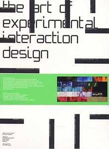 You edited “The Art of Experimental Interaction Design” in 2004. I’ve always been surprised by the fact that you chose to put two words like “art” and “design” together. I thought that the art and the design worlds didn’t like to be mixed together. Did i miss something?
My idea was to try and cram as many buzzwords into the title as possible so that as many people as possible would buy it. Of course it didn’t work like that – artists were put off by the word design and designers were put of by the word art and everyone else was put off by the word interaction which apparently is so passé. I’ve never really felt that art and design are so far apart – this implies a romantic notion of what art is and especially what an artist is. But the real reason for the title was a cunning marketing ploy and I can tell you it failed miserably.
Which exhibition space do you regard as ideal for your installations? The window of a trendy shop in Paris or a new media art festival? How about a museum?
Does Benetton gives you carte blanche? Can your projects for fabrica be as experiemental as you want? Or are there any limits you should respect?
You know what – I’m grateful for any chance to put the work we do in Fabrica out in the world. I really don’t see a shop window as less of an opportunity than a new media arts festival or a gallery or a museum. They’re different audiences and they have different problems and different advantages. The web too – some of the more interesting work done at Fabrica in the last few years has been online – I’m thinking of Juan Ospina‘s Flipbook or Jon Harris‘ 10×10 or the Hatemap project by Harun Alikadic which aggregates extremist websites in a fun-to-use Flash interface. And we’ve just done benettonplay.com which is an experimental games site for Benetton, and which I am very proud of – check out Hansi Raber‘s doodle toy to see what I mean. Although Fabrica is wholly owned by Benetton, they really do have a very light touch when it comes to setting limits. Which is actually incredibly smart of them. 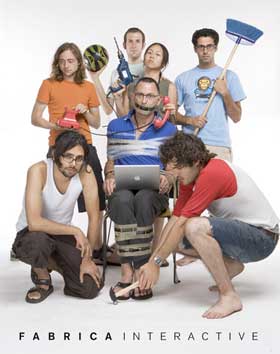 Fabrica invites young creatives from all over the world to join its research centre. They stay a year or two. What is the plus side and the down side of having people come and go so regularly? Don’t you feel that a more long-term collaboration would be better sometimes?
The plus side is that we get a constant turnover of some of the best new talent, under 25 years old, from across the world. Yes, it can be frustrating to lose people after a year or two, but actually it’s not so clear cut – people go out and get on with their creative careers and at the same time maintain a continuing relationship with Fabrica and what’s going on there. Fabrica is situated in the countryside outside Treviso – far from the bustling creative centres of the world – so we work hard to build and maintain relationships with ex-fabricanti and with other artists and designers.
You told me about your respect for Nicolas Bourriaud, one of the few critics who understand the use of performative and interactive techniques. How much does his thinking influence the works developed at the interaction unit of fabrica?
Bourriaud doesn’t influence what we do but the way we think about what we have done. I’m ashamed to say I wasn’t aware of his work until a couple of years ago when Angela Vettese, the critic and curator and head of a contemporary art centre in Venice, the Fondazione Bevilacqua, gave a lecture on relational art at Fabrica. She didn’t talk about interactive art or art that uses computers per se, but what she said had incredible relevance for the issues of spectatorship and authorship and language that have concerned me for a long time – since Antirom and before. She referred quite a lot to Bourriaud’s ‘Relational Aesthetics’. I read the book and found that here was a critical theory – and a body of work – that was struggling with precisely those questions which we were struggling with – how to deal with the fact that the artwork is not made by the artist but by the audience? What is the aesthetic? How do you know if it is any good? How to deal with banality? How to let go? It seems to me that the work of artists like Rikrit Tiravanija or Liam Gillick provides a real opportunity for interactive artists to think about what they are trying to do with technology, but from a different perspective. A perspective which has absolutely nothing to do with technology.
It was also a kind of validation, which I know sounds a bit pathetic, but there it is. Not of any particular piece of work – I’ve no idea if Bourriaud likes or even knows about interactive computer based art, or media art – but of an approach to making art and a way of thinking about what art can be. I’ve long been perplexed by the ghettoisation of interactive art and Bourriaud’s Relational Aesthetics seemed to me to offer a way out of the ghetto. It offers a critical approach to interactive art which doesn’t rely on technical novelty but on broader questions of audience and agency.
We’ll see. A new Fabrica group show, curated by Silvia Marini, Ann Poochareon and myself, called “I’ve been waiting for you” which explores the links between relational art and interactive art, is opening at the Triad gallery in Seoul in November this year. And we’re showing several relational/interactive pieces at the Pompidou Centre in Paris as part of a major exhibition of Fabrica art and design this October.
Can you name us 3 interactive works you find particularly interesting? Why?
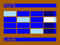
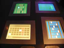 The Composition Station by Andy Allenson with Joe Stephenson, at the Science Museum in London. The piece is a table with 4 touch screens embedded into it – each screen has a musical grid which lets you compose a simple repeating pattern of notes. The key thing is you can change the number of notes in your grid and let it slip away from the other grids. So you get these really interesting patterns emerging from the combination of simple numbers – a 3 against a 4, a 7 and an 11 for example will give an unbelievably complex sequence. Andy Allenson was inspired by his experience of playing in a Balinese Gambelan orchestra – but the piece also seems to owe something to the music of Steve Reich. The Composition Station lets you explore something really fundamental about time, numbers and music – it’s a glorious piece, rich and hypnotic and fascinating. You can get a taste of it on the Rom:One CD-Rom, (Mac OS 9 version only)
And you can see more pictures at http://www.pickledonion.com/cs/index.htm
Marie Sester‘s Access, made at Eyebeam in New York in 2003 and shown at Ars Electronica in the same year, is a piece for public spaces in which a robotic spotlight tracks a person as they walk across an area. It’s funny and scary at the same time – it’s got this deliciously double edged quality to it. As Sester comments in her notes about the piece “beware. Some individuals may not like the idea of being under surveillance. beware. Some individuals may love the attention.” It’s a great example of how interactive work can be meaningful without making a statement – the work is concerned with issues of surveillance, but it’s not making a statement about surveillance, rather it’s staging a mise en scene of surveillance and doing it in a way which manages to be playful and profound at the same time. Photos of Access and videos.
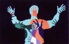
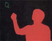
And finally I’d have to include Videoplace created by Myron Krueger right back in the 1970s. He came up with the supremely elegant idea of having the spectator stand in front of a screen and a camera and seeing the image of themselves projected back onto the screen in real time. The result is a literal embodiment of the audience within the artwork where the body itself becomes the interface to kind of self portrait. It’s a basic blueprint for some of the best interactive art created in the last decades – I’m thinking of work by artists like Scott Snibbe, Golan Levin, Rafael Lozano-Hemmer and many others. Videoplace helped us to recognize what Krueger called “a new category of beauty” in the world – an aesthetic which is properly interactive – and for this I am truly grateful to him.
Thanks Andy.
Catch up with Andy’s Interaction Unit at the Fabrica: Les Yeux Ouverts show at the Centre Pompidou, in Paris, it opens October 6 until November 6. They have another piece at Triad in Seoul opening November 15 2006.
Interactive Fabrica promo poster found at Ann‘s place. Pictures of Fabrica’s installations courtesy of Andy Cameron.
*Cameron, Andy. “Dinner with Myron Or: Rereading Artificial Reality 2: Reflections on Interface and Art”. In aRt&D: Research and Development in Art, ed. Joke Brouwer et al. V2_NAi Publishers, 2005. ISBN: 90-5662-423-7.
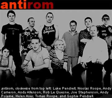
UPDATE: i couldn’t resist. As soon as i saw the image that Ann had blogged of the ten Antirom guys, i knew i had to post it as well. Congrats to Mister Roope for the lovely Hawaii t-shirt.


