eTech notes and images from From Paddles to Pads. Is Controller Design Killing Creativity in Video Games?
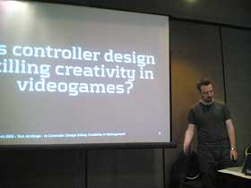 Tom Armitage is neither a game designer nor an interaction designer, he’s just been an addicted player for 20 years. So he’s speaking about the consumer perspective.
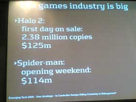
The gaming industry is very big. Bigger than Hollywood as it is often said.
Gaming has many problems. One of them is that games are repetitive. The industry knows they can make big money by just selling the same game (different versions of it) again and again and again.
The new Nintendo Revolution Remote doesn’t promise to change only the way we play games but also change the game itself.
Those who designed the controller shown below assume that you’ve already used a joypad before. The NES pad had four direction, it is pretty simple to use even if you’re not a gamer (from 1982 till 1990). Till the SNES pad the progression has been gentle. But if you skip one generation and didn’t follow the evolution, you’ll have some difficulties to adjust to the new generation. All current pads are pretty much the same.
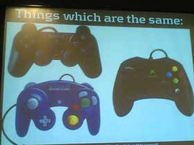
Now if we have a look at handheld we can see that they are roughly identical to those from the past generations. It’s fairly easy to use them. But take the Xbox pad, if you’re not a gamer it’s quite scarry. The ergonomy is OK but the pad offers so much choice and you can’t concentrate on trying to find which is the button you should to press while keeping your eyes on the screen.
Two quotes by Nolan Bushnell (Atari): “Complexity lost the gamer.� “People are interface phobic.� Which doesn’t mean that people hate interface (they have to deal with interfaces all the time in the everyday life), but we just like transparent interfaces.

Image of Alex, Tom Armitage’s girlfriend (she’s first intrigued,, then puzzled and finally pissed.) Alex plays Halo but there’s too much to push, to much to do, plus she has to look at what’s going on on the screen. It is the controllers that are scarring people off.
Current game pads are restrictive and we shouldn’t forget that gaming isn’t limited to the screen.
Examples of this aesthetic issue:
– Singstar, a karaoke game. You instantly understand that you have to sing in the microphone and the way to use it is straightforward, you immediately know how to use it. Karaoke comes with a lot of assumptions: it’s to be enjoyed with friends, you don’t take it too seriously, you’re there to have fun, etc. All this information is already in the device and you perceive it even before playing.

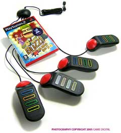
– Buzz says “play with other people.â€? Non threatening device.
– Donkey Konga: it’s a very rewarding game because your hands come into contact not with plastic but with what really feels like a drum. Very satisfying.

All of these controllers are very familiar items. They don’t say “game� but “sing�, “quizz�, or “make music.�
Now take Guitar Hero: it has five buttons. £ buttons would be great because you wouldn’t have to move your hand then and this would make the experience much more easy. 5 buttons require a lot of dexterity. However, you can start low and feel your progression. You are also invited to strike fun poses. This says “Mess around�, play with the controller, take stupid poses, etc.
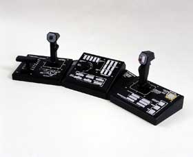
Steel Battalion: very complex interfaces, loads of buttons. But this again tells a lot about the universe of the game. Having many buttons to press reminds of those movies in which we see the hero facing a complicated challenge, he’s on his spaceship/battleship and has to switch a lot of buttons to save the situation.
Halo: a first person shooter game that comes with a twin stick control.
Metroid Prime: once again there’s a first person perspective, aliens to master, etc. But there’s no twin stick, just one
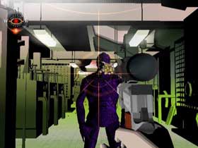
A game can also communicate about its style. For example Killer 7. It’s super weird, the graphics are not conventional and even the controls are mad.
Micro Machines 2 by Sega lets you have 8 people play at the same time. You can share a game pad between two people: one would handle the part on the left and the other the part on the right. And the fun begins.
The aesthetic, ethic nature of the game should be conveyed in the design of the controllers. To create new ways of interacting we have to break from archetypes.
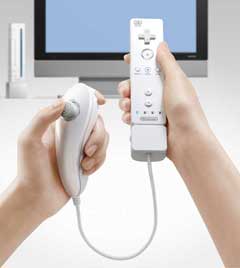
A left-handed person might have problems to manipulate the controller. The new Nintendo controller would solve the problem. The revolution comes from the nunchuck: if you want to swap the controls, all you have to do is just swap hands.
It’s sad that gaming at home is so much restrained and controlled by those controllers. When a video game is represented on television, in comics, all they have to do is show the controller, and you don’t need to see what’s happening on the screen to understand it’s a home game.
But games are so much more than controllers.
