Visual Storytelling- Inspiring a New Visual Language, edited by Robert Klanten, Sven Ehmann, Floyd Schulze (available on Amazon USAand UK.)
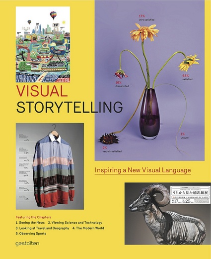
Publisher Gestalten says: Visual storytelling uses graphic design, infographics, illustration, and photography to convey information in the most elegant, entertaining, and informative way. Today, the creative scope of existing visual storytelling techniques is being expanded to meet the formidable challenge of extracting valuable news, surprising findings, and relevant stories from a daily flood of data head on. Visual Storytelling is the first book to focus solely on contemporary and experimental manifestations of visual forms that can be classified as such. The rich selection of cutting-edge examples featured here is put into context with text features by Andrew Losowsky and interviews with experts including the New York Times, Francesco Franchi, and Golden Section Graphics.
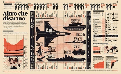 Francesco Franchi, visualization about military spending and armament
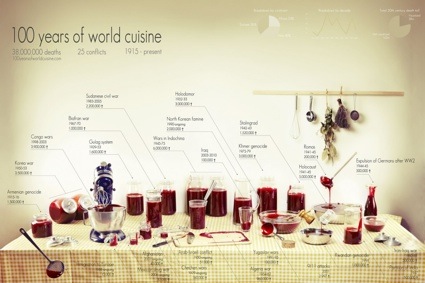 Clara Kayser-Bril, Nicolas Kayser Bril and Marion Kotlarski, 100 years of world cuisine
Visual Storytelling was the big surprise of the last batch of books that Gestalten kindly shipped to me. I thought that volume would be merely lightweight and amusing but it turned out to be far more striking and informing than expected. Hundreds of works are presented in the book. Yet, there’s no redundancy, no boredom, no weakness. It’s a perfectly well curated collection of some of the projects that have spread over countless design/graphic design/interaction design blogs over the past couple of years. Some of the works presented are more narrative than others but page after page have brought me revelation and wonder. I must confess that i don’t read many design blogs (up to zero actually) so it’s probably not much of a challenge to amaze me.
In his introduction, magazine editor and journalist Andrew Losowsky defines ‘visual storytelling’ as a combination of narrative information and emotional reaction, he charts its history, explains its challenges, its ability to substitute data complexity with order and clarity and rejoices in its total absence of universally accepted rules.
The first part of the book contains interviews with a few creative studios: DensityDesign, Les Graphiquants, Steve Duenes, Antoine Corbineau, Carl Kleiner, Peter Grundy, Jan Schwochow and Francesco Franchi. Franchi is the art director for IL-Intelligence in Lifestyle, the monthly magazine of Il Sole 24 ORE, and his work is particularly arresting. Gestalten TV interviewed him recently:
The second part of the book is entirely left to images and short descriptions. The works range from graphic design to software pieces to installations to wall paintings and they are distributed over 5 themes: News, Science, Geography, Modern World and Sport.
Now for a quick selection of some of the works i discovered in Visual Storytelling:
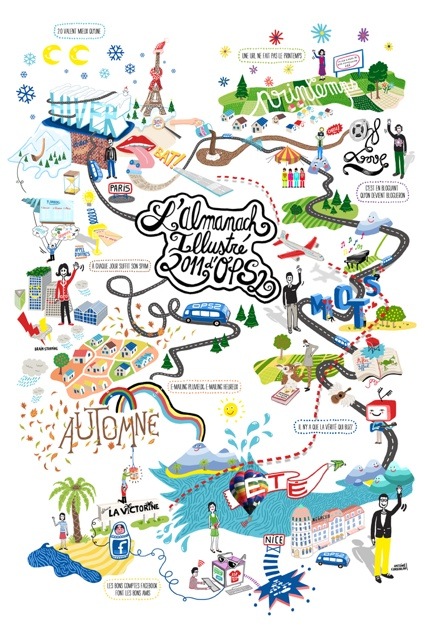 Antoine Corbineau, OPS2 – Almanach season’s greetings 2011 poster
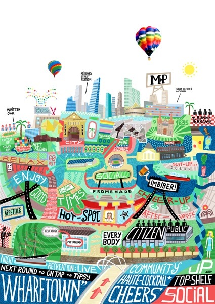 MELBOURNE PUBLIC Restaurant
Roland Loesslein‘s installation, Digging in the Crates, uses modified turntables to navigate dynamic data visualization. The works also uses info graphics and sounds to allow the public to explore Sampling as a production technology of music.

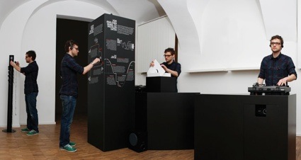 Digging in the Crates. Photo by Sebastian Buehler
Yuri Suzuki and Masa Kimura‘s Breakfast Machine is a Rube Goldberg contraption that makes and serves eggs, coffee or tea and a toast with jam.
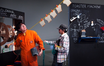 Yuri Suzuki and Masa Kimura at work – photography Johannes Abeling
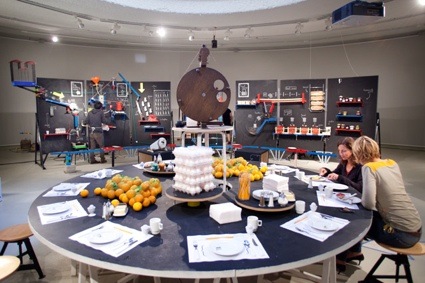 Yuri Suzuki and Masa Kimura, Breakfast machine
 Yuri Suzuki and Masa Kimura, Breakfast machine
Lang/Bauman gave an urban edge to a traditional village in Switzerland by painting lines on the streets that evoke a subway map.
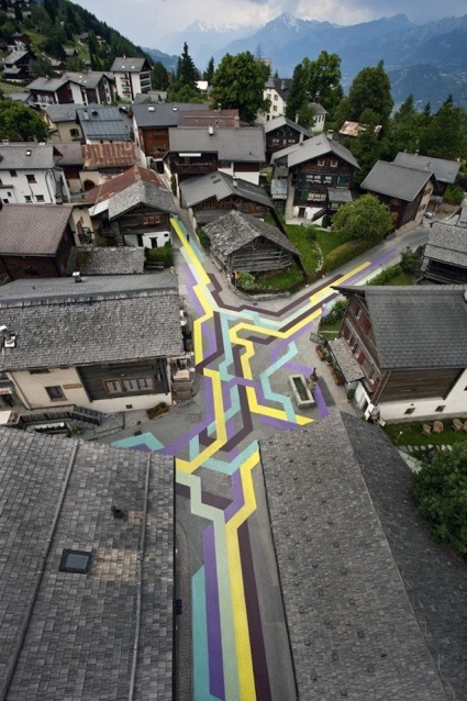 Lang/Bauman, Street Painting #5 (Vercorin)
For their film Immaterials: light painting WiFi, Timo Arnall, Jørn Knutsen and Einar Sneve Martinussen built a WiFi rod that pulses based on the strength of a selected wifi network.
Kali Arulpragasam‘s oversized necklaces pay homage to conflict-torn countries.
 Super Fertile, From the line “Tourism (Terrorism Affects Tourism)”
During 250 weeks, LAMOSCA did an an infographic commentary for newspaper La Vanguardia. Each infographic was inspired by the week’s cover theme
 Data 75 – Homicides in Russia per 100 000 inhabitants
 Data 68 – Light efficiency
Wataru Yoshida‘s mock exhibition posters Composition of Mammals.
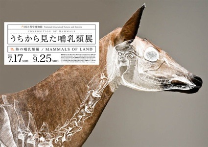
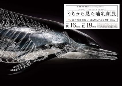
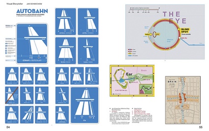
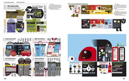
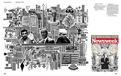
Views inside the book (Images: Gestalten):
Related book reviews: Visual Complexity, Mapping Patterns of Information and Data Flow 2: Visualizing Information in Graphic Design.
