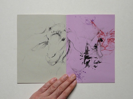
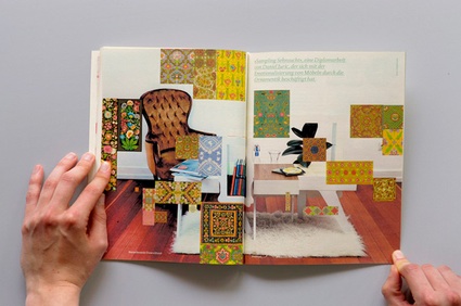
Neuland, The future of German graphic design, by TwoPoints.Net (Amazon USA and
UK.)
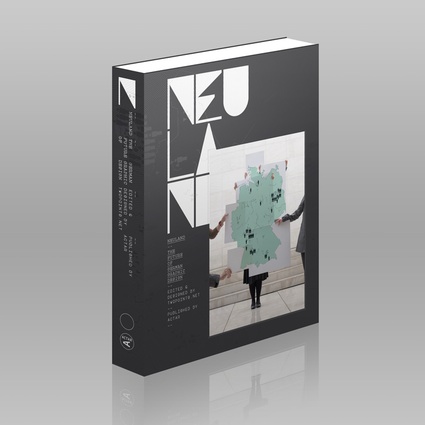
Publisher Actar says: German graphic design has undergone a dramatic metamorphosis in recent years. Young professionals and students have been demonstrating heightened technical skills and strong, individualistic styles. The emerging design generation has broken with cultural and geographical boundaries, entering the international arena and competing with cutting edge design icons worldwide. As the scope and depth of this exciting development has been under recognised, Neuland documents the future of German graphic design by presenting the best work of up-and-coming designers and design studios. This book compiles over 400 pages of exciting ideas, never before seen experiments, self initiated projects and commercial work from Germans working and studying at home and abroad, as well as non-Germans working and studying in Germany.
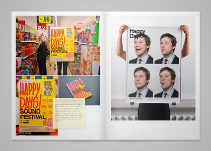 Inside the book
Design studio TwoPoints.Net looked up and down the blogs, magazines and design institutions, asked for recommendations and suggestions, reviewed some 700 portfolios and ended up with a selection of 50 graphic designers and graphic design offices to be featured in the book.
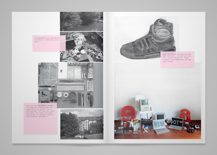 Inside the book
Neuland is not TwoPoints.Net‘s first adventure in the publishing world. The designers are also behind the irresistible design of Super Holland Design, a book dedicated to contemporary Dutch design. TwoPoints.Net is based in Barcelona, yet neither Super Holland nor Neuland reflect their own independent practice nor do they have a Barcelona feeling. Instead, the books seem to have been designed respectively by Dutch or German designers.
Martin Lorenz from TwoPoints.Net throws light upon their strategy: “We work very hard on not having a style. All our inspiration comes from the project itself. In the case of the two books you mentioned, the German and the Dutch culture. This is a very exciting trip for us, starting to get to know the project and its essence, learn from it and then try to do something new or different. This is what is innovation to us. Its not the isolated genius that comes up with the idea that never has been there before. Its the person that is interested in the things that are happening around him and know how to add his bit to culture.
With Neuland this trip was especially exciting because we did besides the design as well the edition of the book.”
Lupi Asensio from TwoPoints.Net explains the differences between SHD and Neuland: “In Super Holland Design we did a grid that we did not respect always cause we know well dutch design as we studied there, and one of the characteristics is they are really lovers of experiments and transgressions of the rules (something we love). In the case of Neuland, the whole grid is DIN size, since is about German design. Is just a small detail that shows how we think in very project considering the content. We never want to put ourselves “over” the content but find the best way how our design can help the content to shine for itself (something specially important when is about design books, so we don’t have a competition going on between our work and the work that is portrayed there).”
Because Neuland means ‘new territory’ in german, various maps locate the schools where the designers featured in the book have studied and where they are based today. It turns out that Berlin is far from being the city that counts most graphic designers. Who would have thought that Darmstadt and Stuttgart were such hotbeds of design creativity? Each of the designers selected get a dozen pages. There’s a selection of their portfolio, their contact details but also some images of their studio, the neighbourhood where they work and of an object or landscape they find typically German. In short interviews, the designers share their working process, their aim, their definition of what is ‘german’, etc. They also get to give their view on the state of contemporary graphic design in the country and their opinion contradicts splendidly the pages that feature their own work. Many of them define German design as being bland, stiff, tame. A duo of designers even declare that there isn’t any such thing as German design yet. I’m no expert in graphic design but, based on what i’ve seen in Neuland, i have to disagree with these stern opinions about contemporary German design. Check out for yourself:
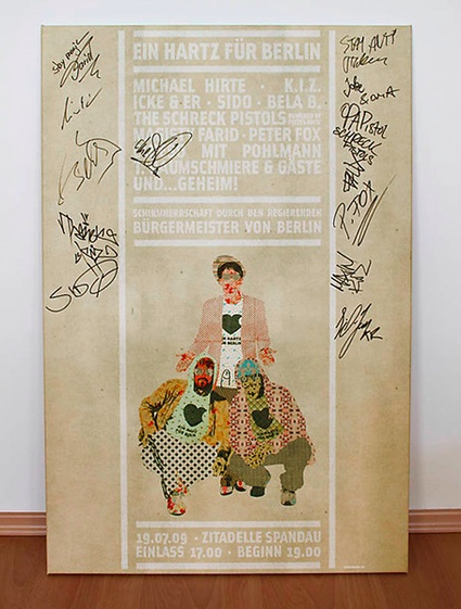 EIN HARTZ FUER BERLIN by Oliver Wiegner aka Ice Cream for Free
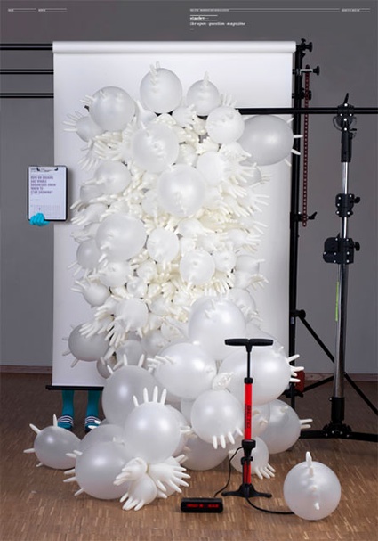 A cover for STANLEY – The Open Question Magazine, by Katrin Schacke
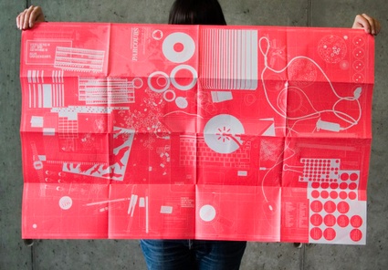 Design for Parcours 2007 by Katrin Schacke
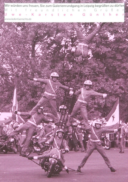 LFN Rundgang, by Jung und Wenig
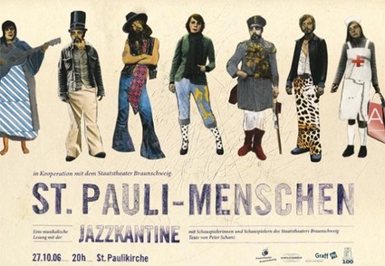 One Hundred Years “Pauli Menschen”, by Rebootlab
Previous book reviews on graphic design: Three D: Graphic Spaces, Enter Spanish Creativity, Tactile – High Touch Visuals, Super Holland Design, JPG 2: Japan Graphics.

