I first heard about the Swiss Architecture Museum one month ago while i was visiting the Contemporary Art Space in Castellon. Reactivate!, the exhibition which closed yesterday had in fact been curated by the SAM. That day, i made a mental note to add a ride to Basel in Switzerland to the agenda.
Architecture-wise the trip started really well. I found a nice hotel which happened to have the most striking parking space i had ever seen:
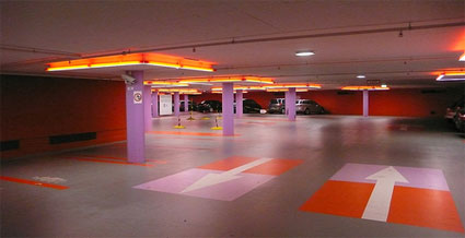
But as far as the SAM is concerned the building itself looks nothing short of ordinary. The programme and the design of the exhibitions, however, are outstanding. Apart maybe from the Netherlands Architecture Institute, i can’t think of any other place which curates and presents such stimulating and intelligent exhibitions dedicated to architecture. The one currently on view should give you an idea of what i mean.
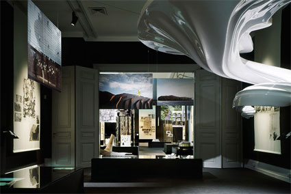 Installation view © Tom Bisig
Curated by Oliver Domeisen and Francesca Ferguson, Re-Sampling Ornament comes exactly 100 years after Adolf Loos wrote Ornament and Crime, an essay which claimed that ornamentation of objects and architecture was a waste of time and a sure way to make buildings obsolete.
Re-sampling Ornament takes a first step towards tracing its re-emergence at the heart of architectural practice.
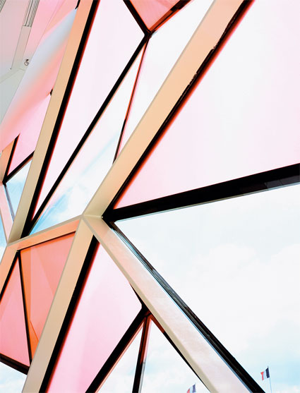 Manuelle Gautrand: Interior view of ‘C_42’ Citroën Flagship Showroom, Manuelle Gautrand, Paris, France (2007). © Philippe Ruault
The exhibition demonstrates how the development of construction and manufacturing processes (think 3D computer modelling, rapid prototyping, CNC milling, laser cutting, etc.) have enabled the rise of a new culture of ornament. One which is not only innovative and aesthetically stunning but also economically viable.
Domeisen‘s research into the history and contemporary application of ornament in architecture has helped articulate the exhibition around associations and groupings that can identify vital traces of ornament in current practice, delineate its boundaries, and place it into a historical perspective.
A crystal clear example of how much some of the contemporary high-tech ornaments allude to past experiments is Evan Douglis Studio‘s Helioscopes which gives new twists and turns to the 18th century French Rococo style.
Computer-aided design allows him to push to the extreme the organic forms and artifices of an invasive ceiling.
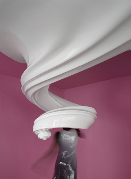 Evan Douglis Studio LLC, Helioscopes, Los Angeles / Chicago / New York, (2006-2007) © Michael Moran
Equally ingenious and astonishing is the facade of the Gantenbein Winery, Fläsch. Bearth & Deplazes Architects designed the project, and invited Gromazio & Kohler to create its façade.
An innovative robotic production method, developed by Gromazio & Kohler at the ETH in Zuerich, ordered the 20,000 bricks according to programmed parameters, at the desired angle and at the exact prescribed intervals. Seen from afar, the bricks look like pixels, each of them reflects light differently and plays with the viewer’s location and the position of the sun over the course of the day. Besides, the masonry acts as a temperature buffer, filtering the sunlight and allowing daylight to enter the hall through the gaps between the bricks.
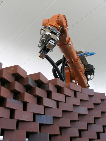 Programmed robot building up the brick wall © Gramazio & Kohler, ETH Zürich
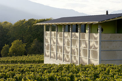 Bearth & Deplazes with Gramazio & Kohler: Vineyard Gantenbein, Flaesch, Switzerland (2006). Exterior view. © Ralph Feiner
Nieto Sobejano Architects have worked in close collaboration with realities:united (quick note: there is a great interview of the Berlin-based architects in BauNetz) to design the spectacular facade of the Espacio de Creación Artística Contemporánea, a new Centre for Contemporary Art in Cordoba, Spain (completion in 2009). They created a ‘media façade’: the building is cloaked with a semi-transparent membrane of computer-controlled neon lamps that enable the programming and screening of pixellated film sequences. The main facade will act as a dynamic surface that reveals the Center’s activities to its urban surroundings and plays with perception. By day the facade, made of concrete panels can be enjoyed for its tactile beauty, by night it turns into a communication instrument made of over 1300 elements of various size.
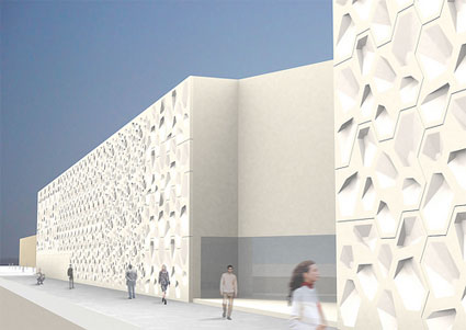 Nieto Sobejano Arquitectos in collaboration with Realities:United. Centro de Creación Contemporánea de Córdoba: Pixel Architecture – East by day. ©2006 realities:united
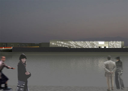 Nieto Sobejano Arquitectos in collaboration with Realities:United. Centro de Creación Contemporánea de Córdoba: Pixel Architecture – East facade by night. ©2006 realities:united
The East Beach Cafe, by Thomas Heatherwick Studio (you might remember his Rolling Bridge), is a long, thin building without flat, 2D façades. The building is sliced diagonally into rusted and oiled steel ribbons which wrap up and over the building:
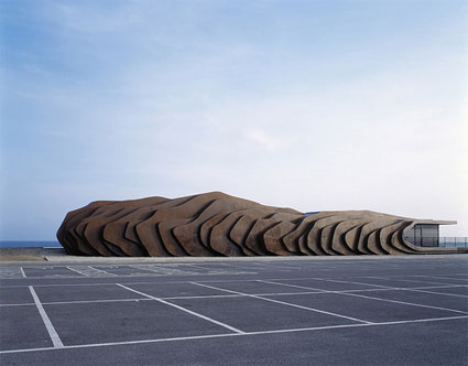 Thomas Heatherwick – East Beach Café, Littlehampton, West Sussex, England (2007), exterior up view. © Steve Speller
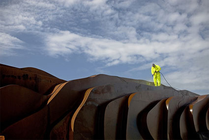 Thomas Heatherwick – East Beach Café, Littlehampton, West Sussex, England (2007), Close up view. © Steve Speller
Danfoss Universe is a 5.5 hectar science museum park in Nordborg, Denmark.
J. Mayer H. designed its most striking area, the Cumulus exhibition building (curiosity center) takes its name from the almost organic and cloud-like roof silhouette, repeated in the ‘Food Factory’, aka the cafeteria. The building exemplifies a trend where ornament is not just covering a construction but is part and parcel of its structure.
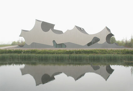 Juergen Mayer H. Architects, Danfoss Universe: Exterior View of the Curiosity Center. © J. MAYER H. Architekten
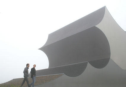 Juergen Mayer H. Architects, Danfoss Universe: Exterior View of the Curiosity Center. © J. MAYER H. Architekten
Francis Soler‘s work for the French Ministry of Culture and Communication is one of my favourite sights in Paris. The architect unified two existing buildings which each came with a different architectural style by wrapping them in a continuous mesh of steel lace. More images.
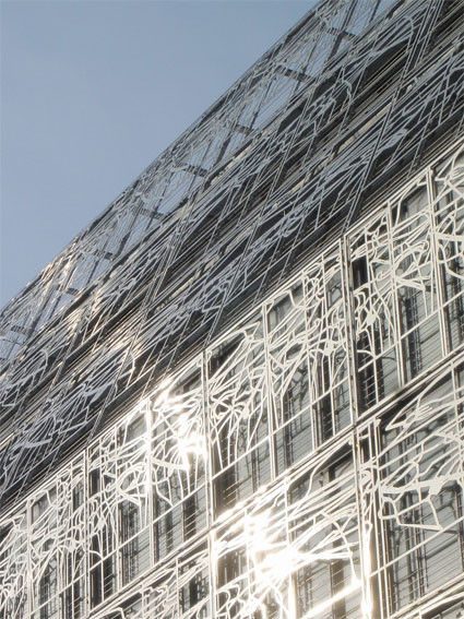 Francis Soler, Frédéric Druot: Ministry of Culture and Communication, Paris, France (2005). Exterior detail. © Francis Soler
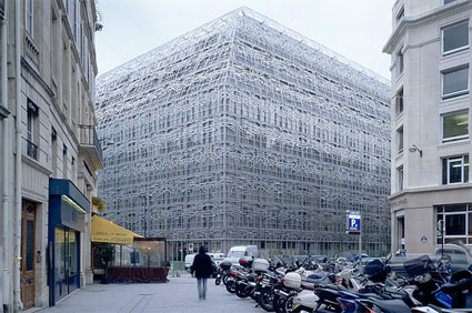 Ministry of Culture and Communication: Exterior View – Ornament connecting old and new. © Georges Fessy
That was just a quick overview of a small number of the projects i discovered at the Museum. If you can’t make it to Basel, the Swiss Architecture Museum has published Re-sampling Ornament, a remarkable catalog that explores with more depth the topic and details each of the projects exhibited during the exhibition.
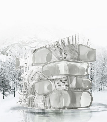 R&Sie(n) / Roche, Lavaux: Water Flux in Winter, Evolène, Switzerland (2009). © Francois Roche / R&Sie(n)
All my images.
Photo on the homepage: Thomas Heatherwick – East Beach Café, Littlehampton, West Sussex, England (2007), Close up view. © Steve Speller .
On view until September 21 at the Swiss Architecture Museum in Basel, Switzerland.

