 John Maeda curated the Simplicity symposium at ars electronica and i think he did a great job at selecting and briefing the speakers. Unless the previous editions of ars electronica i attended, most of the speakers where not new media artists or critics or experts. They were designers, curators, scientists, architects explaining what they are working on.
Here’s my notes from the talk that Sam Hecht gave this morning.
Sam Hecht (UK) studied industrial design at Central St. Martin’s
College of Arts and Design and received his degree in industrial design from the Royal College of Art in London. He has been the recipient of numerous prizes. Together with his partner Kim Colin he established a design studio based in London in 2002: Industrial Facility. Their list of clients includes Muji.
He first gave examples of design or ideas that clearly needed to be improved:
– phone box are now obsolate because of the use of mobile phone so the phone booth are now given new missions. He showed a mobile booth turned ATM machine: you cannot enter the booth anymore, its inside now contains all the technology and you, as a human being, have to stand out in the rain.
The key concepts he’s interested into:
1. Landscape.
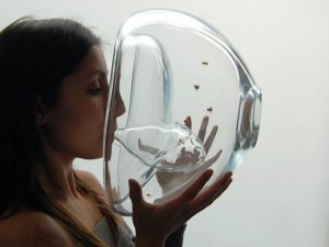
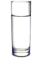
Hecht showed a picture of a glass of water similar to the one below. It would be impossible to re-create this image of the glass in real life. A glass of water is never isolated from its context, you’ll see it on a shelf, in the hand of someone, etc. When you design you have to think about everything that might surround this glass. The boundaries of design merge into the context of the glass used.
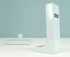 Cordless Telephone
Example of Industrial Facility’s work:
– The Cordless Telephone: a cordless phone is not used regularly but intermitently. The designers wanted to see how far they could go to make the phone part of the background. All details were removed from the phone. Still, it performs like any other. The buttons have been placed at the back and it stands upright rather than reclining. Our expectation of a phone doesn’t look like this one.
– The Landscape Camera: the device has no controls and no viewfinder. Instead, it has a reflective surface that displays the end photograph in its true proportions; it’s the person who has his or her photo taken that choreographs the action.
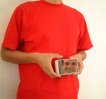
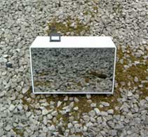 Landscape Camera
2. Renaissance and Dependence
Let’s imagine that the human being is not at the center of the universe but is at the same level as the rest of the planet. What if things could work independently from the human being, what if they didn’t need him?
– Early experiment with Muji: The Second Telephone. It has very limited features and allows only basic communnication. It relies on one wire and needs no electricity nor base station. It is activated when picked up, the microphone and the engaged button are combined into a sprung button.
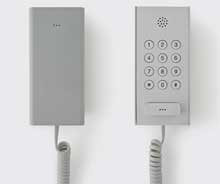
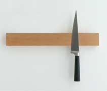 Cordless telephone and Knife Rack
– He also showed another phone that is not yet produced. It was an attempt to make the outside of a phone as smart as the outside. It would communicate with other objects in the house so that you’d have to open it much less (for example, if you’re in the bedroom the phone will display the text message you’ve just received on the screen of your alarm clock.
– Their latest design for Muhi is a coffee maker. Muji dispenses with everything to create something better. The object is totally round, yet not bigger than any other coffee maker (KF 400 or Mister Coffee). It can sit on a corner or stand in the middle of a tabletop. Most design process used paper. They deliberately chose to un-skill themselves. The computer would have made it more complex as it features boundless possibilities. With the computer you can make the coffee maker more fancy and add countless details. Another influence to design the coffee maker is the pot Sam Hecht uses every morning to froth his coffee. The coffee pot looks a bit like the frothing one. You can move it from the kitchen to the dinning room without having the feeling that it’s part of a machine and that it has lost his world.
3. Oddity
He showed examples of bicycle baskets used in Japan by passersby to throw their rubbish. The baskets looks like those for trash you find in the streets and they are at perfect level. Another example is an ATM machine near his studio, it is installed too low.
Industrial facilities works also for a company in Sheffield. They made a knife collection that uses a new type of plastic that is cold to the touch, giving a very hygienic feeling. They are also working on a cutlery collection. They designed nothing, just gathered many kinds of plastic cutlery and transfered their design to stainless steel. Increadible usability. They will be launched next year.
Last anecdote about the memo they designed for Muji. They have the same size as passports and even have the same colours. One day, one of the designers at Industrial Facility just took the notebook instead of his passport to the airport.
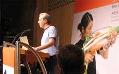
My pictures from his talk. More about IF in ICON magazine and Design Museum.

