The Politics of Design. A (Not So) Global Manual for Visual Communication, by Ruben Pater.
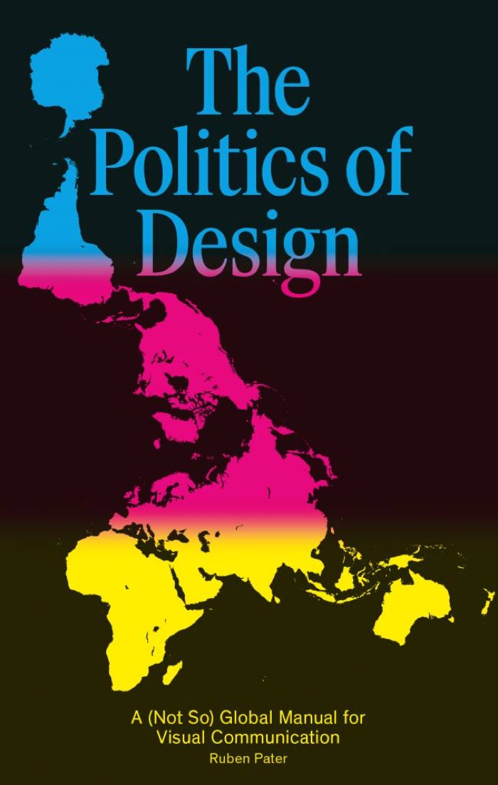
BIS Publishers write: Many designs that appear in today’s society will circulate and encounter audiences of many different cultures and languages. With communication comes responsibility; are designers aware of the meaning and impact of their work? An image or symbol that is acceptable in one culture can be offensive or even harmful in the next. A typeface or colour in a design might appear to be neutral, but its meaning is always culturally dependent. If designers learn to be aware of global cultural contexts, we can avoid stereotyping and help improve mutual understanding between people.
Politics of Design is a collection of visual examples from around the world. Using ideas from anthropology and sociology, it creates surprising and educational insight in contemporary visual communication. The examples relate to the daily practice of both online and offline visual communication: typography, images, colour, symbols, and information.
Politics of Design shows the importance of visual literacy when communicating beyond borders and cultures. It explores the cultural meaning behind the symbols, maps, photography, typography, and colours that are used every day. It is a practical guide for design and communication professionals and students to create more effective and responsible visual communication.

Lena Söderberg, the playmate who became the standard for online imaging tools
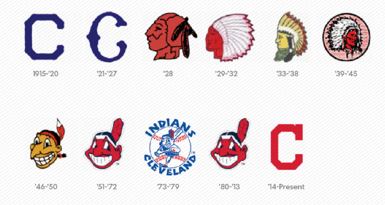
One of the sport teams that appropriate the Native American image for their mascot
I can’t remember the last time i had such an entertaining, witty and informative publication to review.
The Politics of Design is a compact little book packed with little-known anecdotes, historical facts, pieces of advice and lessons learnt from real and often embarrassing communication design experiences.
The author (and the many contributors invited to share their wisdom and insights) draws attention to issues that should be obvious but are too often overlooked by designers: the ethnic stereotypes that should have died decades ago, the graphics that misinform, the cultural appropriations that ransack marginalized communities, the icons that pigeonhole groups of people (not all disabled people are in a wheelchair, not all parents in need of changing their baby’s nappy are women), the domain names that required more careful scrutiny (www.therapistfinder.com, www.budget.co.ck or www.kidsexchange.com), the technologies that betray cultural bias and assumptions (a worrying fact in our age of surveillance and data gathering), etc.
Nothing, not even a colour or a typeface, is as neutral and as innocent as we’d like to believe. And even their meaning, once identified, may change over time and across cultures. In fact, pretty much everything, even time, can be politicized. Two years ago, the clock on the facade of the Bolivia congress in La Paz was de-colonized and altered to turn anti-clockwise.
The author of the book is Ruben Pater (you already know how much i admire his work if you’ve read the interview i had with him last year: Drones, pirates, everyday racism. An interview with graphic designer Ruben Pater.) He is a designer, a researcher from Amsterdam and as ‘Untold Stories’ he works on projects between journalism and graphic design and creates visual narratives about complex political issues.
The Politics of Design should be put into the hands of everyone working in communication design. And also probably in the hands of everyone else since none of us can elude the work of designers.
Random examples of what you can discover inside the book:
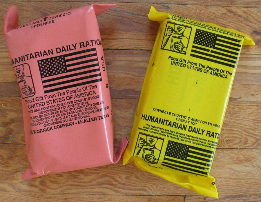
New Humanitarian Daily Ration and Old Humanitarian Daily Ration (image)
In 2001, the United States dropped emergency food parcels over Afghanistan. However, from a distance it was tricky to distinguish them from unexploded cluster bombs. The bags had the exact same yellow hue as the bombs.The U.S. government soon changed the colour of the food parcels to pink.
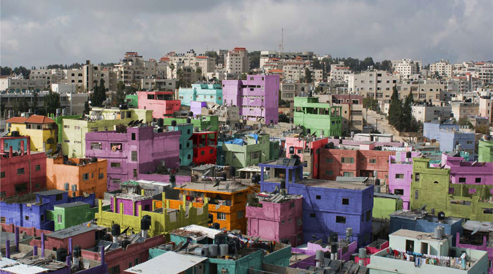
Yazan Khalili, Colour Correction – Camp Series, 2007 – 2010
Yazan Khalili added colour to photos of Al-Amari Refugee camp, located inside/beside/outside Ramallah city as a symbolic act to fill the loss -like a child filling a coloring book- and produce the possibility of hope. Here I’m attempting to appropriate an urban landscape that reminds us of the tragedy -of their existence and our disappearance- in order to subvert memory into a desired future.
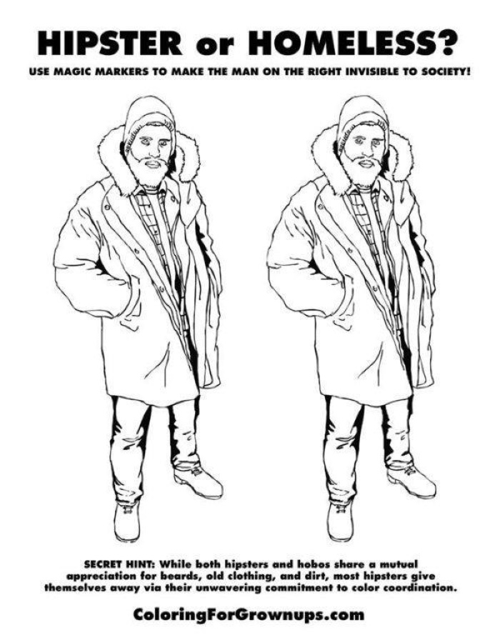
Ryan Hunter and Taige Jensen, Coloring For Grown-Ups: The Adult Activity Book, 2012-2015
Ryan Hunter and Taige Jensen’s coloring book “Coloring For Grown-Ups: The Adult Activity Book” shows the potentially subversive power of colours.

The original version of the 2010 Ikea catalogue and the censored version circulated in Saudi Arabia
Digital manipulation makes it easy to create diversity, rejuvenate politicians, wipe out political opponents, and of course fix women’s unsightly bits (whether they are deemed too flat, too fat, too wobbly, too spotty, too wrinkly, too sexy or not sexy enough.) Unless you prefer to erase women entirely! In 2010, the IKEA catalogue for Saudi Arabia airbrushed women out of pictures. The company later apologised.

Unknown Ammassalik, Inuit, Carved wooden coastal charts carried in their kayaks by Greenland Inuit. Courtesy of the Greenland National Museum & Archives
The most used map, the Mercator was drawn in 1569 and showing all the prejudices that pertain to its age, the one of colonialism and Euro-centrism: Africa and South America look far too small, Australia is even smaller than Greenland, Europe appears larger than it really is.
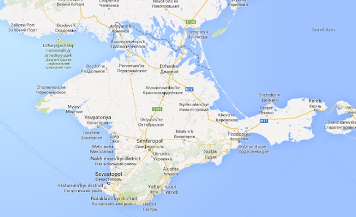
A map of Crimea on google.com
Even contemporary maps should be approached with caution. Because it obeys to local laws, Google map shows differences in borders according to the country you’re accessing the map from. Visitors to the Ukrainian google.com.ua, will find a map of Crimea displaying unmarked border with Russia and a clear internal boundary with the rest of Ukraine. On the other hand, Russian visitors to Google will find the area marked as a separate country from wider Ukraine. Everywhere else, Google uses its legend for disputed borders between mainland Ukraine and Crimea.
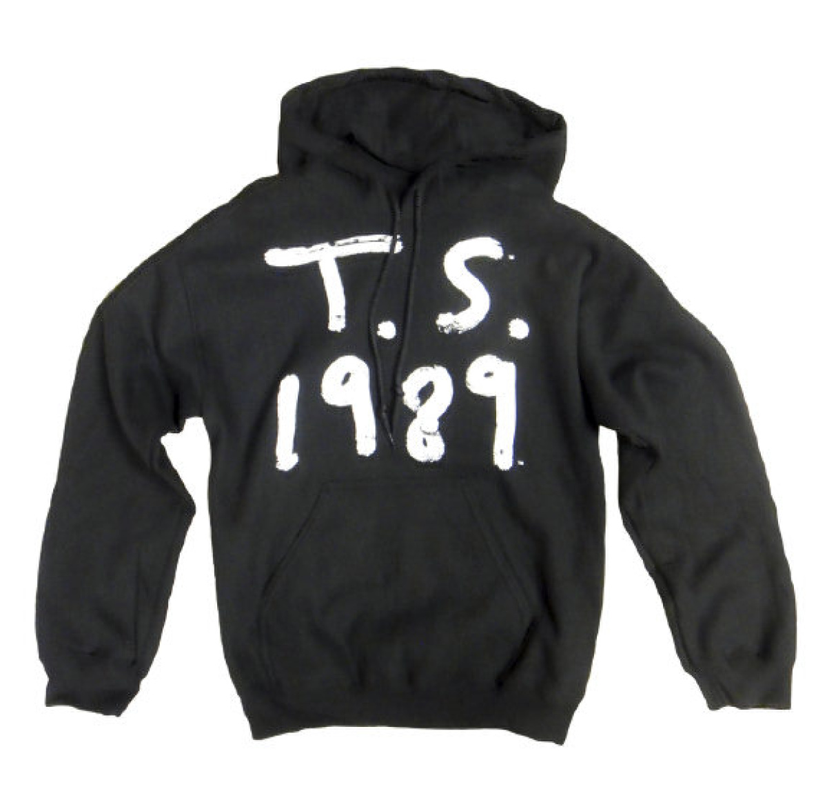
Taylor Swift Chinese clothing line with ‘TS’ and the date ‘1989’ was interpreted by the Chinese as a political reference to the Tiananmen Square massacre
Previously: Drones, pirates, everyday racism. An interview with graphic designer Ruben Pater.
Image on the homepage: Censorship In the Republic. How foreign media are filtered in Iran.
