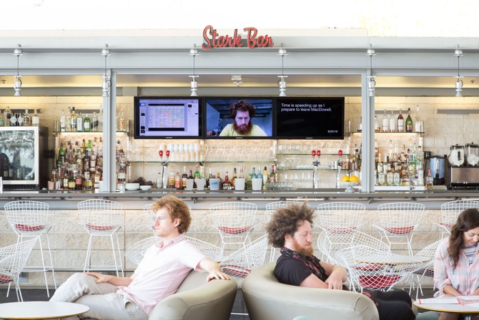
Michael Mandiberg, Quantified Self Portrait (One Year Performance), 2017. Installation view at LACMA’s Ray’s & Stark Bar
In 2008, as the U.S. was going through the Great Recession, Michael Mandiberg noticed that when a bank failed, the Federal Deposit Insurance Corporation (FDIC) would erase its visual identity from the internet. The whole disappearing act was taking place over the course of one weekend; on Friday the bank was there and by Monday morning all traces of its visual identity were gone. Mandiberg started monitoring the weekly updates to the FDIC Failed Bank List and downloading the logos of the banks in advance of their public wipe out. With his collection of over 500 logos, Mandiberg is now probably the greatest archivist of failed U.S. banks.
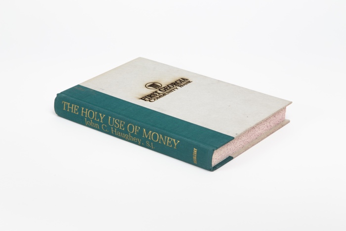
The second part of his work consisted in using a laser-cutter to burn the name of each bank and its logo onto the covers of investment guidebooks. Total Money Makeover, The Holy Use of Money, Success Is a Choice (my favourite!), etc. The titles of the books are as grand as their fate is humble: Mandiberg bought them from the dollar racks of the Strand bookstore in New York city.
Michael Mandiberg, FDIC Insured (First Georgia Community Bank, Jackson GA, December 5, 2008), 2009-2016
Michael Mandiberg, FDIC Insured Documentation
I would normally say that i have absolutely zero sympathy for the fate of banks. Yet, i found FDIC Insured incredibly moving. At first, all you see are mundane logos and bank names. A moment later, you start visualizing the employees who lost their job, the hundreds of thousands of individuals dispossessed of their savings… Maybe you even knew some of these people. Do check out the book and the web archive of the project. The sheer banality and repetition that FDIC Insured exposes make the Great Recession all the more crushing and incredibly tangible.
There are many reasons why i wanted to interview Mandiberg. He is an artist whose work i’ve admired for years, the founder of New York Arts Practicum and the co-founder of the brilliant Art+Feminism Wikipedia Editathon which invites women artists around the world to fight gender gaps online by updating Wikipedia entries on subjects related to art and feminism.
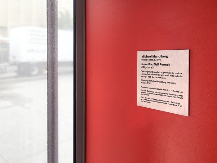
Michael Mandiberg, Quantified Self Portrait (Rhythms)
And right now, Mandiberg has a year-long show at the Los Angeles County Museum of Art (LACMA). Titled Workflow, the exhibition and project explore the changing definition of labor in the digital age by pushing self-tracking technologies to their most invasive limits.
Quantified Self Portrait (Rhythms) sonifies a year of the artist’s heart rate data alongside the sound of email alerts. The other work, Quantified Self Portrait (One Year Performance), is a stop motion animation composed of webcam photos and screenshots captured from Mandiberg’s computer and smartphone every 15 minutes for an entire year. Perhaps the most shocking aspect of this project is that it actually echoes current practices for monitoring staff productivity.
I’m so happy the artist found a moment to answer my many questions about Workflow and FDIC Insured:
Michael Mandiberg, Detail of “Quantified Self Portrait (One Year Performance)”, 2016
Hi Michael! Quantified Self Portrait (Rhythms) is played in LACMA’s Pritzker Parking Garage elevators. Is the location meaningful? Why parking garage elevators?
I wanted an enclosed space to hold people in the sound. These elevators are blood red, like a beating heart or a womb. Elevators are small, and the Pritzker elevators are glass and metal, so they become a resonant box: the sound feels like it is coming from all around you. Some people say the feeling is comforting; others report feeling claustrophobic.
Elevators have become spaces where people routinely check their mobile phones; the 45 seconds provide just enough time to take a quick glance and satisfy our addictions, but not long enough to do anything meaningful. Elevators are places where we are willfully trapped, though only temporarily, for the most part. (Have you ever been stuck in an elevator? I have. Kind of frightening!)
In Los Angeles, where the vast majority of people commute by car, parking garage elevators are liminal spaces between the outside and inside. They are a kind of lobby that precedes the lobby. In this case, they mark the threshold between the bustle of the outside world and the contemplative space of the museum. At LACMA, the “lobby” is actually an outside pavilion (because it almost never rains in LA, and when it does rain, practically no one goes out). Also, Quantified Self Portrait (One Year Performance) is installed directly across the pavilion from these elevators.
Michael Mandiberg, Quantified Self Portrait (Rhythms), 2017. Installation in LACMA’s Pritzker Parking Garage elevators
The work sonifies a year of your heart rate data alongside the sound of email alerts. How did these two connect? Did your heart jump with each email alert?
I spent time in the installation when I was documenting it, and noticed times when my heart started beating fast in the lead up to the sound of a sent email. I imagine this was because of the concentration and stress that accompany a difficult email. At the same time, the email alerts are staccato, erratic: jarringly disconnected from the rhythmic pulsations of my heart. I’m working on a series of slightly more conventional visualizations for the project, however in this case, I used sound as a form through which the data would speak on an emotional and psychological level.
Michael Mandiberg, Quantified Self Portrait (One Year Performance) – Documentation
In an interview with Unframed, you say that the works you’re showing at LACMA, Quantified Self Portrait (Rhythms) and Quantified Self Portrait (1 Year Performance), directly pay homage to Tehching Hsieh’s work. His yearlong performances were famously challenging physically, emotionally, and psychologically. Quantified Self Portrait sounds like a very stressful performance, too (at least to me). One year is a very long time and not only can things go into unexpected and unpleasant directions, but they can also wear you out or maybe unnerve you over time.
What were the challenges and difficulties you encountered over the course of this performance?
I experienced challenges tracking my life (which was time-consuming and stressful), but the performance also made me acutely aware of the challenges that were already present in my life. By giving my life a visible framework, the performance brought frustrations and difficulties that I previously regarded as mundane, or didn’t notice, into focus. This is a significant difference between Hsieh’s performances and my work: Hsieh imposed onto himself simple but exaggerated or absurd gestures that reflected daily actions. By repeating these gestures, he reframed their meaning. They weren’t necessary gestures—they referenced necessary gestures. I imposed on myself a system of tracking externally imposed, necessary gestures and actions: the things that I tracked are gestures required of me.
So, the challenges I experienced didn’t arise from imposing an abstract disciplinary system on myself, but resulted from noticing and recording the ways in which my life is already a tightrope act of internalized self-discipline. The year made it visible that, in a sense, I bring my prison everywhere I go.
I also used a more complicated mechanism of marking time, which introduced more possibilities for failure when the system breaks down. Once a month, I would have some kind of technical crisis. This is, of course, normal in projects that use technology. So these moments of failure end up embedded in the record itself, like my journal entry from March 22, 12:41 a.m., which reads: “I can’t sleep. I realized that my Fitbit battery was dying. I went to transfer the data before the battery died, out of fear the data would disappear. I killed the battery AND it didn’t transfer.” At 1:11 a.m. on the same day, I write: “I am going to bed now. I couldn’t find the charger. My Fitbit is dead. I assume I will get to sleep around 1:30–1:45” After five and a half hours of what I imagine was pretty bad sleep, I wrote at 9:06 a.m., “I woke at 7:17. After an hour of searching, I found my computer bag. [Which held the charging cable] Fitbit is charging.”
Was your relationship with your computer and with internet altered by this year-long performance? Did you self-censor when you knew the system was about to take the screenshot of your computer screen, for example? Or try to adopt a more relaxed expression or rearrange the space right behind you when the camera was about to take your portrait?
For the first few days, I was self-conscious. I remember looking at the clock and thinking “I should wait one more minute, until it takes a photo, before I go to the bathroom.” I remember noticing where the light source was in the room, and positioning myself so that I wasn’t backlit. I remember my partner, Jackie, would ask if the system was about to take a photo before sitting next to me to look at something on my computer. Within a week or two, though, I became accustomed to it and then forgot about it. I grew so accustomed to it that I didn’t notice when the software on my laptop crashed and stopped working for a while.
The software on my iPhone actually required me to press a button, because iOS doesn’t allow software to automatically take photographs in the background. So I always knew when those photos were happening, but I just took them wherever I was, in whatever pose I was in, bad posture and all. Toward the end, Jackie started trying to photobomb the iPhone photos.
Self-monitoring technologies promise users that they will gain some “self-knowledge” through this voluntary accumulation of data. Did you get some of that? Learn something about yourself? Useful or not?
I went into the project intending to make a critical Quantified Self Portrait, which would articulate the possibilities and limitations of the aspiration for self-knowledge through data.
I learned some things, but if I’m honest with myself, they’re all things I already knew but didn’t allow myself to articulate: I don’t sleep enough. I work too much. I spend a startling amount of time on my iPhone. Most of my time in the studio is spent in what might be considered a producer role: planning, writing emails, applying for grants, documenting the work, traveling to install the work, etc. I spend little of my time making, whereas my assistants spend almost all their time making: writing code, editing video, laser cutting to make the work. But seeing these realities rendered in a fairly conclusive way was a bit unnerving.
I also learned things that I hadn’t been seeking, that I didn’t know I wanted to know. In an effort to get some “qualitative” data, I wrote in a journal almost every evening, and then distilled these entries into a few sentences that I typed into a piece of software on my phone. These short texts form the third channel of the video as it is installed at LACMA. These texts reveal to me just how much physical pain I was experiencing, the level of stress my day job causes me, how happy a bike ride or a trip to the beach makes me feel. They also chronicle my uncertainty that I’ll unlock any kind of self-knowledge through this data.
The work makes remote computer labor very tangible. It also made me realize how present and invisible it is in our life—how intrusive and grim it is for workers, too. Could you tell us about the weight this online labour has on our work culture? How much place it takes in our everyday gestures and how much more importance it might take in the future?
This is a big question. There is no one answer, because we don’t have a single work culture across countries or across industries and classes. But the weight is there. Here are a few points in the constellation: In the US, big-box retailers and restaurant chains have installed self-checkout kiosks which remove human contact, put people out of work, and extract involuntary surplus labor from customers. For over a decade, we’ve all been solving reCaptchas for Google, performing micro-labor by training AIs (yes, that’s what we are doing when we “prove we are human” and identify all the cars in the photo—directly or indirectly, we’re talking to AIs). An entire industry of content moderators, often based in the Philippines, have major psychological trauma from repeated exposure to ISIS beheading videos, dick pics, animal torture videos, etc. as they review posts that have been flagged by AIs or by humans. France has implemented new laws protecting workers from having to check email after work hours; yes, it’s for a limited segment of the workforce, is still a step forward.
Part of the problem is that this techno-speedup produces a kind of addiction. An addiction to working. An addiction to the infinite scroll. An addiction to the quantitative rewards of social media metrics. I don’t use this word lightly: research indicates that it is an actual addiction, triggering the same neurological rewards as cocaine or gambling.
As I was writing that last paragraph I impulsively checked social media. Four keystrokes: Command-Tab, Command-L, one “f” which autocompletes, Enter, and I scroll through more of the same about American neo-Nazis and our abusive, gaslighting President. I compulsively return again and again, hoping to get my high, except everything I read makes me miserable. As with any drug, the more you do it, the more it takes to feel high, and without it you feel incomplete. My partner and I have a practice of asking each other, “Is that making you happy?” when we see each other caught in the hypnosis of the infinite scroll. I think you know what the answer is.
Hunched over my laptop, my wrists are sore as I write this. I go in and out of cycles of repetitive strain injuries. I’m in the trough of one now. That instinctual four-keystroke sequence hurts, twisting my wrists into contorted positions, over and over again.
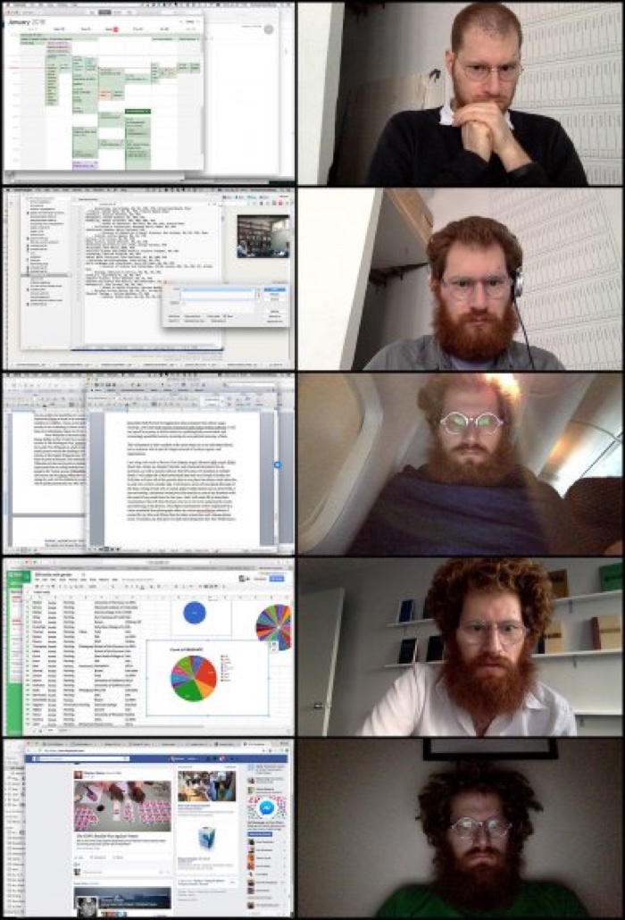
Michael Mandiberg, Quantified Self Portrait (One Year Performance)
In the video interview with LACMA Unframed, you mentioned that you were recreating one of Charlie Chaplin’s movies shot by shot with the help of online workers. Are you still working on that project?
Yes, I am still working on the Chaplin film. I made some headway this summer. I had to pause working on it when Quantified Self Portrait, which had very distinct and unavoidable deadlines, kind of took over my life. I also experienced unexpected hurdles working with online labor platforms: Fiverr.com kept rejecting my posts, and I was unable to get anyone on Mechanical Turk to complete even a three-second clip, even when I offered $40 per clip. It seemed that the Turkers were unwilling to leave their houses or set up a camera on a tripod. In response, I made a piece where I asked two hundred Turkers to take photographs out of the window in the room they were working.
As I said in the LACMA Unframed interview, I view all these works as part of a larger project exploring contemporary digital labor. The Chaplin film and the windows look outward, representing the lives of others, while Quantified Self Portrait looks inward, using myself to show that conventional representations of how an artist works bear little resemblance to reality.
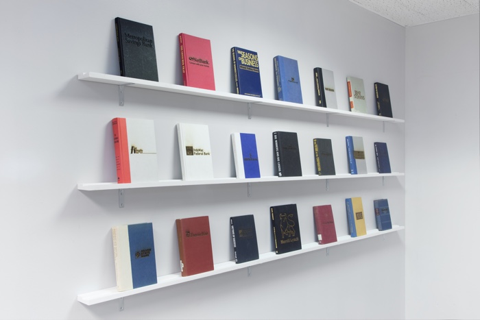
Michael Mandiberg. Installation view of “FDIC Insured”, Denny Gallery, 2016
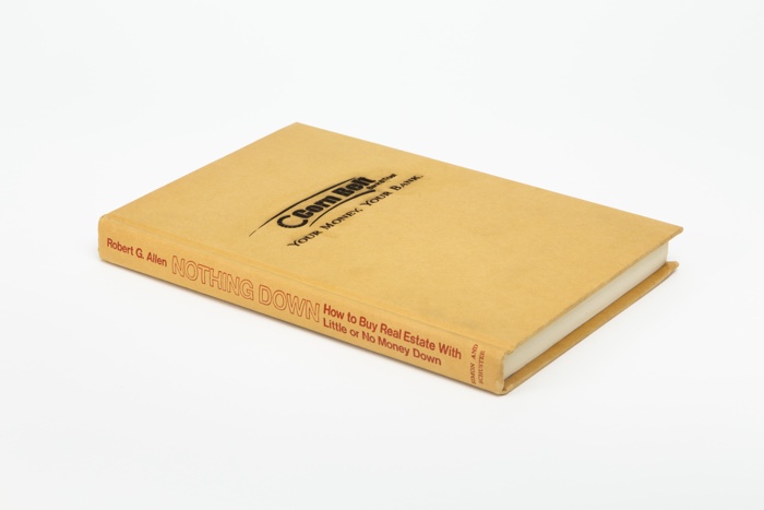
Michael Mandiberg, FDIC Insured (Corn Belt Bank and Trust, Pittsfield IL, February 13, 2009), 2009-2016
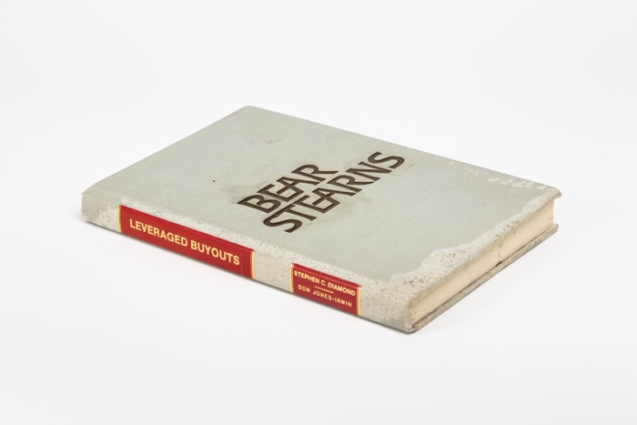
Michael Mandiberg, FDIC Insured (Bear Sterns, New York NY, March 16, 2008), 2009-2016
How did the whole FDIC Insured project start? When did you realize that the failed banks’ identities were being erased? And when did you get the intuition you would collect such an impressive collection of logos?
When I started collecting the logos in 2008, I had just completed Digital Foundations with xtine burrough. I was thinking a lot about design, engaging in free culture activism that often centered around archives, and making work with found books as a material. FDIC Insured pulled from each of these threads.
My work with books began on the street. Walking around Brooklyn in 2007, I began noticing the books people had started to leave on their stoops. I collected these books, although I didn’t know what to do with them. I was trying to think through what it meant for these objects, which had been so important for so long, to be discarded at that precise moment.
We all felt the breakdown of the financial system. I was thinking a lot about these banks, the failures of the system, and the contraction between this failure and the purpose of the modern logo. I started collecting logos, unsure of what I would do with them. At some point in the winter of 2008–09, I connected the dots.
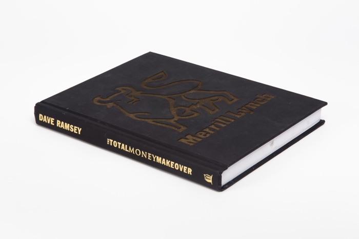
Michael Mandiberg, FDIC Insured (Merrill Lynch, New York NY, September 14, 2008), 2009-2016
Michael Mandiberg, FDIC Insured (Washington Mutual Bank, Henderson NV, September 25, 2008), 2009-2016
You’ve now seen, recorded, and laser-cut hundreds of bank logos. What can you tell us about their design and aesthetic? What do they communicate about the banking system and its values, for example?
Many of the logos are inspired by classic American Modernist logos from the 1950s, like Paul Rand’s IBM logo or Chermayeff & Geismar’s NBC logo. Characterized as “corporate design,” this particular flavor of Modernism aims to be timeless (both immediate and eternal), as well as being legible in different languages and cultural contexts.
These logos manifest timelessness by seeming to erase history: they remove whatever might have come before, and have rarely been changed since. These banks chose a style that was meant to exude stability, permanence, trust, and confidence, and yet they failed.
The logos also seek to evoke a sense of permanence through their iconography. The US economy and banking system were built on slavery and settler colonialism, obscured by myths of manifest destiny and white supremacy. It’s no mistake that these logos include iconography of land (oceans, lakes, mountains) and the fruits of the land (wheat, grapes). For a country with a relatively short history—both in relationship to the nations of the many continents its citizens immigrated from, and the indigenous nations they conquered—these logos claim power from the past by using historical iconography: Greek columns, statehouses, and references to the antebellum South. The word “first” is repeated again and again: there are multiple First State Banks, First National Banks, First Community Banks. Everyone wants to be first, and thus oldest. Of course, there is no Royal Bank(!)
Color plays a significant role. Many of the logos include blue: the color of honesty, the color of the Virgin Mary, the color of suit lawyers advise that their clients wear in the courtroom. Some logos are green, the color of the dollar bill. Very few include any red, which is associated with stop signs and Communism, unless the color is explicitly themed around the red, white, and blue of the US flag.
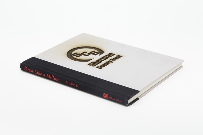
Michael Mandiberg, FDIC Insured (Sherman County Bank, Loup City NE, February 27, 2009), 2009-2016
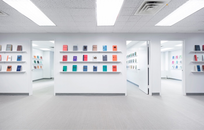
Michael Mandiberg. Installation view of “FDIC Insured”, Denny Gallery, 2016
I was actually very surprised by the fact that the visual identities of the failed banks are erased from the web. I recently had a long discussion with people from various parts of Europe about the fact that failure is actually valued in the US far more than here in Europe. We try to hide our failures, whereas in the US it seems that failure is part of the experience gained, and it’s not something to be ashamed of. Do you know anything about the rationale behind this complete erasure of the visual identity of the banks?
I don’t know if I can speak to the comparative cultural value of failure. When you say that the US values failure more, I think of F. Scott Fitzgerald’s “There are no second acts in American lives” on the one hand, and also Samuel Beckett’s “Ever tried. Ever failed. No matter. Try Again. Fail again. Fail better.” on the other. Maybe the closest contemporary example might be the way Silicon Valley embraces failure as the moment of “pivot.” The Venture Capitalist pivot, in a sense, is the latest turn in the American ideology of entrepreneurship, where risk and failure serve as mileposts on the road to self-appreciation of one’s “human capital.” This narrative tries to convince the 99% that we haven’t succeeded because we haven’t risked enough, not because of clear structural inequalities.
I do think that the symbolic value of this erasure is telling: we have to erase the history of these repeated failures in order for society to accept and trust this economic system, despite its repeated cyclical pattern of near-catastrophic failure.
But I don’t think that the banks have an explicit or rational policy mandating erasure of these visual identities. Rather, it’s more a byproduct of the effort to maintain structural continuity and visual branding, combined with something akin to linkrot on a corporate scale.
From a pragmatic User Experience (UX) design point of view, the organizations that take over these failed banks are faced with thousands of customers visiting www.oldbank.com that need to be absorbed into www.newbank.com with as little disruption as possible. I regularly observed the new bank redirecting everything on www.oldbank.com (including the legally required FDIC transfer notice) to a specific landing page to welcome the new customers (e.g. www.newbank.com/welcome-old-bank-customers.) This redirect also means you can’t access any of the logos that might have been there.
In a less pragmatic and more symbolic way, the new bank needs to manifest its own visual presence throughout the virtual and physical sites of the old bank. While the interior design of the spaces cannot be completely changed in one weekend, they change what they can in such a short time (the signage on the outside of the building, the employees’ uniforms) and complete the remainder of the work soon thereafter.
You might think that these logos are all archived somewhere, but they aren’t. The most prominent ones, like Washington Mutual or Lehman Brothers, are archived on websites that collect the logos of Fortune 500 companies. Some but not all of these banks had a presence in the Internet Archive’s Wayback Machine, but most of these records don’t contain images.
Any upcoming work, field of research or event you could share with us?
FDIC Insured will be included in POST FAIL at Fotomuseum Winterthur this winter. The Dutch language version of Print Wikipedia will be included in The House of the Book at the Koninkelijke Bibliotheek this fall. Michael Mandiberg: Workflow is up at LACMA through New Year’s Eve, and work from these projects will be included in a solo show at Denny Gallery this fall.
Thanks Michael!