
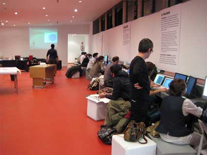
A second project developed in November during the Visualizar workshop directed by Jose Luis de Vicente and organized by the Medialab Prado in Madrid. Participants had two weeks to develop data visualization projects, with the help of three instructors, in addition to assistants and collaborators.
 Elie Zananiri is mostly interested in combining stop-motion animation, computers and micro-controllers through interactive video installations and data visualizations.
Elie currently works at Obx Labs in Canada as the lead developer on Citywide and NextText for Processing. He also does freelance programming.
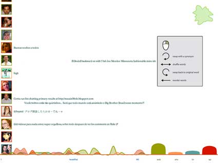
The project he developed in Madrid is tweetPad, a software for a more dynamic visualization of the Twitter feed, enabling the user to use simple mouse gestures and manipulate the feeds. This is done by deconstructing the text; scrambiling the letters or words, breaking sentences apart, replacing words, combining multiple entries into one, etc.
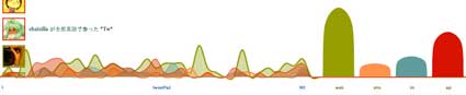
tweetPad also visualizes statistics on the source of the incoming messages (web, sms, instant messages, or 3rd party software) and the number of characters per message.
tweetPad is software used to visualize Twitter feed in a new, dynamic fashion. Why do you think that Twitter users would need such tool? What can tweetPad bring to their relationship with the now famous s ocial networking and microblogging service?
Most social networks work in a similar way: someone posts something, others look at it and sometimes reply. The idea behind tweetPad is to not only be on the receiving end of these feeds but to be able to manipulate them, on a lower level of abstraction. It’s about dropping the meaning and just playing with the text. Instead of responding to a statement, you deconstruct it, i.e. scrambling the letters or words, breaking sentences apart, combining multiple entries into one, … Your reply is a re-hash of the original. It’s a different approach that’s more fun and prone to experimentation. I find that it’s an interesting tool for Twitter users because it’s a radical way of looking at interacting in social networks.
 Could you take us through the design of tweetPad? Which kind of design solution did you develop to make the navigation and use of the software clear for everyone?
The main idea was to have an abstract, yet natural interface. Although traditional GUI elements such as menus, buttons, and checkboxes are recognizable and work well, I find that they are quite bland, so I am always thinking of new ways to interact with software. For tweetPad, I thought it would be interesting to use mouse gestures that are simple enough so that users could figure them out on their own. For example, a clockwise-turn on a word will swap it for a synonym and a horizontal shake will scramble the words in the message. The navigation is not clear right off the bat, but I think that it can be easily discovered after a few minutes of clicking around and playing with the software. My goal was to design something playful and intuitive, not necessarily to-the-point, and I think it adds a nice dimension to the piece.
I was reluctant to use any informative text at first, because my idea was that text is the medium in tweetPad, but I realized I would have to for the statistical aspect of the piece. There are two sets of animated curves at the bottom of the display that count the number of characters per tweet and the tweet sources, and they are much more interesting to look at when you understand what they represent. It was hard to guess what they meant without a legend, so I figured that transmitting the information clearly was more important than a somewhat obscure conceptual ideology.
 The tweetPad software offers a vast array of possibilities. Yet you managed to finish the project in a relatively short time. What were the biggest challenges you encountered while developing tweetPad and how did you overcome them?
The biggest challenge was to wrap my head around the project as a whole to be able to plan out the development over 2 weeks. I was working alone 90% of the time but everybody was giving me really great feature ideas all the time, so I was constantly torn between incorporating them and finishing on time. For example, the synonym swap idea came about early in the workshop, but it still took 3 full days to implement properly. It was definitely worth it because it’s quite a nice touch, but it took a couple of sleepless nights to get back on schedule.
Another great challenge was incorporating meaningful statistics. This is another component I had not originally thought of, but being at a data visualization workshop, the topic obviously came up many times. I had written code for slick-looking curvy lines that stretched and squeezed and flowed nicely, but when I mapped them to actual data, I had to use randomly selected units of measure (for example, a line represents a message with 0-35 characters and has a new point added to it every 2 minutes), and although the result looked cool, it was confusing and did not transmit any information. I finally dropped that for the current design, which is both good-looking and understandable.
Do you have any plan to develop the project further?
Definitely.
The first feature we had thought of was to be able to break the messages apart into words and to further break the words apart into letters. We could then re-arrange the words and letters, kind of like those word magnets people have on their fridge, and combine a bunch of messages to make a new tweet that could be submitted by the user to his own account. I haven’t had time to implement this at the workshop but this is the original goal of tweetPad, so I will definitely find the time to do it.
It would also be interesting to add a personal module, where the tweets that come in are only from people you are following. The issue with this is that there won’t be as many messages coming in, so it would need to be altered somehow to stay interesting.
And since the beginning, I keep thinking that I need to try it on a big screen, with a wiimote instead of the mouse.
Thanks Elie!
All images courtesy of Elie Zananiri.
Previously: Visualizar workshop: Visualizing: tracing an aesthetics of data; HumanFlows.